
Good Pud packaging
Contributed by Amanda DeVries on Mar 7th, 2023. Artwork published in
January 2023
.
Source: www.goodpud.ca License: All Rights Reserved.
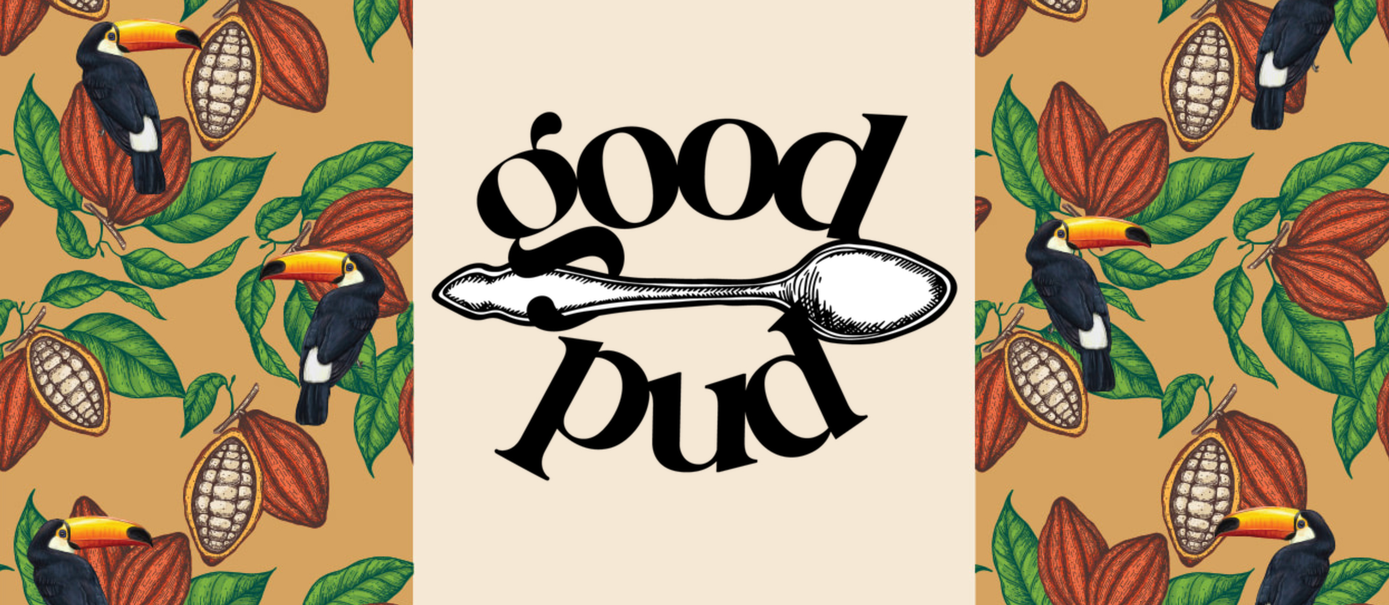
These tiny “pots de crème” by Good Pud are an absolute dream, and needed the premium look to go with it. But we also wanted to strike a good balance between a premium look but also not to take ourselves too seriously.
Knowing that the products would eventually go beyond chocolate (but would always be some sort of pudding style), a spoon was the choice for a graphic mark. The elegant but still chunky Bigola Display was used for the main visual identity and is balanced by the understated Sackers Gothic.
The packaging design balanced the premium logomark with whimsical graphics and happy colours.

Source: www.goodpud.ca License: All Rights Reserved.
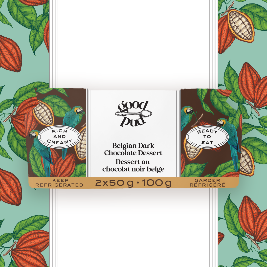
Photo: Amanda DeVries. License: All Rights Reserved.
Belgian Dark Chocolate Dessert packaging
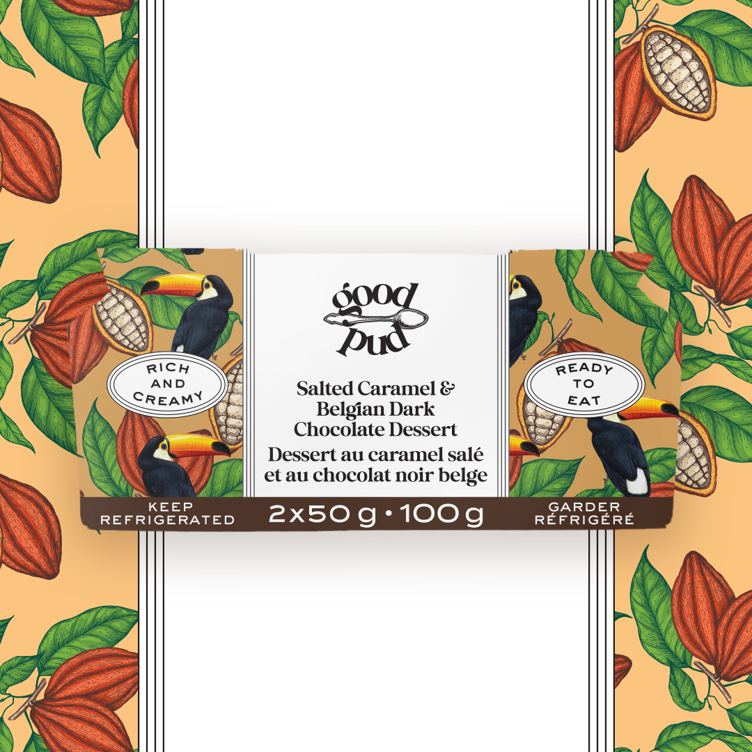
Photo: Amanda DeVries. License: All Rights Reserved.
Salted Caramel & Belgian Dark Chocolate Dessert packaging
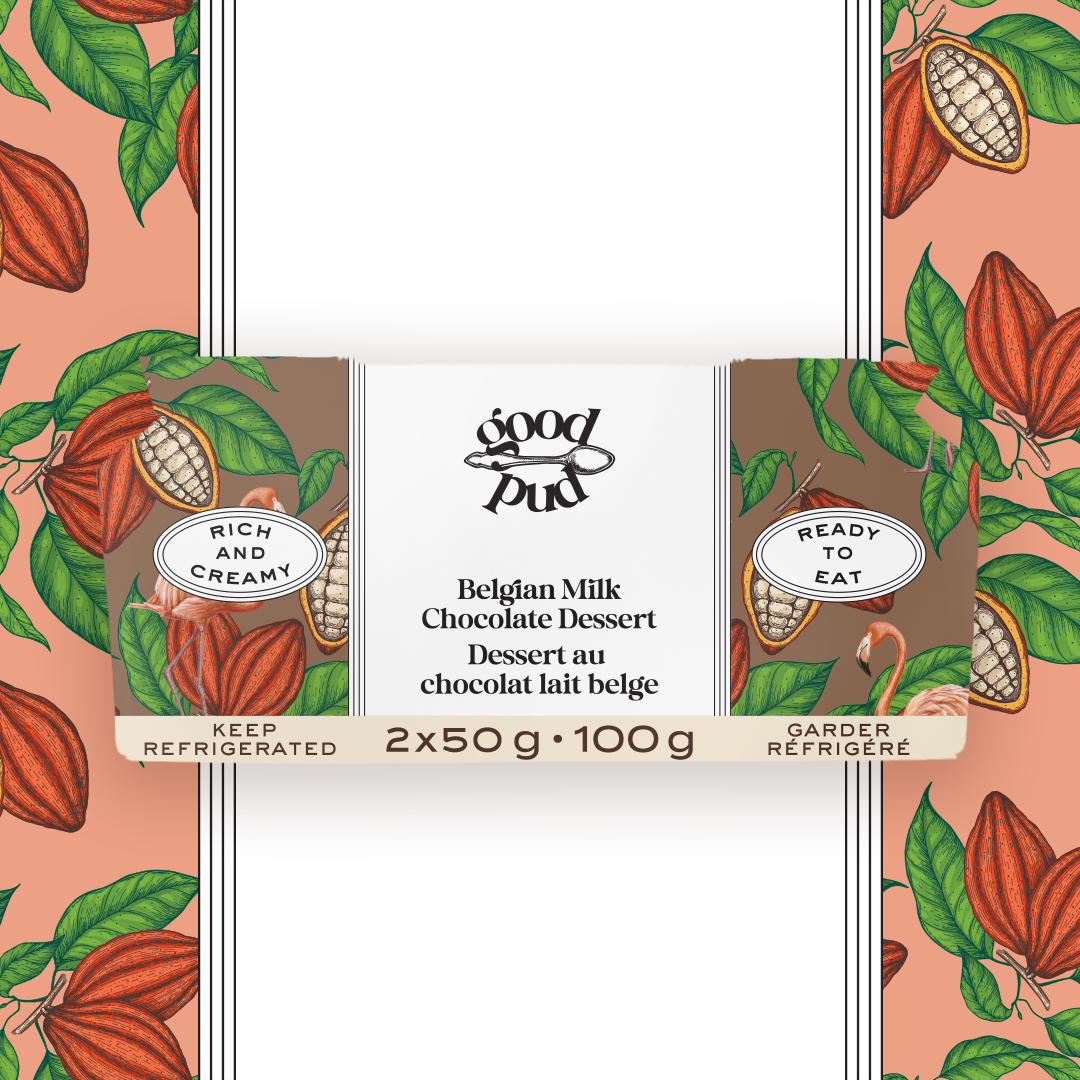
Photo: Amanda DeVries. License: All Rights Reserved.
Belgian Milk Chocolate Dessert packaging


")


")


