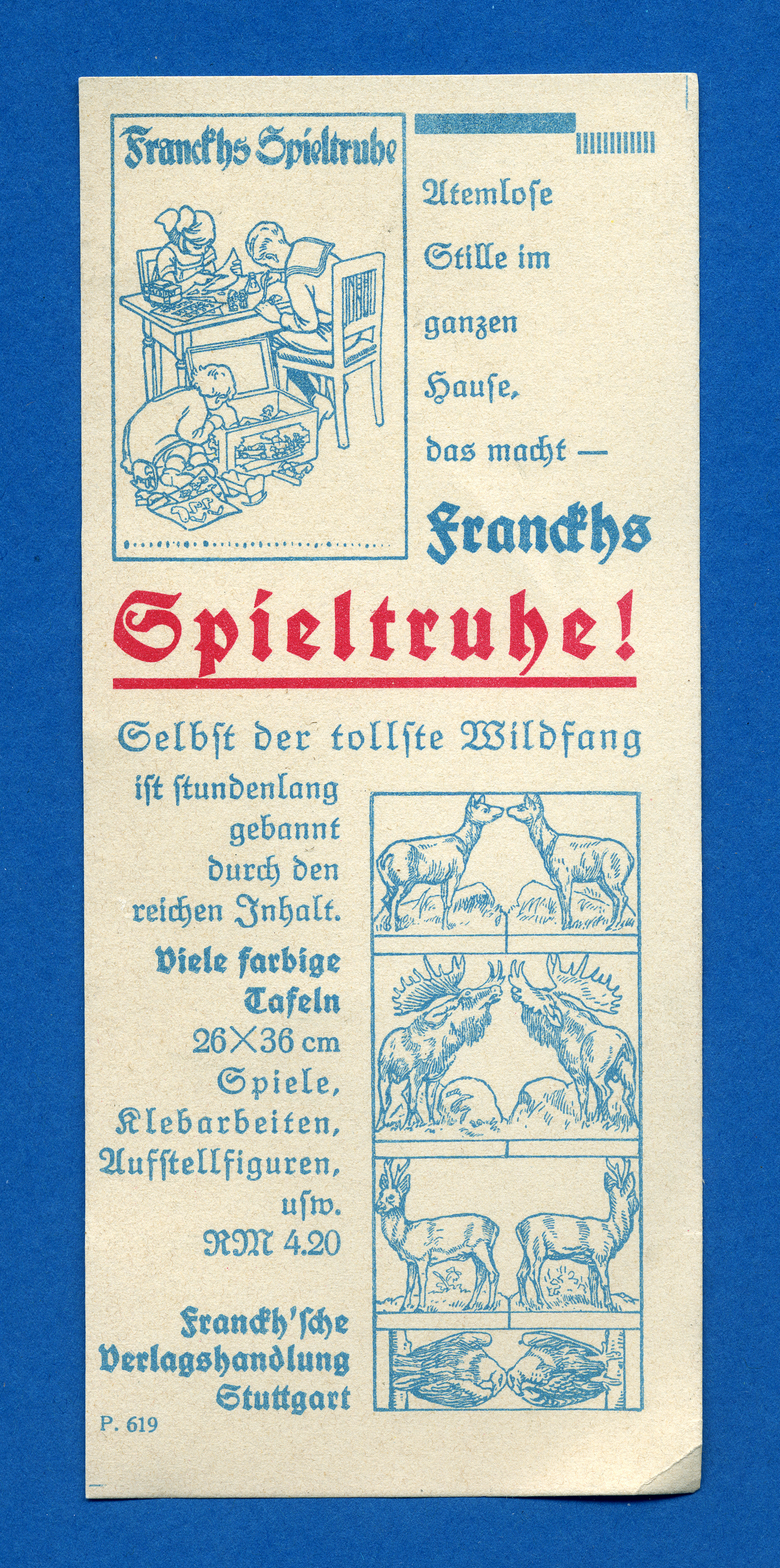
Franckhs Spieltruhe ad
Source: www.flickr.com Uploaded to Flickr by altpapiersammler and tagged with “kochfraktur”. License: All Rights Reserved.

Topics▼ |
Formats▼ |
Typefaces▼ |


1 Comment on “Franckhs Spieltruhe ad”
Franckhs Spieltruhe [Franckh’s Play Chest] comprised 48 pages with both multi-colored and single-colored charts and cut-out sheets. It was edited by Fritz Seitz in cooperation with the editorship of the monthly Basteln und Bauen. It was published in 1926 by the Franckh’sche Verlagshandlung in Stuttgart (Source: ZVAB). Today, this publisher is known as Kosmos.
The bolder style is Rudolf Koch’s Deutsche Schrift. The title combines pretty much all means of emphasis that existed in blackletter times: bold weight, increased letterspacing, underlining, red color — and an exclamation mark for good measure. Interestingly, this promotional leaflet still looks almost restrained in comparison to the mix of inevitable color photography and beveled-embossed-outlined type with drop shadow that we have today. I’m not sure what the other typeface is. It shares some characteristics with Unger-Fraktur.