
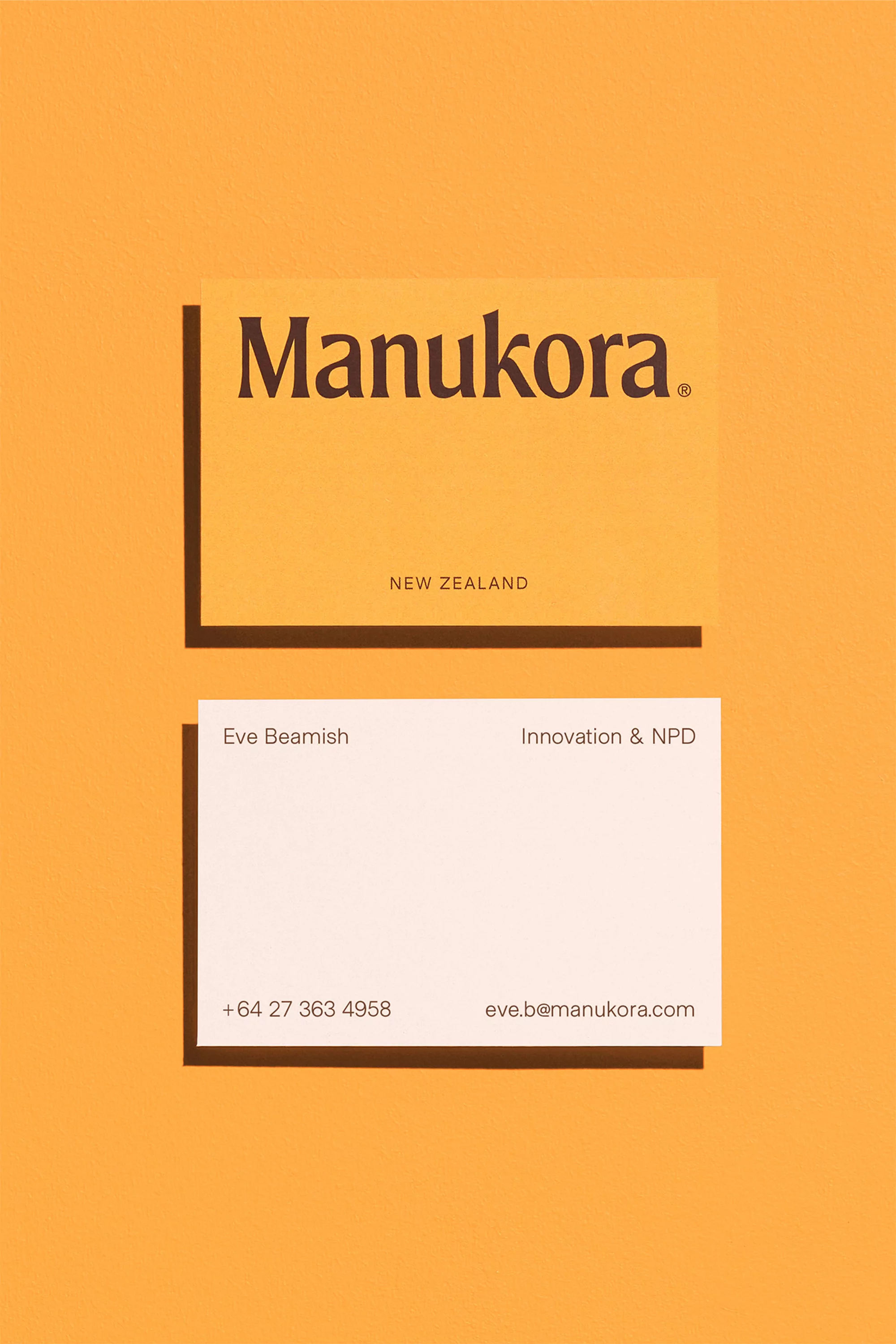
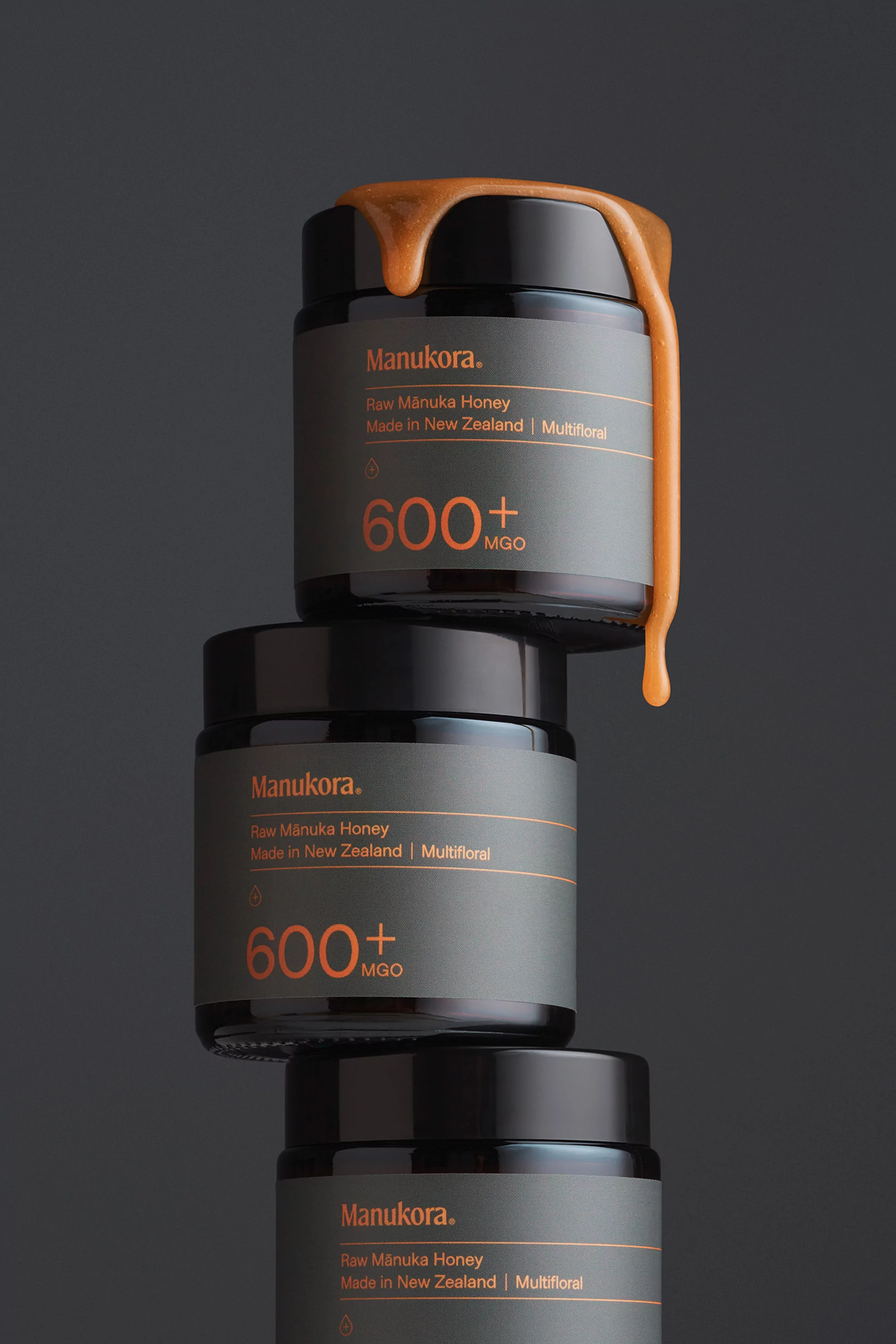
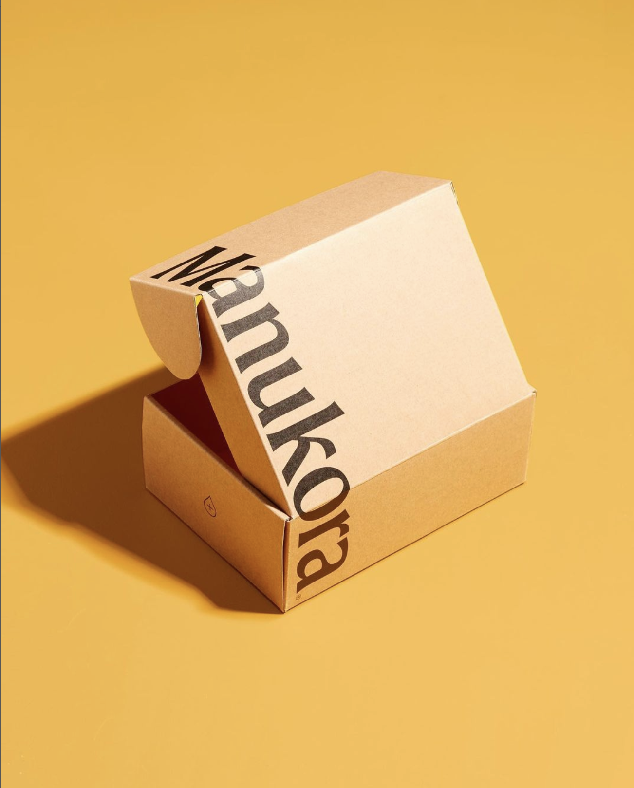
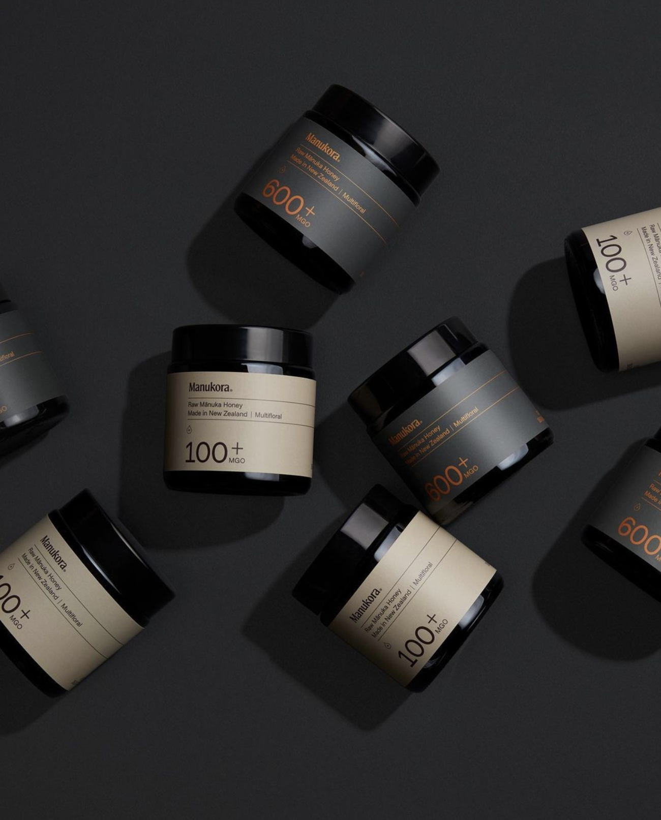
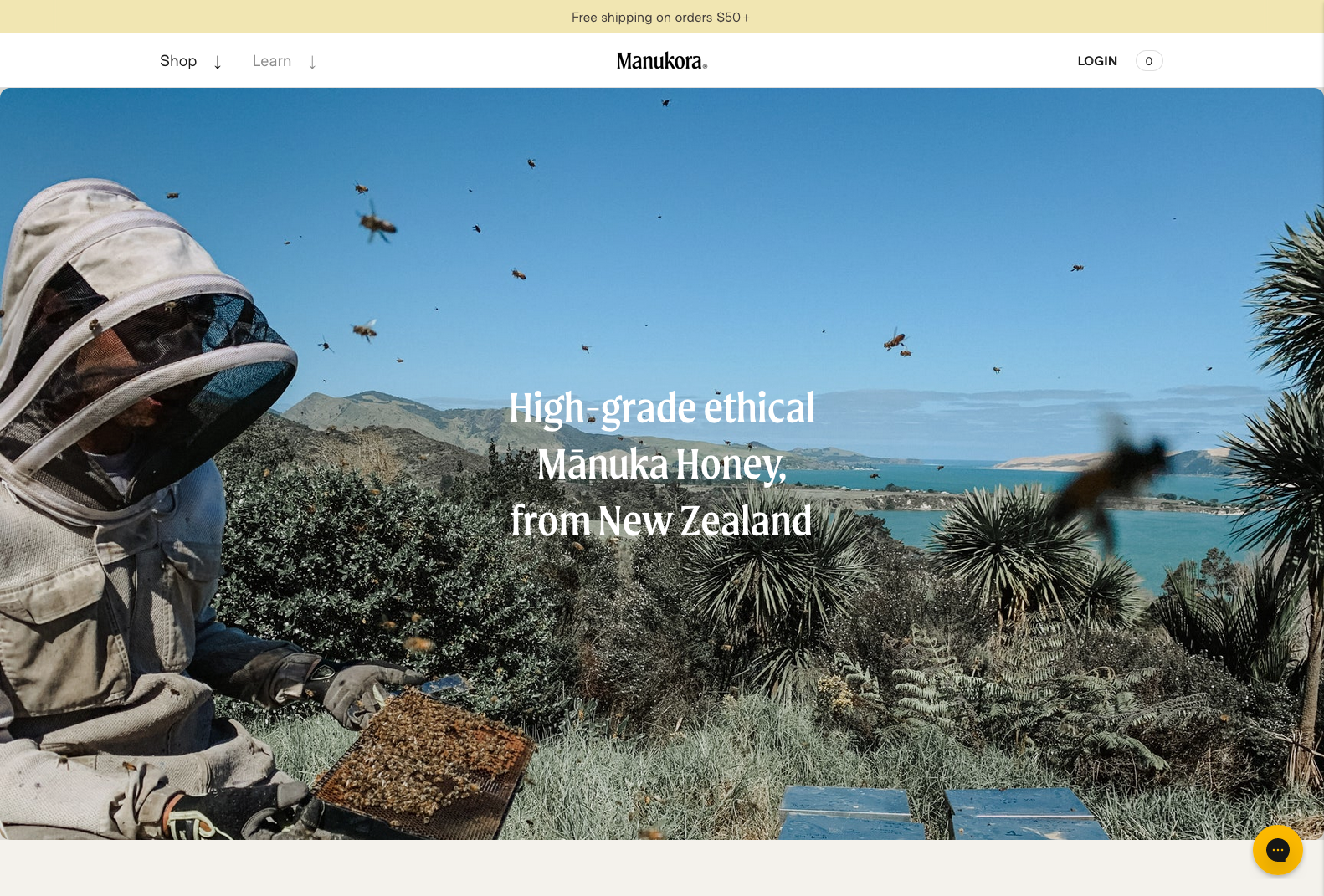
Manukora brand identity
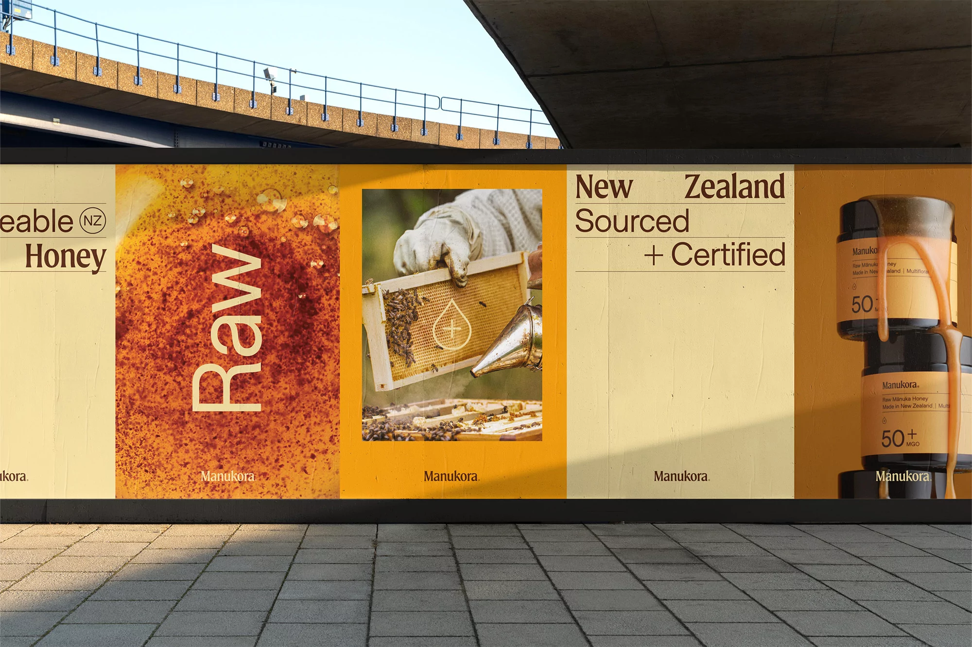
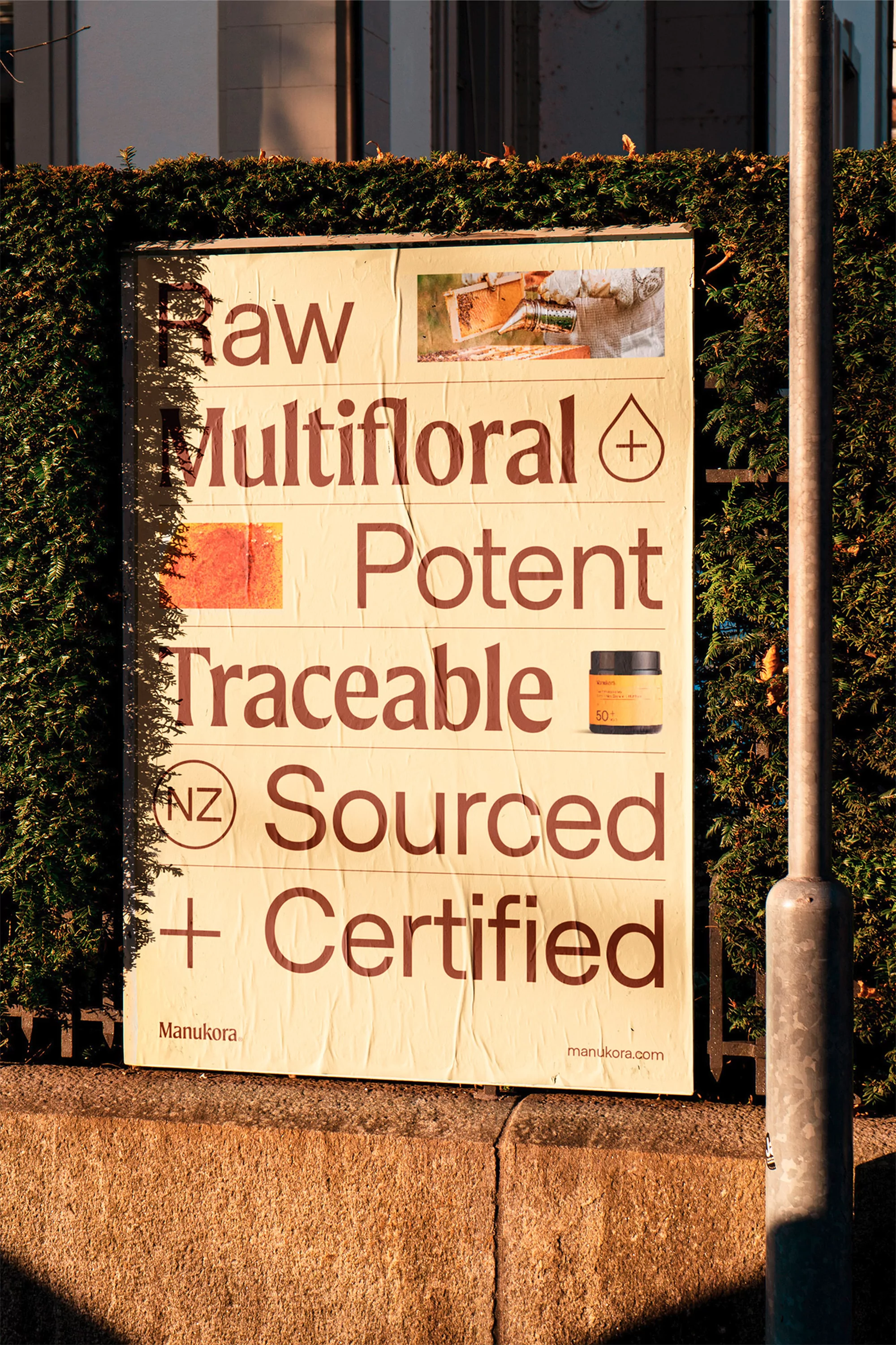
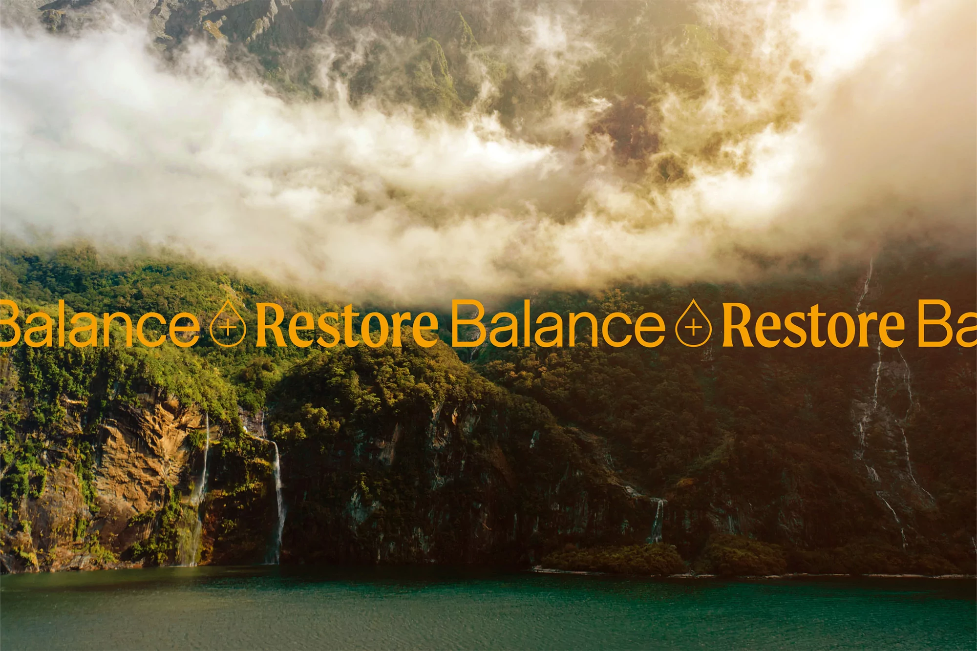
Moret by The Northern Block and Metro Sans by Samuel Oakes in use for Manukora, a brand of high-grade ethical mānuka honey from New Zealand.
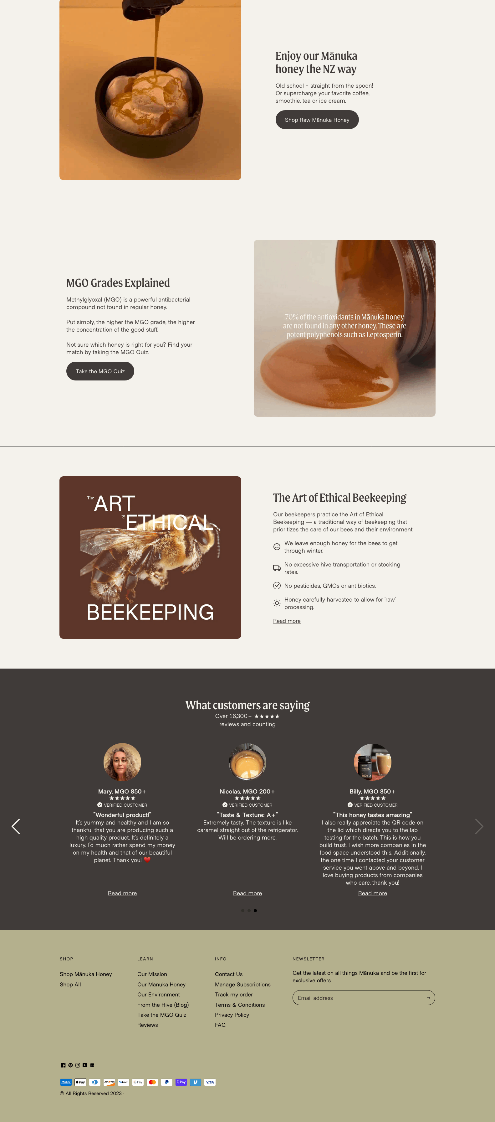
Pendo's rebrand of Manukora uses a customised version of Moret for its striking brand identity and botanical collection packaging.
Words from Poppy Thaxter for The Brand Identity:
A pairing of Northern Block’s serif Moret and Samuel Oakes’ Metro Sans provides a careful typographic balance for the brand’s messaging. “The combination speaks to both the history and locale of Manukora, and the simplicity and transparency of the product,” Creative Director and Co-founder Peter Ladd tells us. “This combo allows for a playful approach to communications, pairing the typefaces with specific messaging, and matching the feelings we wanted to evoke.”
Pendo worked closely with Northern Block to create a custom version of Moret; a type family inspired by 20th-century European sign painting. The goal of the customisation, Ladd explains, was to create “a more sophisticated, simplified version of Moret.” In order to achieve this, the team “pulled back on all the flourishes” as well as redesigned several of their letterforms: ‘a,’ ‘c,’ ‘f,’ ‘k,’ ‘q,’ ‘r,’ ‘s.’ “We’ve also further customised the letterforms for the Manukora wordmark,” Ladd adds “looking at each of the letterforms, and how they relate to one another.”


")


