POC POC @ FOMU Antwerp
The Constant Now is a gallery space in Antwerp, Belgium. Beyond that physical presence, it’s a network and platform dedicated to further diversity and polyphony in the field of visual arts. It was founded by art historian and journalist Magali Elali who acts as its managing director and curator. A central aspect of The Constant Now’s work is to help young artists of color to get a foot on the ground in the art scene, for instance by mounting exhibitions and organizing mentoring programs such as POC POC. This program brings together young talents and established artists, curators and staff from galleries and museums in order to transfer knowledge from one side to the other and to establish bonds between both.
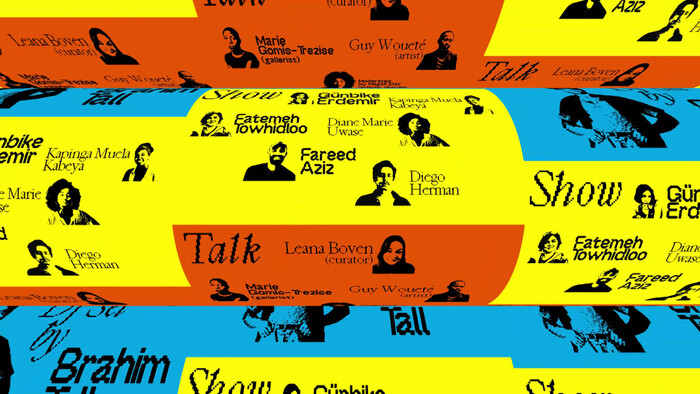
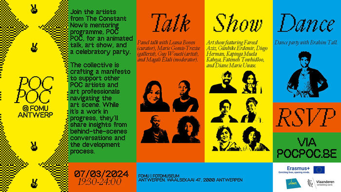
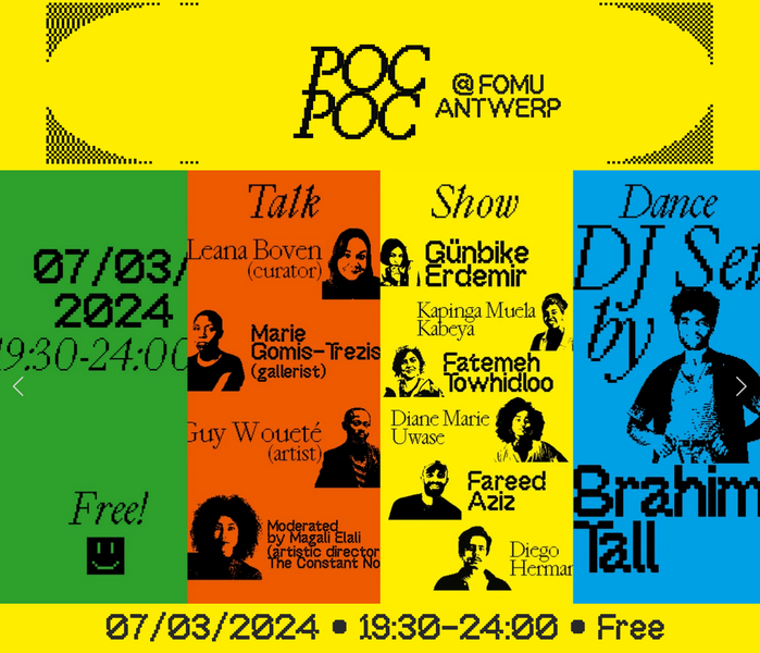
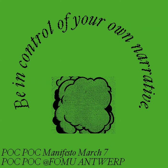
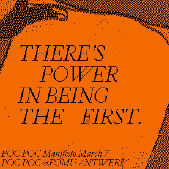
Featured in this post is visual material designed by Elali’s partner Bart Kiggen, a graphic designer, photographer and videographer running the studio Keen. It advertises a special event held at FOMU Fotomuseum Antwerp on March 7, 2024. The graphic concept combines black-and-white portraits of the participants in a high-contrast xerox look with vibrant bright colors: yellow, green, blue, and orange red.
In his YouTube channel, Kiggen writes: “The identity is based upon cheap advertising signs and poster displays. I wanted the identity to have a contemporary, loud, and analog feel. Because the topic is quite serious, the identity is very playful as a contrast. For animation, every wave of communication is ‘plastered’ upon the last one, creating a hodge podge of animation.”
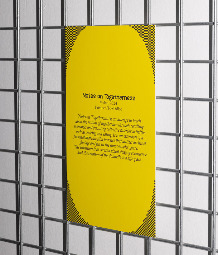
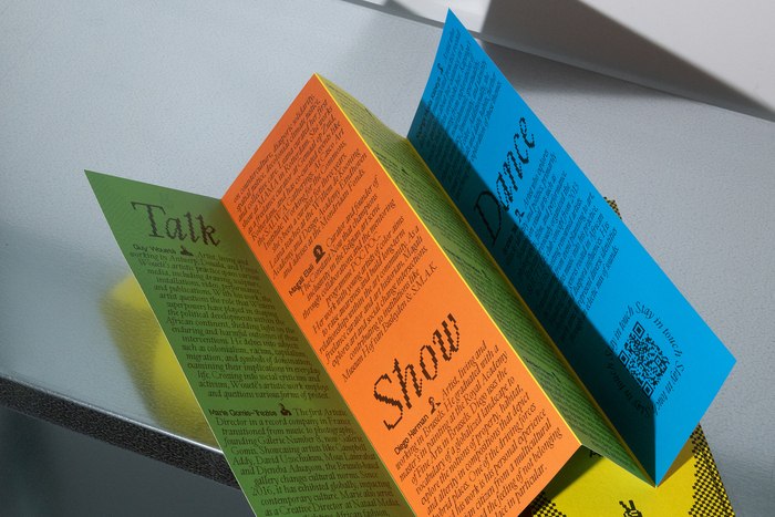
What most contributes to the recognizable style is the typography with its rough, pixelated aspect. The fonts in use are OffBit – which is a pixel font by design – and Cardinal, a seriffed roman described by its designers at Production Type as “reminiscent of an era of ‘old digital typefaces’, evoking the early computing days” – and this way very much in line with the look and feel of the graphic design. Yet one has to clarify that Bart Kiggen did not just run the typeface through a pixel filter. Instead he is one of the first to ever use a special bitmap variant, Cardinal Tech, that is currently being prepared for release.

- Chapters
- descriptions off, selected
- captions settings, opens captions settings dialog
- captions off, selected
This is a modal window.
Beginning of dialog window. Escape will cancel and close the window.
End of dialog window.
Website

- Chapters
- descriptions off, selected
- captions settings, opens captions settings dialog
- captions off, selected
This is a modal window.
Beginning of dialog window. Escape will cancel and close the window.
End of dialog window.

Formats
- Web (4599)
- Books (5502)
- Branding/Identity (6761)
- Posters/Flyers (4778)
Designers/Agencies
- Keen (4)
Tagged with
- FOMU Antwerp (1)
- The Constant Now (1)
- People of Color (POC) (16)
- events (145)
- identities (1672)
- typeface combinations (3178)
- pixels (73)
- bitmap type (109)
- pre-release uses (477)
- italics (415)
- duotone / halftone on color (88)
- patterns/textures (292)
- checkered (43)
- animation (283)
- 3D effects (262)
- websites (2589)
- social media (704)
- type on a curve (875)
- invitations (199)
- posters (1095)
- leaflets (76)
- concertina fold (31)
- programs (515)
- mentoring (4)
- diversity (22)
- talks (8)
- art exhibitions (652)
- parties (108)
- DJs (39)
- dithered (6)

