

IDCNY Newsletters
Contributed by Stephen Coles on Feb 10th, 2014. Artwork published in
.
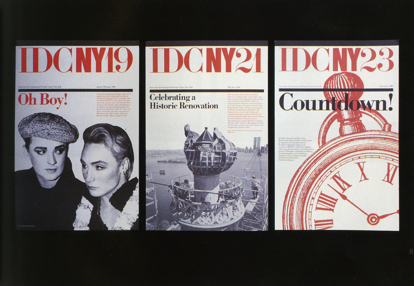
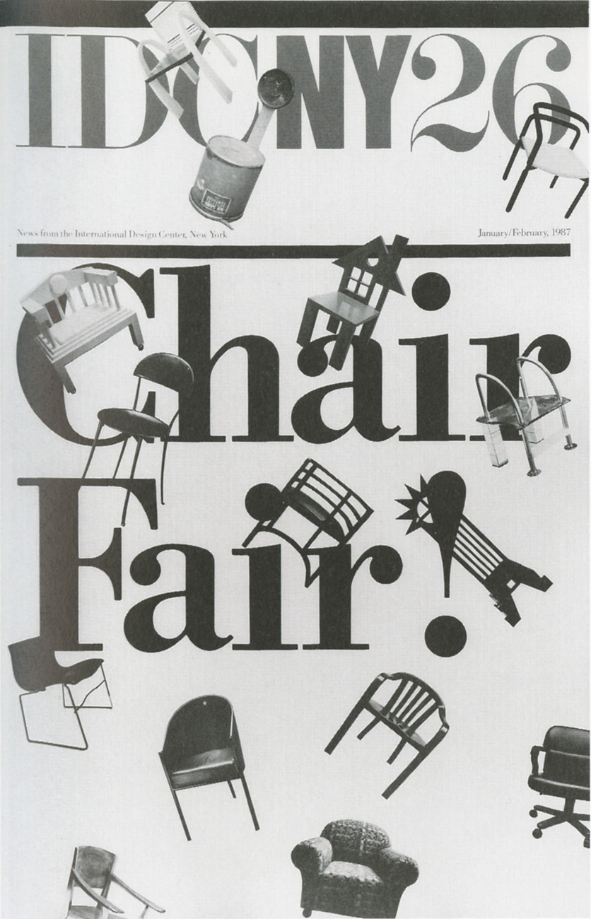
Newsletters for the International Design Center, New York.
Source: da.aiga.org License: All Rights Reserved.


")


")


")

7 Comments on “IDCNY Newsletters”
Michael Bierut:
I found a Didot in Lettera 1 that is similar to ITC Didi, but differs in that many of its caps are broader (except for the ‘J’) and it has much smaller serifs and obviously none of the English Modern details.
What stikes you as particularly similar to Didi? Isn’t this as close to it as almost any Didot? But I can confirm that this book must have been a bible to New York designers in the ’60s. References or questions about it popping up on a daily basis currently.
I don’t think it’s very close to Didi. It’s just that a lot of the Didot revivals appear to be based on smaller sizes or different cuts than this one. It’s about the sharpness of the details and the length of the bracketed serifs.
But now you’ve got me checking and it’s true that LInotype Didot Headline and H&FJ Didot Bold 64pt are also along the same lines.
You had me checking too afterwards :)
I looked at Stempel’s Didot in The Tome (gonna post a photo later) and it’s actually pretty bad, from ca. 1800, good in small sizes but rather clumsy in the larger ones. So I guess, given that Haas took over Deberny & Peignot and Stempel took over Haas anyway, Frutiger probably based his Linotype Didot on D&P’s version. The original lowecase looks nothing like Diti though. Here is a bad photo from Tschichold’s Treasury, the right showing appears to be the same as the one in Lettera.
There is also a nice one from Klinkhardt but it’s unlikely that ever made it to the US. Others, like the one from Ludwig & Mayer, differ to a greater extend but that one apparently was the basis for VCG’s and Castcraft’s version. Like you said, all depending on what sizes they took as a basis, but also what member of the Didot clan’s type: François (still a lot of Fournier in it), Pierre (e.g. Didot Elder) or Firmin (most digital versions).
Indra + Stephen: Just a note about the source of Frutiger Didot.
Adrian Frutiger asked Ladislas Mandel about what perfect source will be to start a Didot. Then, Ladislas told him to use La Henriade as reference, so Frutiger bought the book at Librairie Paul Jammes. So, Linotype Didot may be influenced by D&P Didot, but the starting point source is really this book. (I know this from conversation with Ladislas and Adrian).
Its good because this reference is now on the book, see: books.google.fr/books?id=sB…
Yes, I know, this story is mentioned in the Frutiger book, too.