
Trimfit

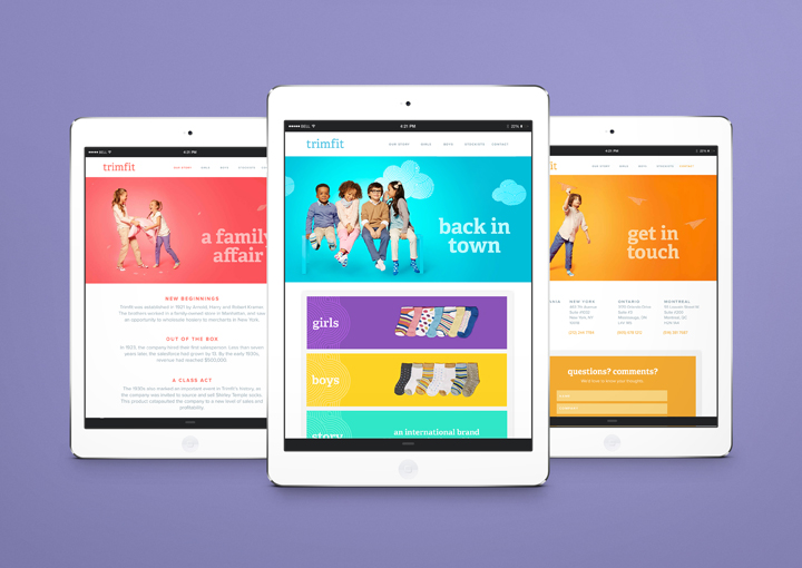
Trimfit is a legacy brand, marking its hundredth year in the garment industry. The company desperately needed a brand refresh that would place them at the forefront of the children’s apparel business in North America. The challenge here was creating a brand that was accessible enough for the big box stores (in which Trimfit can be found at the entry level price-point) as well as boutique children’s clothing stores (in which they are positioned at the higher end of the pricing structure.
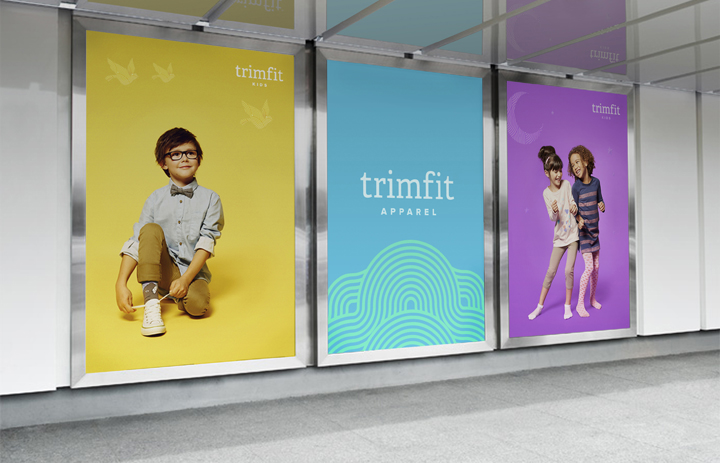
With a distinct focus on brand recognition, we produced a streamline visual platform and graphic language flexible enough for a variety of applications; a brand identity system that uses a fresh, contemporary palette of colours to distinguish itself against key competitors in the marketplace. Paper props were introduced to mirror the magic & whimsy of childhood, and a pattern was developed and applied across all collateral as a graphic device that not only serves as a unique identifier, but also adds a touch of playfulness to in-store displays. In doing so, we created a system that not only speaks to the child, but also the consumer.


, 2–3 May 2013")


")


")


