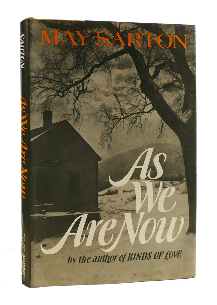
As We Are Now book jacket
A homage to Ursula Suess on the occasion of her 100th birthday
One advantage that lettering has over typeset text is that the artist can always alter letterforms ad hoc, depending on the context. This allows her to make the most of the available space, to dissolve awkward pairs into pleasing combinations, or simply to enliven a design by means of variegation.
Ursula Suess was a graphic artist who designed numerous book jackets in her career. For the majority of them, she’d come up with her own letterforms. I’m adding a selection of designs that hints at her stylistic range in the comments to this article.

An early jacket with italic lettering, designed by Suess for Sean O’Casey’s Sunset and Evening Star, Macmillan, 1955
In the early 1970s, Suess set about designing a typeface. According to a 2014 article by Ellen Sussman, she was in part motivated by the fact that “most type styles at the time were too wide and didn’t fit on a jacket.” Her typeface indeed is compact, both horizontally and vertically, with condensed, tight-setting letterforms and a large x-height with short extenders. Suess didn’t want to forgo all the flexibility she was familiar with from lettering, so she drew a large set of alternates. A TGC specimen sums it up: “She used lettering similar to this in her book cover designs, where space limitations called for lettering with many swash characters that was strong and condensed, yet rich and sensuous.” The calligraphic design was released by VGC as a stand-alone italic in 1972, named Book Jacket. Whether you find the name boring or brilliant, it did clarify the intended application area.
And Book Jacket indeed was used for designing book jackets. One example by Suess herself is shown here. (See Robert Halsband’s biography of Lord Hervey for a second one.) As We Are Now is a novel by Belgian-American writer May Sarton (1912–1995), published by W.W. Norton & Company in 1973. Suess used her typeface in two sizes, with the alternate swash caps for the big initials, a wider terminal form in “We”, and hardly any space between the last two words of the title. For the subline, she opted for more restrained forms overall, but inserted a descending h, a sweeping f that embraces the preceding o, and a single swash cap L in “LOVE”. The a in “author” is the double-story alternate. May Sarton’s name is set in Richard Isbell’s wide Americana.
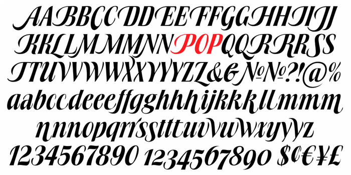
Partial glyph set of Book Jacket Pro, the digitization drawn by Patrick Griffin and released by Canada Type in 2010
Ursula Suess was born August 13, 1924 – which means it’s her 100th birthday today. Canada Type, who released a digital version of Book Jacket in 2010, provided a biographical outline:
Ursula Suess was born in 1924 to German parents in Camden, NJ, and grew up in Munich, Germany, where she attended two semesters of design school at the Academy of Fine Art before it burned down during the war [in July 1944]. She then studied calligraphy with Anna Simons for two years. She returned to America in 1946 and established herself as a graphic designer working for Oxford University Press, Macmillan Co., Harper, and other publishers. She also taught calligraphy for 20 years at the Westchester Art Workshop, and at the Cooper Union in New York City. In her 50s she learned to cut gems and eventually became an accomplished gem carver. She moved to Green Valley, AZ, in 1998, and has been applying her artistic versatility with clay, water-color and acrylics.
In Arizona, Suess became a long-time member and supporter of the Tubac Center of the Arts. Ellen Sussman mentions paper sculpture, pottery, and collage as additional techniques she engaged in. Apart from Book Jacket, she is credited with at least one more typeface: Rotalic is a low-contrast italic sans featuring swash caps with ball terminals. It was also released with VGC. One of its four styles was recently digitized as BN Rascal.
Suess passed away in May 2020, at the age of 95. She left us a large number of beautiful works, including many pieces of lettering and two unique typefaces that have stood the test of time.

Ursula Suess at the Tubac Center of the Arts. The Center has a number of her donated works and continues to honor her with the URSUS award for abstract work in their annual members’ exhibitions.
Formats
- Books (5652)
Topics
- Literature (2619)
Designers/Agencies
- Ursula Suess (3)
Tagged with
- May Sarton (1)
- W.W. Norton & Company (11)
- uses by the typeface’s designer (1058)
- book jackets (799)
- hardcovers (1154)
- first editions (187)
- novels (577)
- fiction books (400)
- italics (450)
- alternate glyphs (1196)
- swashes (612)
- book spines (1288)
- reversed type on an image (1046)
- typeface profile (83)
- 1970s (1399)
- lettering (568)
- early uses (1801)
Artwork location
- United States (8646)
- New York City (2462)













8 Comments on “As We Are Now book jacket”
As promised, here’s a selection of jacket designs by Ursula Suess, posted in chronological order. Take note that these are examples of lettering, that is, custom drawn or written letterforms. Apart from secondary text on some of them, they don’t feature any fonts in use.
As a U.S. citizen, Suess was able to return to the United States after WWII. She did so in 1946, at the age of 21 or 22, at first without her parents. In 1952, she was commissioned to design the jacket for the first American edition of Anne Frank’s famous diary. Compare the layout and lettering to jackets designed by George Salter.
A nice play with positive and negative. The lowercase letters of the written roman are repeated as a light shadow or after-image, slightly shifted in the direction of the pen angle.
One of my favorites: letterforms with a vertical stress are dancing around baseline with, occasionally (and gracefully) bumping into each other. All interletter space is filled with seemingly effortless squiggles.
More ornamented letterforms: an animated Latin, but with bracketed serifs. The white bodies are filled with red dots and spikes as one can find in Victorian wood type. For contrast, a script for the author’s name.
Who said sans serifs can’t be expressive? Suess came up with some lovely shapes for The Trouble with Love.
Three books from a whole series titled “Your Name – Your Saint”. Suess had to vary size and width to accommodate the different names. The superscript t does double service as a cross. I’m fond of the color palette, too.
The wide grotesk is typeset (from Venus), but the spirited italic comes directly from Suess’s hand. Similar styles were also used by other New York jacket designers, see for example works by Oscar Ogg.
For this jacket, Suess revisited the theme of playing with the relationship of figure and ground (see The Changing Years above) and took it to the max. The future is dizzying. What a fantastic piece of lettering!
A festive alphabet, with illustrations by Suess and design by John Begg (1903–1974). See the post by UW-Milwaukee Special Collections for more images from this limited-edition publication.
A novel from Suess’s native country, in German, with an illustration of the Brandenburg Gate. The title is shown in a style that hybridizes italic with fraktur elements, see for example the M without diagonals, the stemless d, and the “broken” curves at the top of e and g. The author’s name, by contrast, is rendered in a lightweight Tuscan, and the editor’s name in extended roman caps.
An upright cursive with letterforms that don’t stray too far from Book Jacket.
For this jacket, Suess also opted for an upright italic, but one of a different kind – it’s a pretty classic chancery. Secondary text is written in roman caps.
Compare the r with the high flag to the one in Certain Poems. A related glyph was included in Book Jacket.
Things don’t have to be complex to be beautiful: a straightforward sans – once in condensed caps, and once in mixed case with wide proportions – shown against a two-color illustration.
Another plain sans, put on a steep slope for drama. Gorgeous! I haven’t seen a physical copy of the jacket, but I reckon the scratch marks in the black are part of the design.
This jacket is from 1972, the year that Book Jacket was released. Suess could have used her typeface by then, but went with lettering instead. Maybe she found the topic asked for something a tad more traditional. Also, she wanted to combine three different styles – and Book Jacket only offered a single one. The sweeping T in “Three” is similar to the one included in the typeface. There was also a variant of the cover in white on red.