
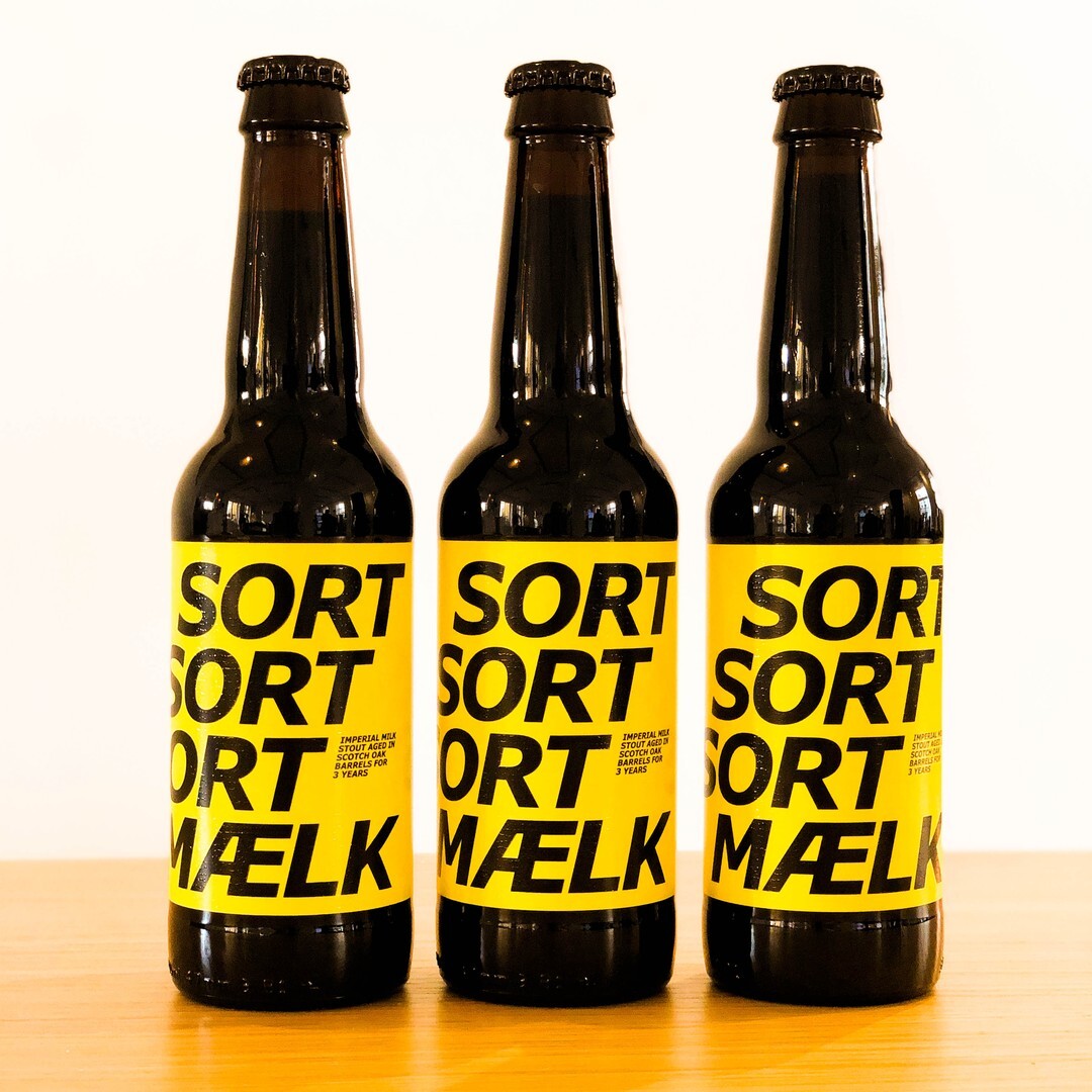
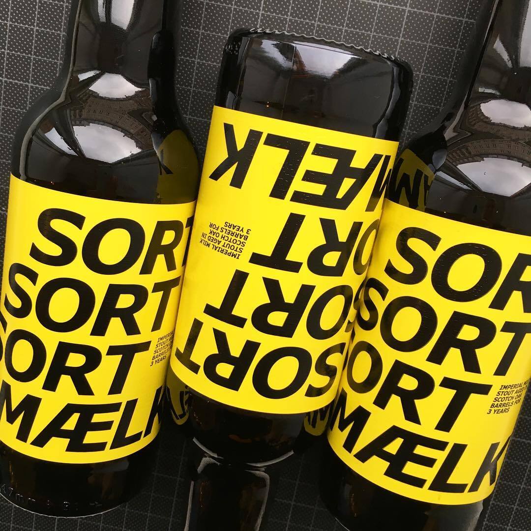
To Øl Milk Stout
Contributed by Tiffany Wardle on Feb 11th, 2025. Artwork published in
circa April 2019
.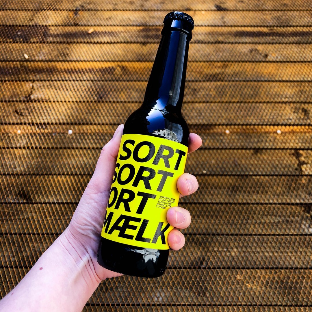
Carter & Cone’s Verdana makes for a strong and unexpected choice on these labels designed by Kasper Ledet for To Øl brewery. This high-quality milk stout “has enough bite for even the bravest,” and I thought that the choice of Verdana echoed the rest of their youthfully rebellious brand. Verdana was initially designed for on-screen use with clarity and versatility in mind. But I feel as if Verdana Pro, now with two widths, adaptability has been increased. I think this packaging proves the point—it’s ready for use beyond the screen.


, 28–30 June 2013")


")


")


")