
Minneapolis StarTribune – Interiors
Contributed by Font Bureau on Aug 22nd, 2014. Artwork published in
.
License: All Rights Reserved.
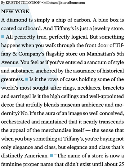
The design and editorial teams at the Minneapolis StarTribune first met in 2002 to address their changing readership and set a new course. Poynter Old Style Text and Kent Lew’s Whitman Display were soon brought on board.
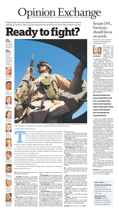
Deputy Managing Editor of Visuals, Monica Moses, saw the upscale potential of this designed-for-text typeface in headlines and commissioned as such. It has a Minnesotan “value for intelligence but not self importance” she felt.
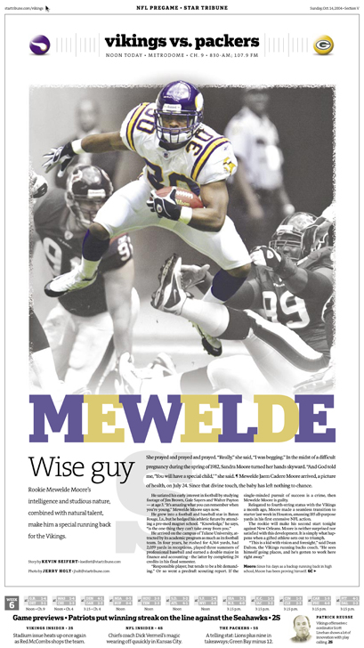
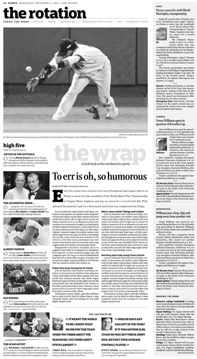
Choosing Christian Schwartz’s slab serif Popular was in contrast to the trend of pairing serif and sans serif in a usual display structure. Often set in lowercase, it has immediate appeal for everyone.
License: All Rights Reserved.
License: All Rights Reserved.
License: All Rights Reserved.

License: All Rights Reserved.
License: All Rights Reserved.

License: All Rights Reserved.

License: All Rights Reserved.
License: All Rights Reserved.

License: All Rights Reserved.

License: All Rights Reserved.


")


")


