An independent archive of typography.
to participate.
Topics
Formats
Typefaces

Norwegian Bible, 2011 Editions

This worthy but inconsistent effort makes a great case for text families that cater to both literary and editorial needs.

Contributed by Frode Helland (Monokrom Skriftforlag) on Nov 29th, 2011. Artwork published in .

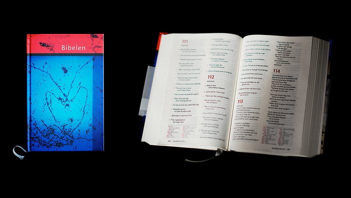
    The Standard edition of the 2011 Norwegian Bible. The cover is a glass painting by Norwegian artist Tor Lindrupsen. Click to enlarge.

    The new Norwegian Bible translation is by no means a rush job. The project began way back in 2000 and involves input from theologians and linguists, as well as some of our greatest authors of fiction, among them Karl Ove Knausgaard, Jon Fosse, and Hanne Ørstavik. A standalone edition of the New Testament was released in 2005, while three variants of the “Good Book” in its entirety were released simultaneously this fall: a standard print edition (medium and large print), a literary print edition, and a digital edition for the iPad.

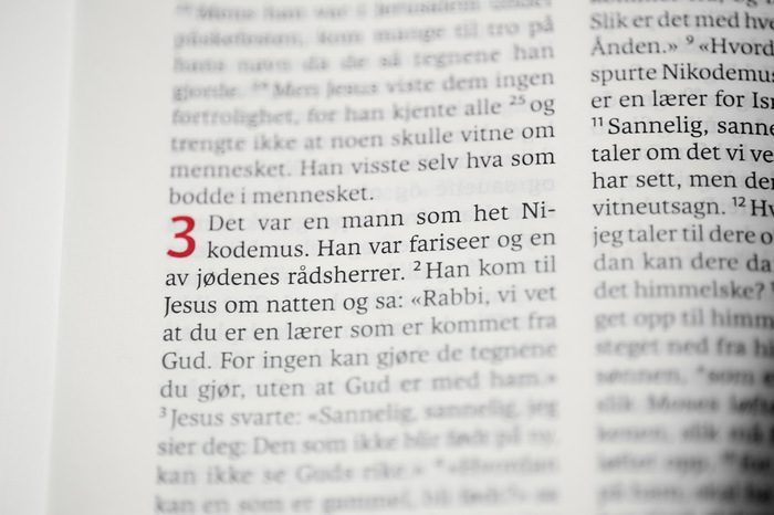
    Karmina in use for the Standard edition of the 2011 Norwegian Bible. Click to enlarge.

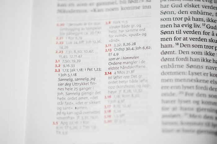
    Karmina Sans is used for notes. Click to enlarge.

    The Standard edition, by the Danish book design bureau 2Krogh, is not unlike the expected Bible format, but the choice of typeface, José Scaglione and Veronika Burian’s Karmina, gives the text a distinctly contemporary tone. Karmina is, from a technical point of view, a wise choice for such a dense book — its chunky serifs, open letterforms, tall x-height, and large inktraps make the text readable at small sizes. Still, I can’t help but feel it might be bit a too static for the material. The Bible’s ancientness, its poetic language, and religious authority calls for more subtlety and passion than an economical, rational news face like Karmina can deliver.

    2Krogh made wise use of the baseline rhythm, aligning body copy on both sides of the slightly opaque thin paper to minimize visual clutter. The typesetting is lovely, and the color is remarkably even, considering the short measure. Both all caps and small caps could do with more tracking, and the use of a bar to separate chapter name and page number (in both editions), looks rather dated.

    The Standard edition comes in various bindings. The most publicized cover — Tor Lindrupsen’s red and blue glass painting — is unfortunately the least inviting.

    The 2011 Norwegian Bible, Literary edition. The borders on each cover use elements from Egyptian, Hellenistic, and Roman art.

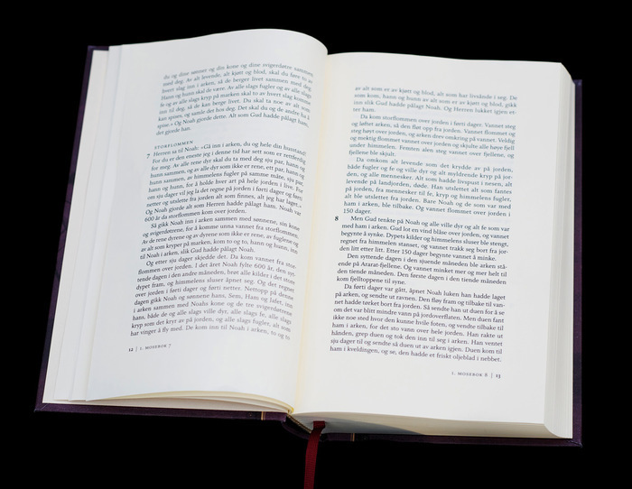
    A spread from the Literary edition. Click images to enlarge.

    The Literary edition, on the other hand, is a marvelous piece of art: Aud Gloppen of Blæst designed a three-piece box set bound in cloth and typeset in Kent Lew’s Whitman on cream-colored paper. Unlike the Standard edition, the text runs uninterrupted by verse numbers and footnotes. The body copy runs in one column, emphasizing the poetic qualities of the language. The titles are foil stamped on the covers in gold on a dark, almost misty background with tasteful engravings and subtle borders running parallel to the spine.

    Whitman’s austerity is balanced by the literary edition’s comfortable margins and cream-colored paper. Here’s one of a dozen alphabetic acrostic poems in the bible, marked with Hebrew letters in the margin.

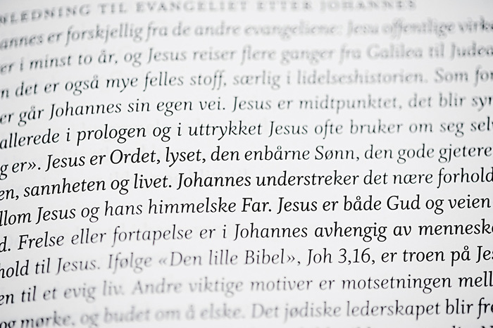
    Each section in the Literary edition has an introduction set in Whitman Italic. The mistake of lining figures (see “Joh. 3,16”) was discovered too late to correct for the first print run. Click images to enlarge.

    2Krogh did the typesetting following Gloppen’s direction, and apart from a small mistake with numeral styles (see image above), the craft is sublime. The book looks and feels like a high-quality novel.

    With this edition, Bibelselskapet first intended to continue in the style of the already proposed Standard edition, but designer Aud Gloppen expressed the need for a more humanist tone. Its predecessor, the New Testament of 2005, was typeset in Bram de Does’ Trinité (a choice seemingly inspired by Jongbloed’s De Bijbel released a year earlier). Whitman was chosen as a middle ground between the calligraphic style of Trinité and the more modern, rugged Karmina of the Standard edition. Whitman’s proportions and color lend themselves nicely to the wide measure and large leading. Although austere, it does not come off as such on the page.

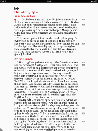
    The iPad app Pomegranate lets you read the Bible in one of four different fonts. This is OurType’s Fresco. Click to enlarge.

    The Digital edition was not supervised by Bibelselskapet. The translation was licensed to 2Krogh and Jongbloed’s iPad application, Pomegranate. I applaud the simultaneous digital and analogue releases, but with its cumbersome navigation and half-baked “pour text into template” approach, this app does not feel like a well-considered product. Pomegranate offers the choice between four text faces (Karmina, Karmina Sans, Fresco, and Fresco Sans) in five sizes and a multitude of color treatments, completely ignorant of the relationship between measure and leading, and disregarding the fact that type intended for a particular size range might not work well when scaled.

    Although it was intended as a visually consistent release, the Norwegian Bible collection stops short of that goal. The Standard and Literary editions have too little in common, both externally and internally. If anything, this release makes a great case for text families that cater to both literary and editorial needs.

    Based in Oslo, Frode Helland is a graphic designer specializing in type, identities, and editorial design.
    Photos by Erlend Berge.

    Typefaces

    • Whitman
    • Karmina Sans
    • Karmina

    Formats

    Topics

    Designers/Agencies

    3 Comments on “Norwegian Bible, 2011 Editions”

    1. this is an interesting entry!

      for one, i did not know that translating the bible to norwegian was such a young project.

      and then, typesetting the bible seems like a really heavy task. it is a lot of text, and there is a lot of tradition that can stand in the way of straightforward reading usability. mainly, the inline chapter/verse annotations, but also the call for portability or compactness.

      then, the text both needs to be presented according to its central theological role, and emanate a certain dignity, but is also in dire need of being made more accessible & look more modern.

      i agree that the literary edition looks beautiful & very book-like. however, leaving verse numbers out of the copy limits its usability severely. its really just a reading book, not one you can use to work with, or even look up a quotation. (i study philosophy, but teaching a philosophy course for theology students for one semester had me look up more bible verses than i can count, whenever essays were due)

      in that regard, i do understand the economically oriented workmanship of the standard edition. it looks readable and easy to navigate – with every aesthetic compromise that entails.

      now if someone were to integrate navigation in a way that allowed for not only readable but also aesthetic copy handling...

      the botched digital edition is an unnecessary and irksome oversight.

    2. i did not know that translating the bible to norwegian was such a young project.

      It's not the first translation. It's just a new one.

    3. its really just a reading book

      As was the original sources.

    Post a comment