
MCCANNPR Romania

Challenge
Like all marketing & communication disciplines, PR is undergoing major changes. Old paradigms become obsolete, audiences and their mindsets evolve, the media diversify and fragment, while brands hand their agencies problems that are ever more difficult, intricate, and stringent. PR agencies seek a new authenticity for their discourse and their work, while trying to attract and retain the best young minds that enter marketing and communications. MCCANNPR Romania believes this authenticity can only stem from an audience- and content-centric approach to how they do business.
The client is a market leader in Romania. A local rebrand of a global name is always a major challenge, for it is bound to attract close scrutiny and impact the reputation of the brand well beyond its nominal geographic reach. It must strike a good balance between heritage and vision. It must make a stark statement and demonstrate originality without gratuitously showing off. The brief is inevitably a very full plate.
Strategy. Make powerful content, and make content powerful.
As in all our rebranding projects, we sat down with the client and re-defined their brand. MCCANNPR Romania adopted a new business model, built on content that is useful, contextualized, and thought out for long-term impact and risk resilience. Thus, they aim to turn their clients’ brands into publishers that create and share content real people want to enjoy and build upon. The new positioning — risk-proof, tech-savvy content creators — speaks not of a traditional PR shop, but of a PR-led creative agency.
Identity. Turn information into content. Raw data into meaning.
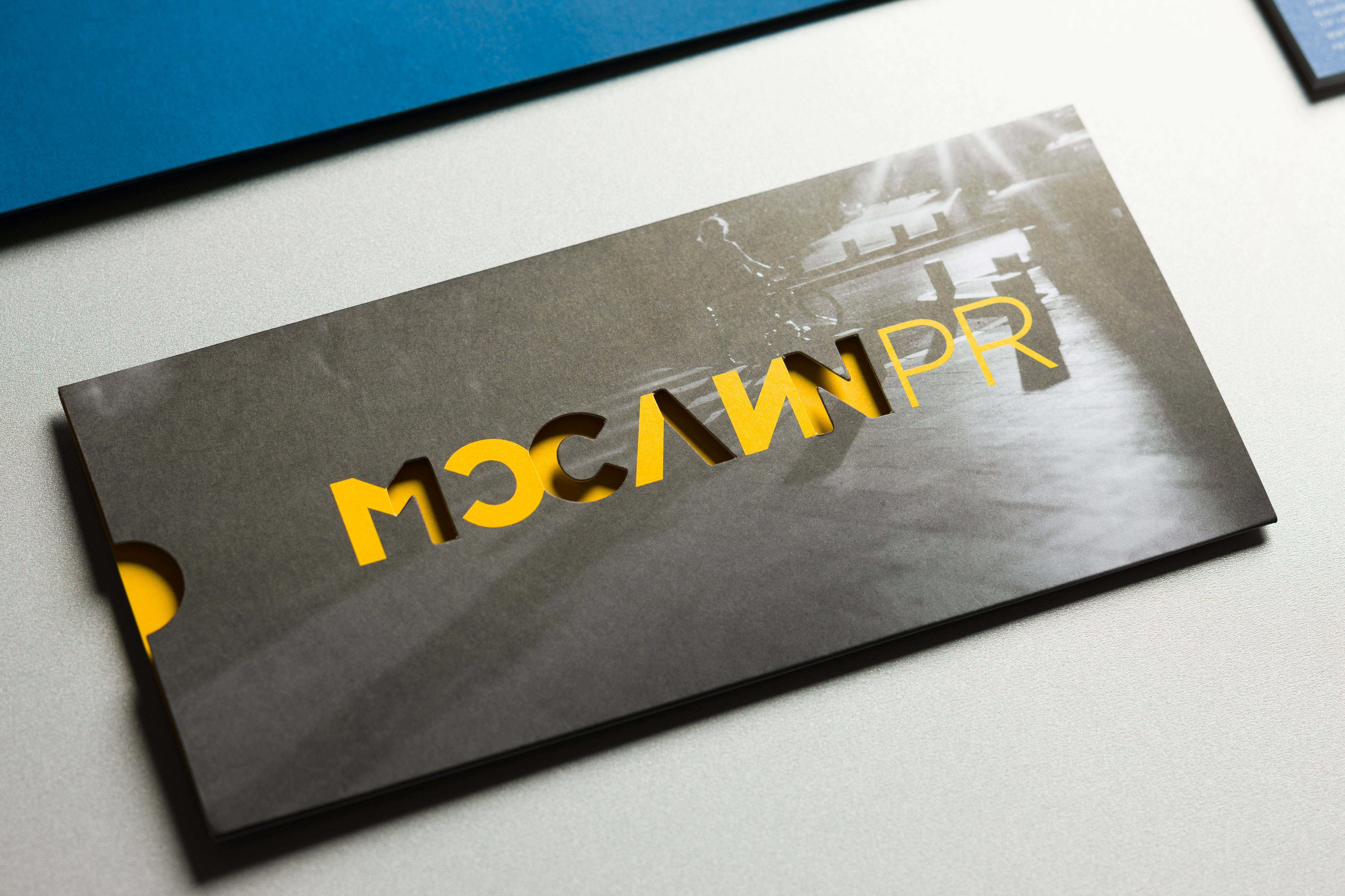
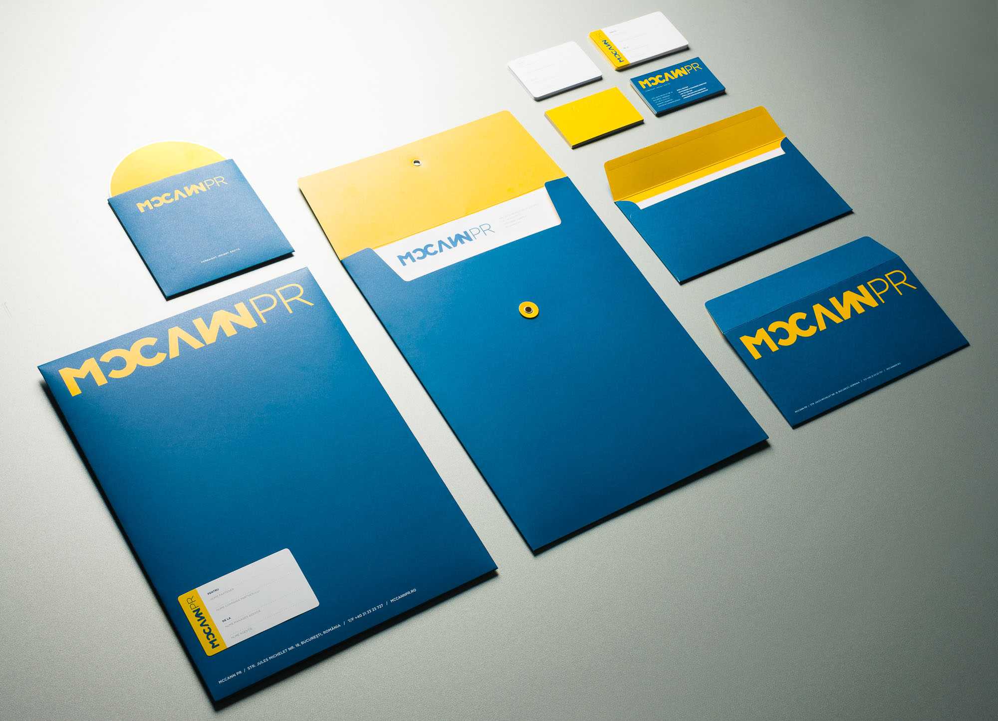
MCCANNPR Romania’s new brand slogan — Foresight. Insight. Excite. — walks the talk. Its three words effectively summarize the brand’s whole meaning, and the new logo adds a strong visual demonstration to it. There are no gimmicks there, no fancy symbol or trendy embellishments. The logotype unfolds like the wings of a butterfly. An initial 1C\N doubles itself into a custom-set MCCANN, to be shortly completed by PR. Thus, apparently nonsensical information starts making sense and telling a story under our eyes. This dynamic digital logotype also jumps out into the physical world, to live as embossed or cut out versions in printed material.
Client credits
Imola Zoltan, Co-founder & Managing Director
Andreea Leonte, Creative & Strategy Director
Agency credits
Brand strategy and slogan: Stefan Liute, Adriana Liute, Sabina Fratila
Identity design: Vlad Sulea
Web design: Alexandru Gugurel
Web development: Doru Sana


")


