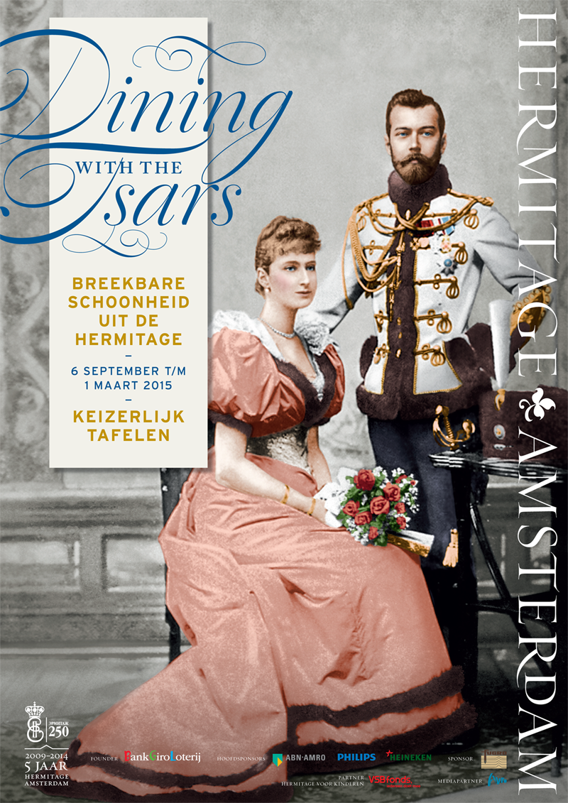
Dining with the Tsars poster
Contributed by Ramiro Espinoza on Jan 26th, 2015. Artwork published in
November 2014
.
Topics▼ |
Formats▼ |
Typefaces▼ |


")


 Chart")


3 Comments on “Dining with the Tsars poster”
The Hermitage Amsterdam logo uses Requiem Fine, with the alternate ‘T’ and the swash ‘R’. The smaller superscript ‘D’ (Mantinia-style) is probably taken from the small caps. The first ‘M’ has been modified.
Sorry for being the smart ass here, but the sans used on the left hand side looks more like Interstate than Gotham.
You’re absolutely correct. Correction made.