

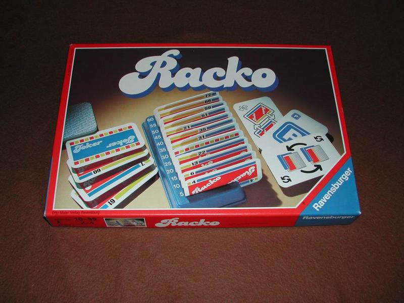
Racko (Rack-o), Ravensburger edition
Contributed by Stephen Coles on Feb 23rd, 2015. Artwork published in
August 1987
.
Source: boardgamegeek.com License: All Rights Reserved.
Like the similar Gaston/Charade, Candice often looks better when the letters are connected, as proven in this logo for Racko (the German version of the popular American card game Rack-o). It makes one wonder if the original Letraset version was meant to have overlapped spacing and the makers of the digital fonts mistakenly added unnecessary space between the letters.

Source: boardgamegeek.com License: All Rights Reserved.
Source: boardgamegeek.com License: All Rights Reserved.


")


")


