
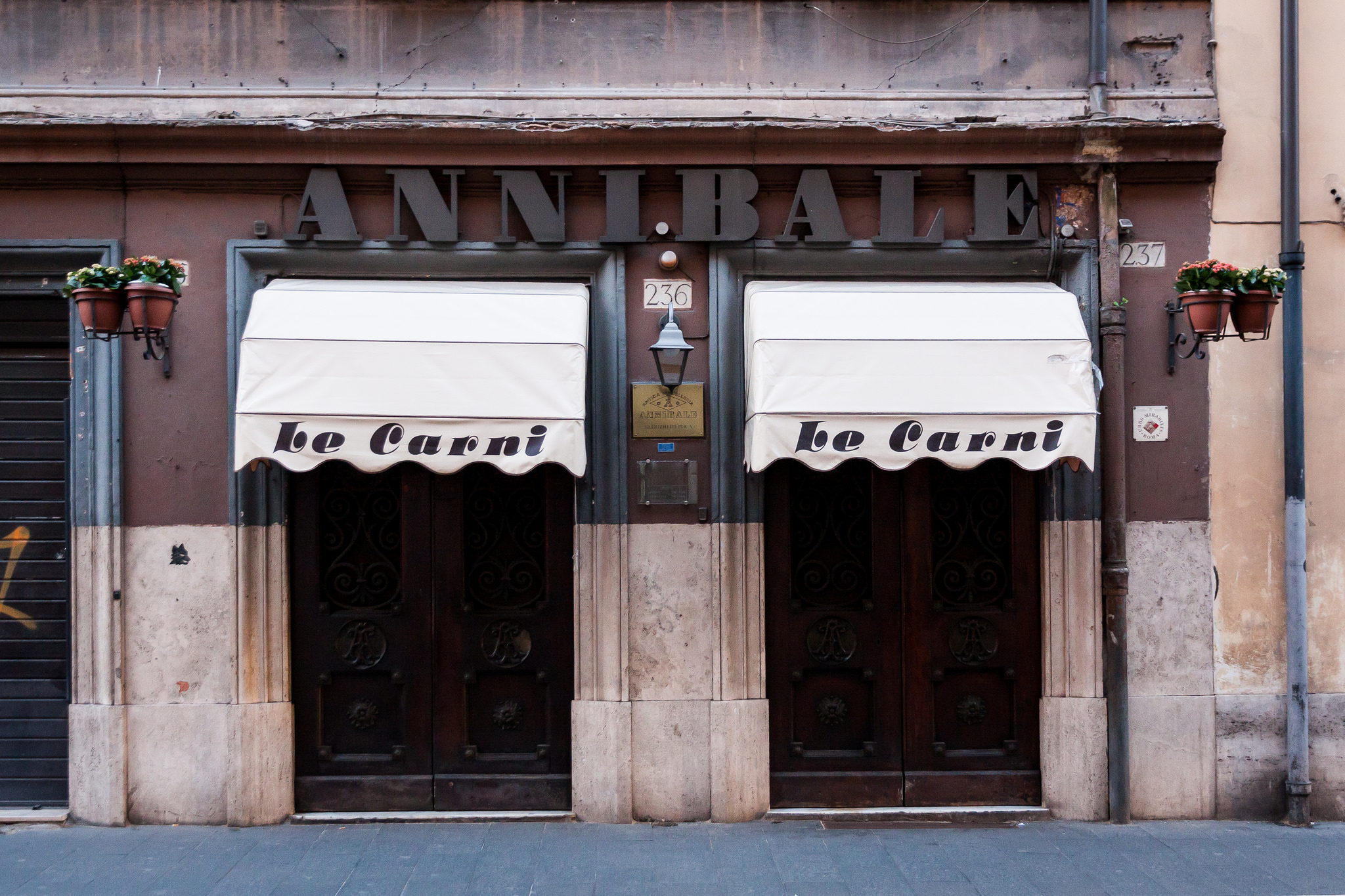
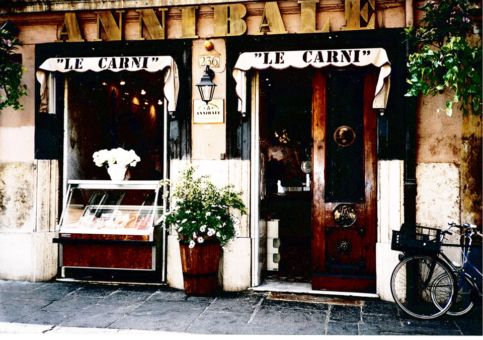
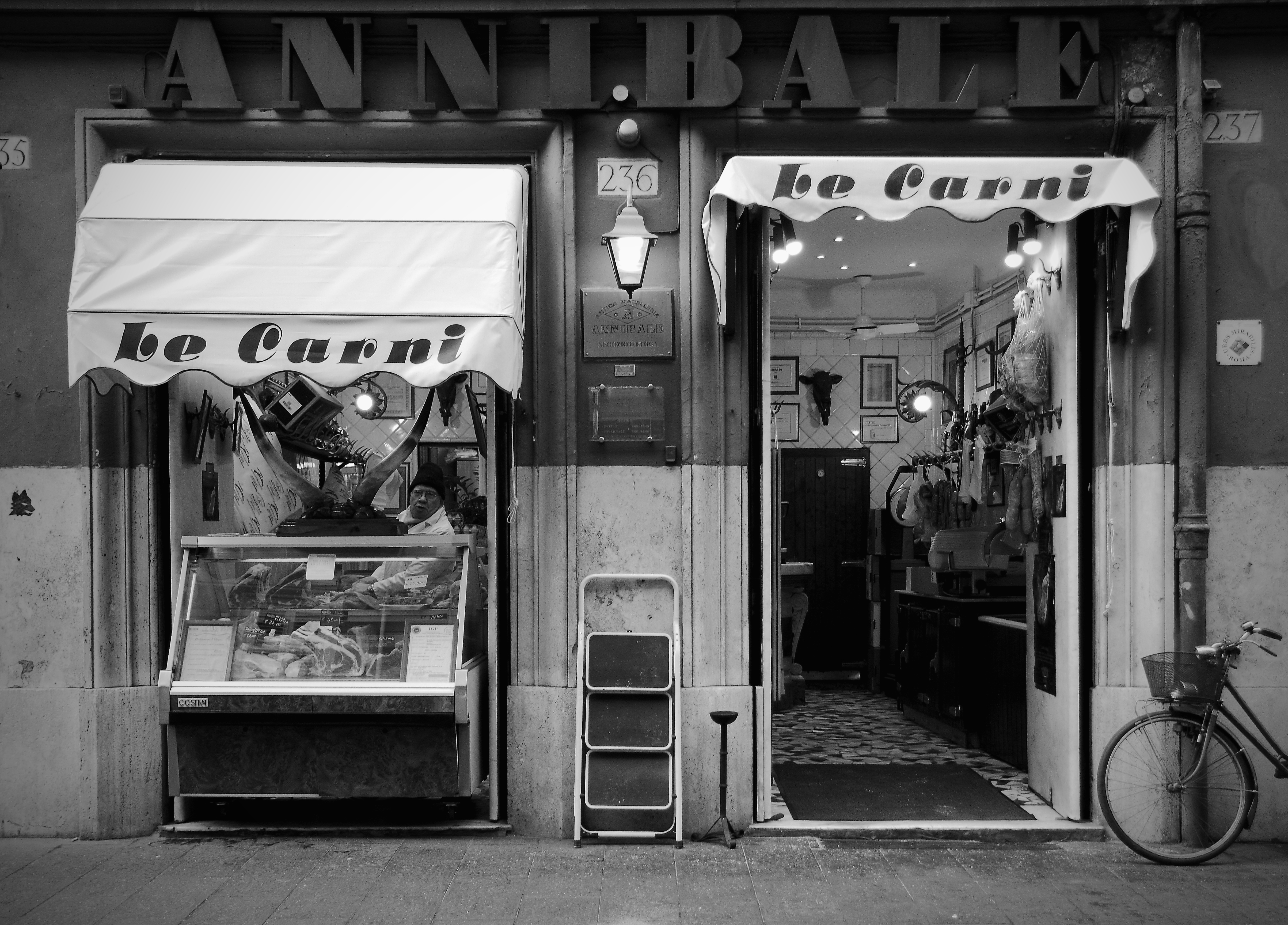
Macelleria Annibale: Le Carni
Contributed by Florian Hardwig on Mar 19th, 2015. Artwork published in
.
Source: www.flickr.com Uploaded to Flickr by Thomas Lieser and tagged with “stilla”. License: All Rights Reserved.
The dimensional (wooden?) fat face letters used for the name of this butcher in Rome — est. in 1888 — are probably custom. As far as digital fonts go, a mix of Ultra Bodoni, Oban, Margarita and Isambard would bring you close.
The “fat-face cursive” on the awning is Stilla. Unfortunately, it has been loosely spaced here. Remember: heavy type generally asks for tight spacing, so that the tiny counters harmonize with the inter-letter spaces. This use of Stilla apparently is not a leftover from the 1970s, but a rather recent addition: Older photos document that Stencil had been used before.

")


")


