
Automatic for the People by R.E.M.
Contributed by Stephen Coles on May 11th, 2015. Artwork published in
.
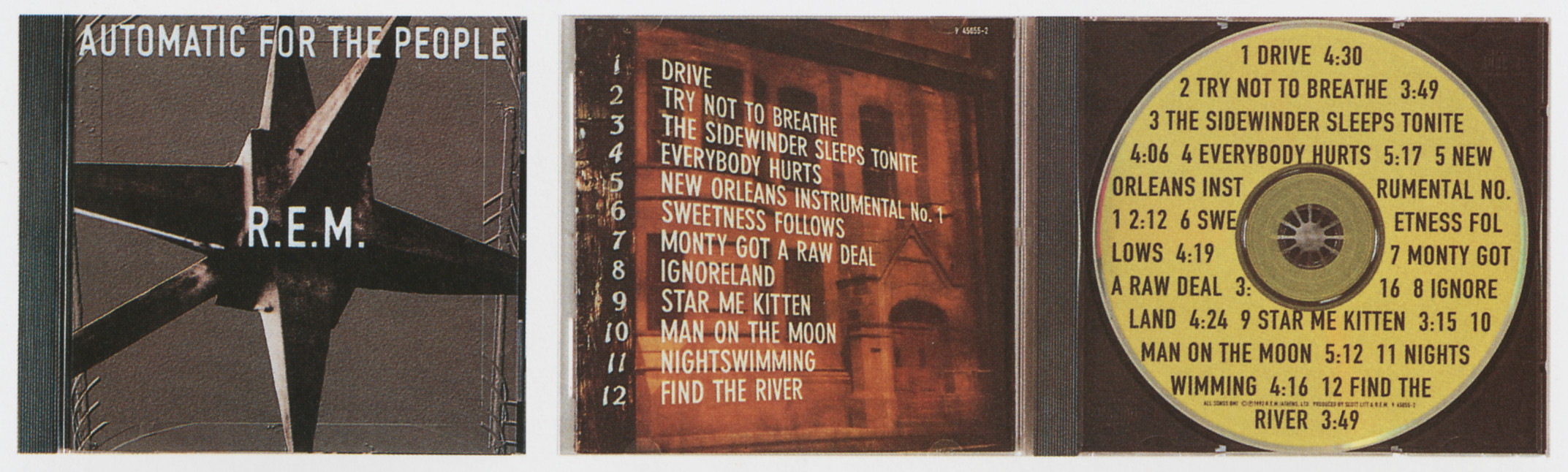
Design firm: Warner Bros. Records
Art directors/designers: Tom Recchion, Michael Stipe
Photographers: Fredrik Nilsen, Anton Corbijn
Digital imager: Cecil Juanarena/Insight Communications
Typographer: Tom Recchion


")


")


1 Comment on “Automatic for the People by R.E.M.”
R.E.M. clearly really liked muscular industrial sans-serifs like Akzidenz, DIN, Futura Bold and Franklin. Rather unexpectedly, their 1999 single At My Most Beautiful uses at least two weights of a Johnston revival (presumably ITC Johnston which was released that year). It looks unlike anything else they ever published.