
License: All Rights Reserved.
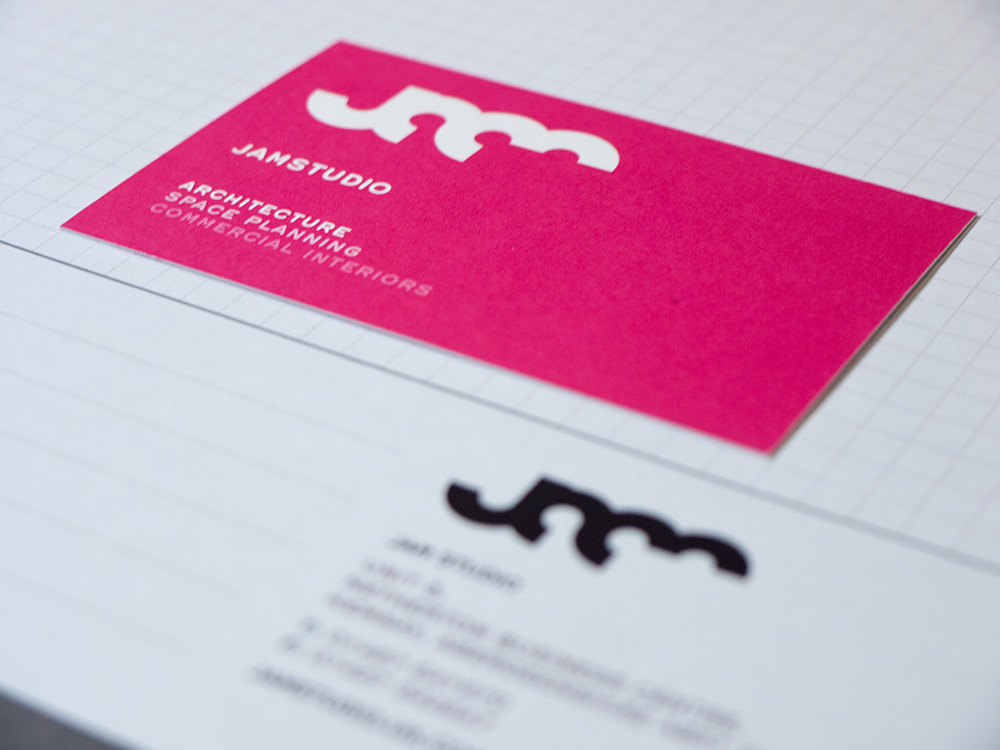
As part of an entire rebrand of leading Scottish architects JAMstudio, we wanted to present bold, confident messaging. The typeface we chose to carry this weight was Hermes – a clean and modern reinterpretation of the type from the Hermes 3000, a typewriter from 1966. A time when architecture, design, writing and photography were synonymous with character and a timeless style. Hermes worked well at small sizes where its clear geometric shapes allowed for easy readability. At larger sizes, its uniques character and visual quirks helped support a specific tone of voice for the JAMstudio brand.

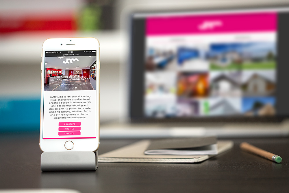
Source: jamstudio.uk.com License: All Rights Reserved.
")


")


")


")

