

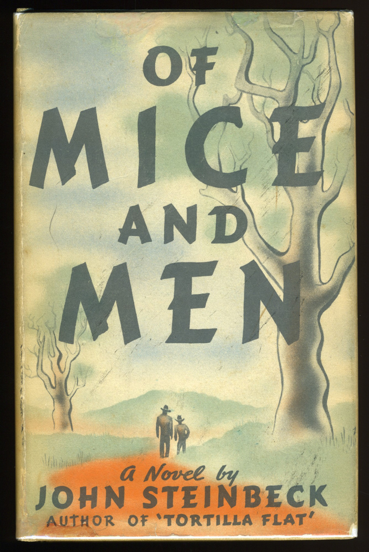
Of Mice And Men by John Steinbeck, first edition
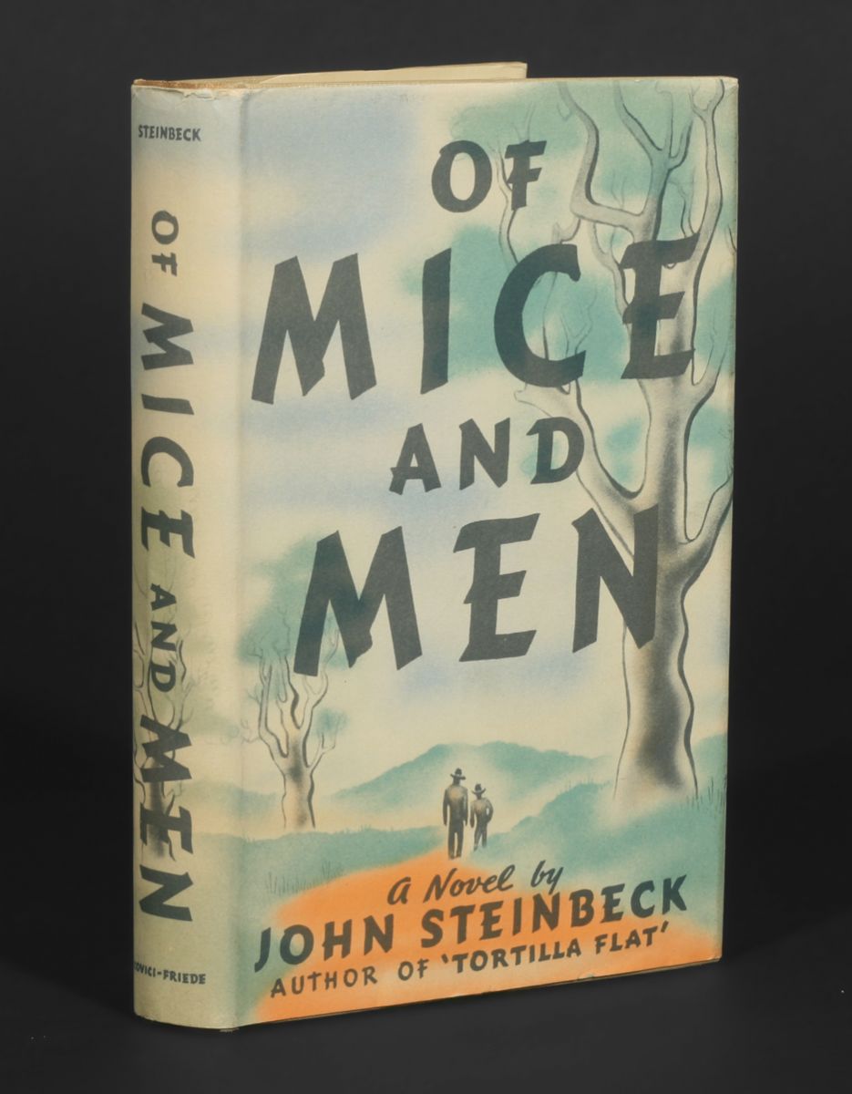
There isn’t any type on the front and spine of the jacket for John Steinbeck’s novella, and yet it qualifies for the inclusion on Fonts In Use: the freely-drawn caps are clearly based on Cartoon. This caps-only typeface, a design by Howard Trafton, was first cast by Bauer in 1936 — only one year before the book was released. Apart from the fact that repeating letters are not identical, the only real departure from the model is the ‘M’ and how the center strokes meet – it’s almost like an upside-down ‘W’, but not quite.
For the text on the back and the inner flaps, Memphis was paired with the bold display face known as Titanic or Hercules. Its jolly ‘A’ and ‘M’ make me think of Robert Crumb’s Keep on Truckin’ cartoon.
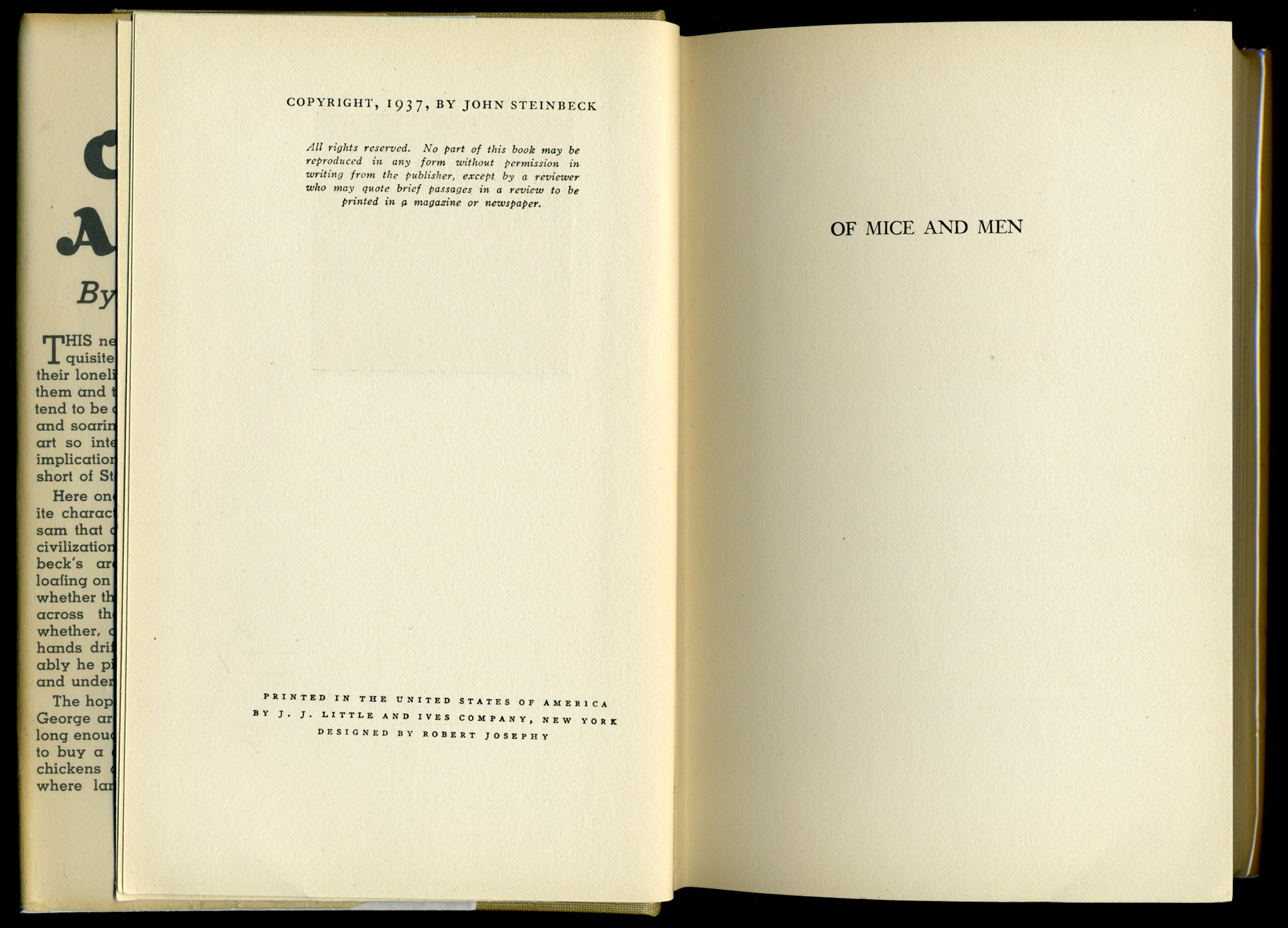
Printed in the United States of America by J.J. Little and Ives Company, New York. Robert Josephy is credited as the designer. It is unclear whether he is responsible for the interior only, or also for the jacket.
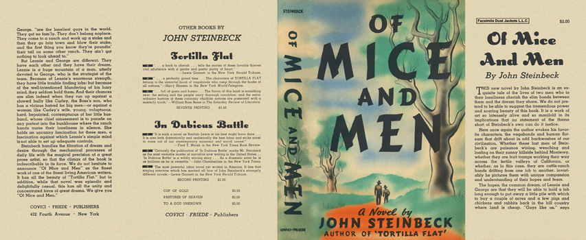
Facsimile dust jacket
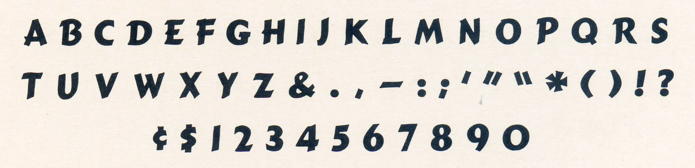
Glyph set of Cartoon Bold


")


 book cover")


")


 for FHNW Academy of Art and Design")

")


")

2 Comments on “Of Mice And Men by John Steinbeck, first edition”
What’s the body text for the book?
Hello Michael, do you have a good image of the book’s interior?
The italic used for “All rights reserved” etc. with the single-storey g might be Linotype Old Style No. 1. The title page appears to be in Janson.