
End as a Man
Contributed by Stephen Coles on Jul 9th, 2015. Artwork published in
.

Source: digitalcollections.nypl.org The New York Public Library Digital Collections. 1926 - 1947. License: All Rights Reserved.
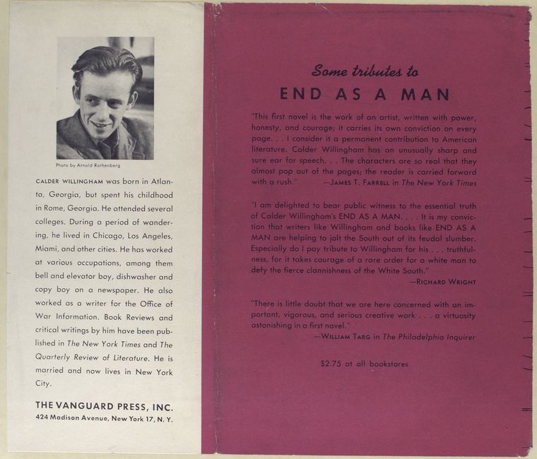
The title on the front cover appears to be lettering based on the Futura (or Spartan) which is used elsewhere: The ‘E’ is widened to better fit the stacked-and-justified setting. Futura’s uncommonly seen small caps are used on the flaps and back cover.
License: All Rights Reserved.


")


")


