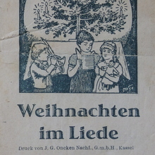
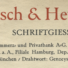
Designed by Friedrich Bauer and issued in 1907–1910 in
7 styles (3 weights, 2 of them with italics, plus
2 condensed weights). [Seemann]
Initially (until 1912) named Nordische Antiqua (Swedish:
Nordisk Antikva). Developed in cooperation with
Swedish printer Waldemar Zachrisson [DBS]
who sometimes is credited as designer. [Onze
Kunst] Accompanied by Seeland-Initialen and
Seeland-Ornamente drawn by Gerhard Heilmann. [DBS]
Used in 1907 for Genzsch & Heyse’s Bunte Blätter,
Vol. 3 No. 1. [DBS]
First used for a full book in Zachrisson’s
Boktryckeri-Kalender [DBS,
1907]
In 1916, Genzsch-Antiqua with Kursiv and halbfett
were cut in a Cyrillic version. Large sizes of some styles also
made in wood. In 1929, Genzsch & Heyse added another 3 italic styles in a revised version for
newspaper use as Genzsch-Zeitungs-Kursiv.
Rosenborg-Kursiv (1910) is an italic variant with
swash caps. [Reichardt, Seemann]
Also cast by Berling as Nordisk antikva and by
Stevens as Stanhope Old Style. [Reichardt,
R. H. Stevens] Some styles adapted for the Intertype
[Musterkartei DIN 16507] and also Linotype/Typograph [Reichardt]
Not to be confused with Linotype’s Nordische Antiqua,
which was their adaptation of Turnus-Antiqua (Stempel,
1910). Taken over More…
Designed by Friedrich Bauer and issued in 1907–1910 in 7 styles (3 weights, 2 of them with italics, plus 2 condensed weights). [Seemann] Initially (until 1912) named Nordische Antiqua (Swedish: Nordisk Antikva). Developed in cooperation with Swedish printer Waldemar Zachrisson [DBS] who sometimes is credited as designer. [Onze Kunst] Accompanied by Seeland-Initialen and Seeland-Ornamente drawn by Gerhard Heilmann. [DBS] Used in 1907 for Genzsch & Heyse’s Bunte Blätter, Vol. 3 No. 1. [DBS] First used for a full book in Zachrisson’s Boktryckeri-Kalender [DBS, 1907]
In 1916, Genzsch-Antiqua with Kursiv and halbfett were cut in a Cyrillic version. Large sizes of some styles also made in wood. In 1929, Genzsch & Heyse added another 3 italic styles in a revised version for newspaper use as Genzsch-Zeitungs-Kursiv. Rosenborg-Kursiv (1910) is an italic variant with swash caps. [Reichardt, Seemann]
Also cast by Berling as Nordisk antikva and by Stevens as Stanhope Old Style. [Reichardt, R. H. Stevens] Some styles adapted for the Intertype [Musterkartei DIN 16507] and also Linotype/Typograph [Reichardt] Not to be confused with Linotype’s Nordische Antiqua, which was their adaptation of Turnus-Antiqua (Stempel, 1910). Taken over by Bauer. [1963 correspondence]
In 1995, Sven Seddig and other students at the Hochschule für bildende Künste in Hamburg digitized the roman, under the direction of Gisela Will and Hans Andree [Materialverlag].
Commercial digitizations were made by Bo Berndal as Nordik (Agfa, 1992) and by Gerhard Helzel (1995–2005, 5 styles). In 2016, Michael Wörgötter digitized the schmalhalbfett and made a wood type revival, and eventually revived all 7 original styles as LD Genzsch Antiqua (Lazydogs, 2020). See also Tarocco and Stanhope.


