
Hope & Anchor branding
Contributed by Mark Fleming on Oct 7th, 2015.
Hope + Anchor, an award-winning strategic insight agency, approached Rosie Lee needing a brand identity to help cement them within their sector yet set them apart from their competitors.
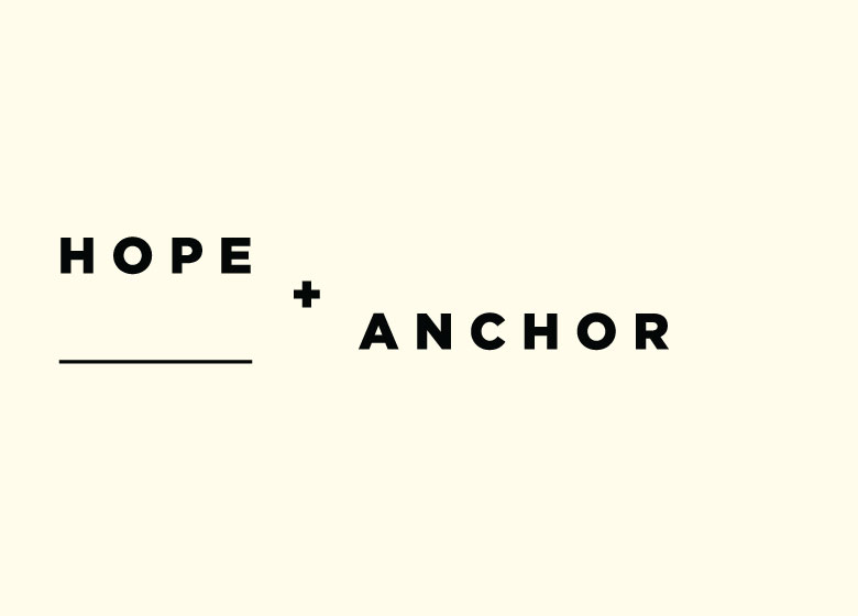
The Hope + Anchor name was inspired by the key strengths and approach of the agency; namely, its use of creative thinking and people (Hope) combined with its grounded understanding of clients’ business needs (Anchor).
We developed a brand identity that emphasised this duality and that used an invisible horizon line to visualise the contrast between the two words – Hope as rising and Anchor as weighted. This concept runs throughout the identity with all key typographic statements appearing to float.


")


")


</cite>")


