
Bosco Chocolate Syrup

“Hobo AND Comic Sans AND Brush Script ?” — Nina Stössinger
Chocolate syrup manufacturer Bosco definitely isn’t shy of font choices that make the type elite shudder. BOSCO for the kid in all of us! On the van depicted above, they went whole hog and applied some slanting, outlining, and 3D effects. Oh so THICK and Rich. (Is that the ‘A’ from Script MT rearing its monocular head in “All Natural”? Why?)
The logo is in Bertram, a jolly all-caps face designed by Martin Wait for Letraset. A digitized version came bundled with CorelDRAW in the 1990s. The chocolate bar packaging below demonstrates that it can look almost classy, without the extra effects, and with a limited number of accompanying fonts.
The letterforms in the current logo have been tamed a little: the baseline is less bouncy, the split shadow was dropped, and a smiley swoosh added instead.
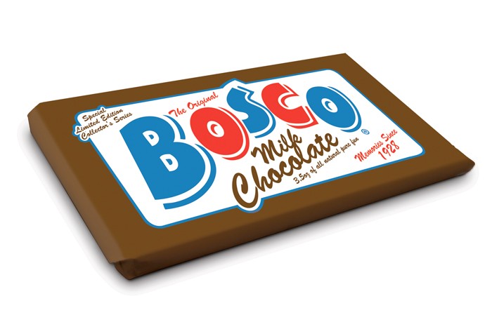
Bosco Milk Chocolate — “Special Limited Edition Collector’s Series”
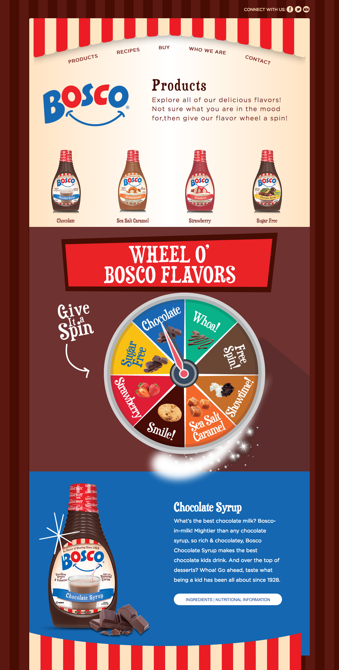
The fonts used on the website are more select: Ray Larabie’s wacky Duality is paired with the no-brainer Gotham. But what happened to the letter spacing? 4px (on 20px type) is … oh so LOOSE.


")
")


")


")


