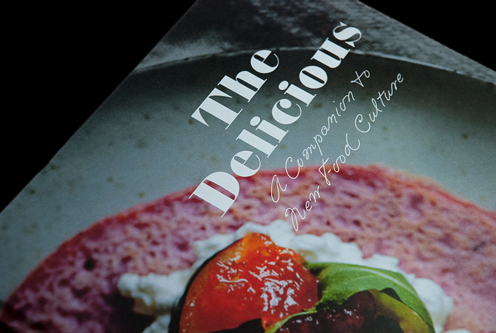
The Delicious
Photos Tuomo Metso
In case someone missed it: food is trending – and so is artwork with food and about food. Here is a masterpiece …
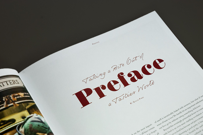
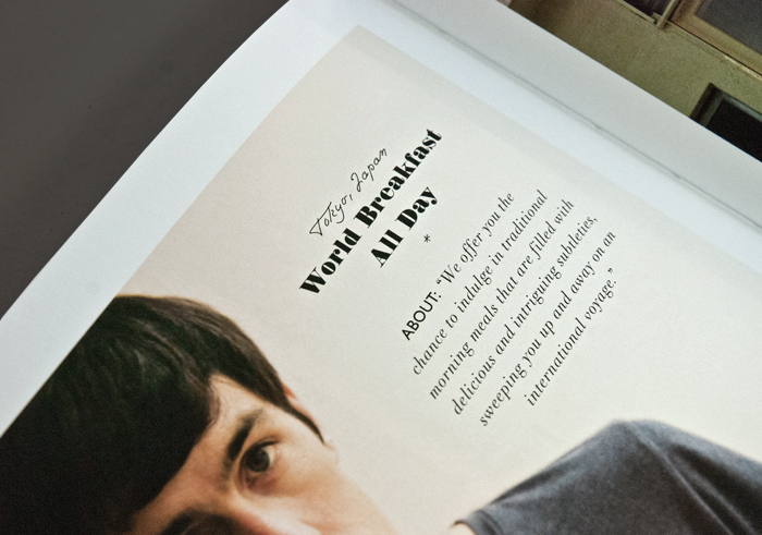
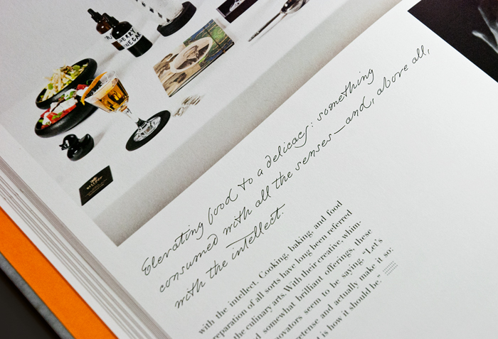
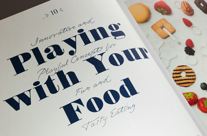
The Delicious / A Companion to New Food Culture by Gestalten features both pioneer and acclaimed chefs from around the world and their cooking art. Inside is a spacious layout full bodied with aromas, tasteful photography and a delicious mix of typefaces notoriously hard to read:
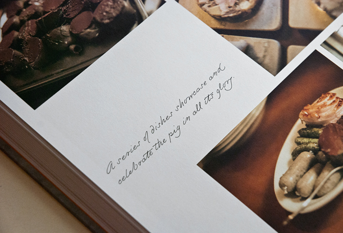
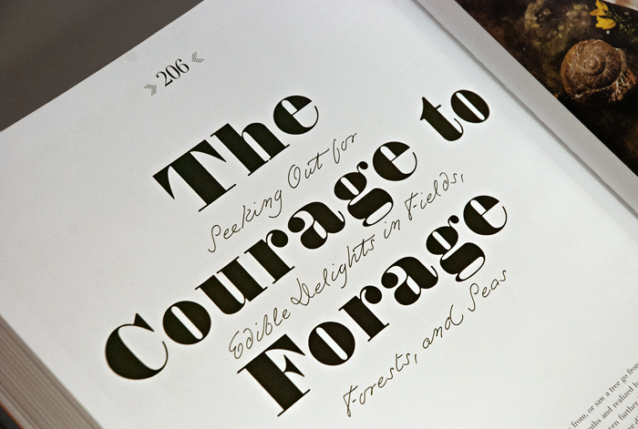
Neoclassicist Didot Elder for running texts, and for chapter headings Fette Bauersche Antiqua – even more extreme in its contrast – combined with Emily In White, a digital interpretation of Emily Dickinson’s handwriting – often described as resembling bird tracks. Thank God there is also Gill Sans for the running titles – at least they are easy to read.
Great food should not be easy to eat. And a great book does not have to be easy to read.