
Fort Washington Florist
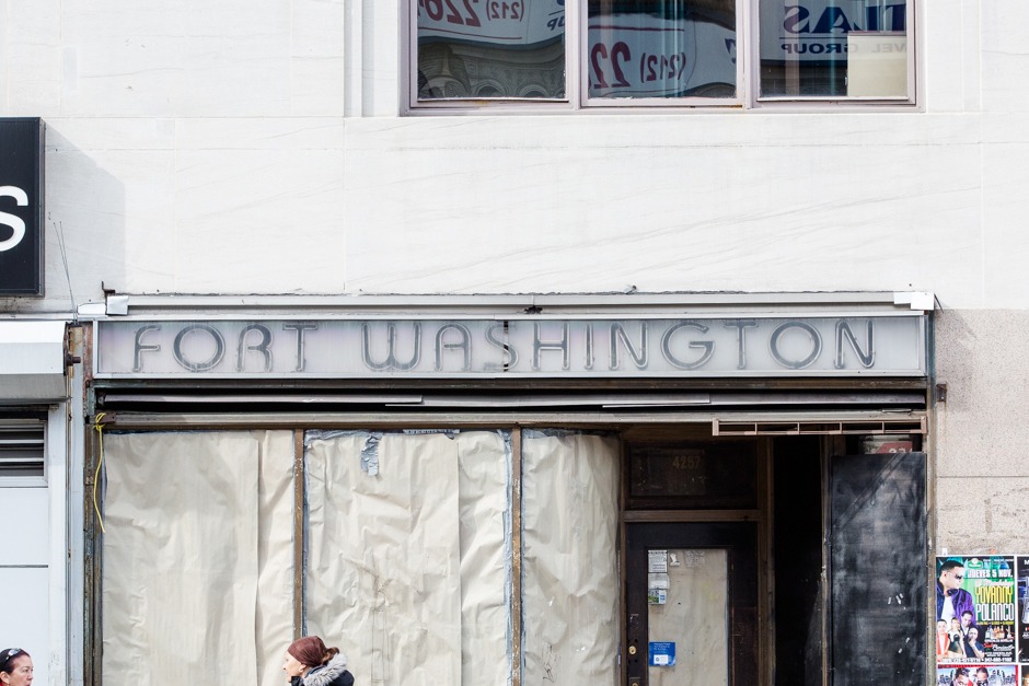
“By the time we snapped a photo of this neon FORT WASHINGTON sign, evidence of whatever commercial enterprise that had once been there was long gone and half boarded up. Upon doing a little digging into the Department of Buildings records, however, uncovered an illuminated sign permit for the words FORT WASHINGTON FLORIST issued to the address in April of 1998. It turns out that the Fort Washington Florist—which shuttered just this past January—first opened its doors in 1917, operating for nearly a century in the historically immigrant neighborhood.
The sign itself features ITC Bauhaus, a geometric sans typeface designed by Edward Benguiat and Victor Caruso. The name reflects the designers’ inspiration, the Universal typeface created in 1925 by Bauhausian artist and graphic designer Herbert Bayer. The original typeface reflects the Bauhaus aesthetic of essentialist functional design, with typography serving as “both an empirical means of communication and an artistic expression, with visual clarity stressed above all.” Monotype Imaging, which acquired ITC in 2005, notes that Bauhaus is a popular choice for public signage because of its vintage art deco feel. ITC Bauhaus’ open form lends itself especially well to the neon sign, providing perfect gaps for electrical wiring.” — Hopes&Fears


")


")


")
")


