
Twinings of London Teas
Contributed by Richard Lipton on Feb 18th, 2016.
License: All Rights Reserved.
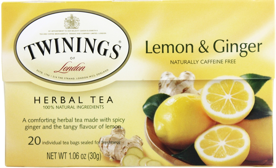
“London” is set in Sloop though the ‘L’ is not quite right.
Source: www.walmart.com License: All Rights Reserved.
Source: www.twiningsusa.com License: All Rights Reserved.
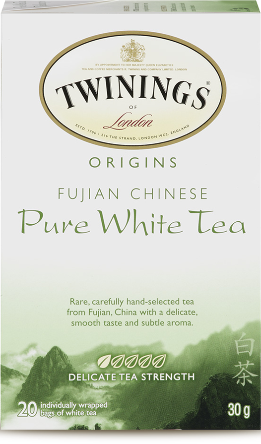
The packaging for Fujian Chinese Pure White Tea features Present, a calligraphic typeface commonly associated with “Asianness”. It was designed by German graphic artist Friedrich Karl Sallwey in 1974.
Source: www.twiningsusa.com License: All Rights Reserved.
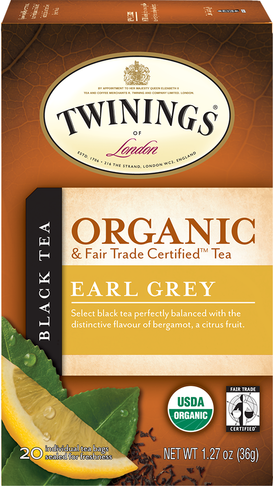
The Organic line combines Mrs Eaves and Mr Eaves Sans.


")


6 Comments on “Twinings of London Teas”
So I suppose you drink this and not the other brand, eh Mr. Lipton?
It’s only the tip of the iceberg of my family betrayals, Mr. Coles.
Hi, Any indication of what font the new Twinings double Passion Flower Night night tea uses?
Hi Nicholas, this one? That would be Berliner Grotesk.
Yes that’s the one! It’d been keeping me up all night – I can rest easy now :-)
Glad I was able to help! It’s the third time I’ve seen Berliner Grotesk used for packaging design recently. Looks like it has a small comeback in its 107th year.