Stedelijk Museum identity (2012)
Four years after the dust settled, a look back at the controversial rebranding of Amsterdam’s home for contemporary art.
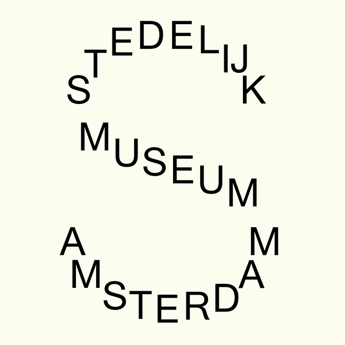
The 2012 visual rebranding of Amsterdam’s Stedelijk Museum was designed by Mevis & Van Deursen, and includes a website, publications, newsletter, stationery, and posters. The S-shaped logo is based on Union, a typeface designed in 2009 by Czech-born Radim Peško:
Union derives from the two most commonly used typefaces on PC and Mac platforms: Arial and Helvetica. Essentially, Union is a synthesis of these typefaces; its contours have been adjusted to retain the flexibility characteristic of both fonts. Union is intended for situations where Helvetica seems too sophisticated and Arial too vulgar, or vice versa.
The museum’s unique relationship with graphic design dates back to Wim Crouwel 1964 ‘SM’ logo and Experimental Jetset’s 2004 ‘SMCS’ temporary logotype and sign system. Expectations for this redesign were high after a previous identity proposal (the outcome of an international competition) by French designer Pierre di Sciullo had been ditched by the newly arrived Stedelijk director, Ann Goldstein.
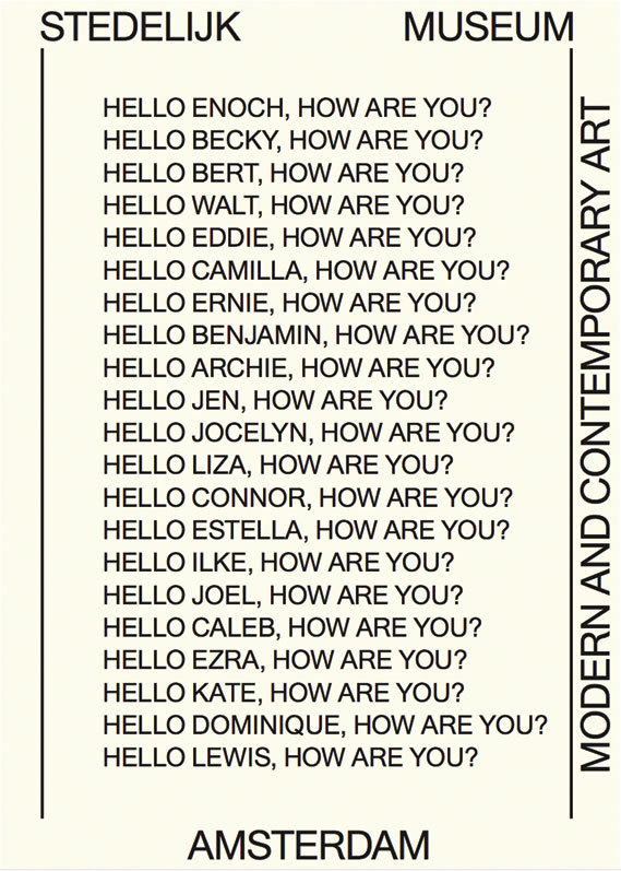
Poster proposal.
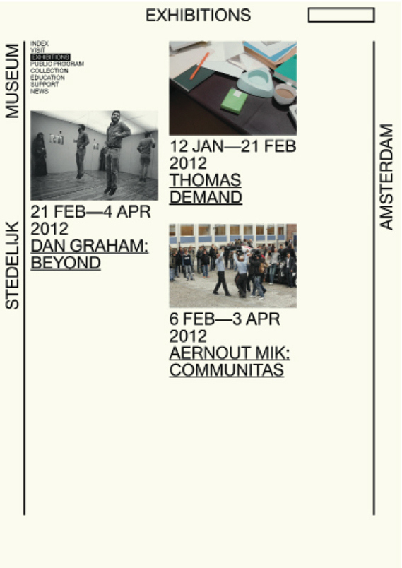
Website proposal.
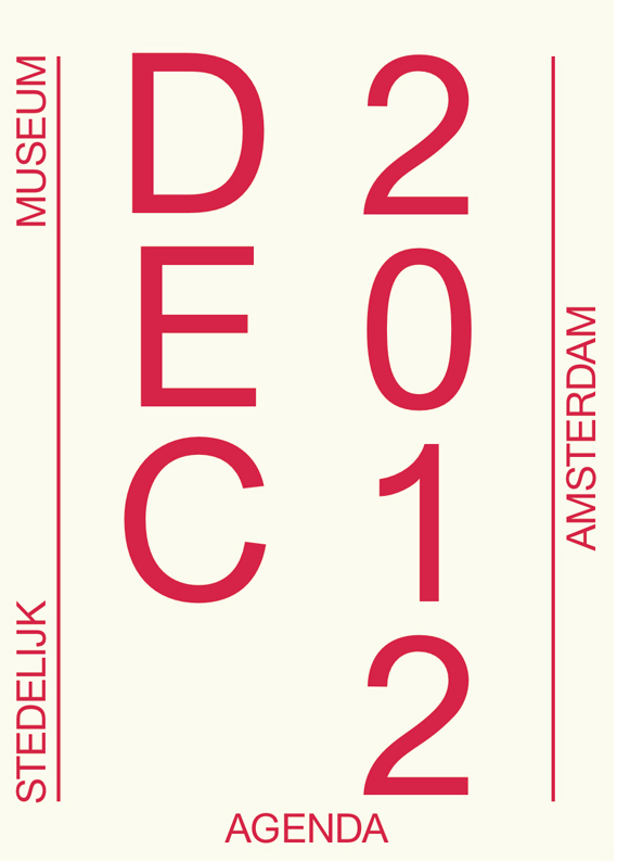
Agenda proposal.
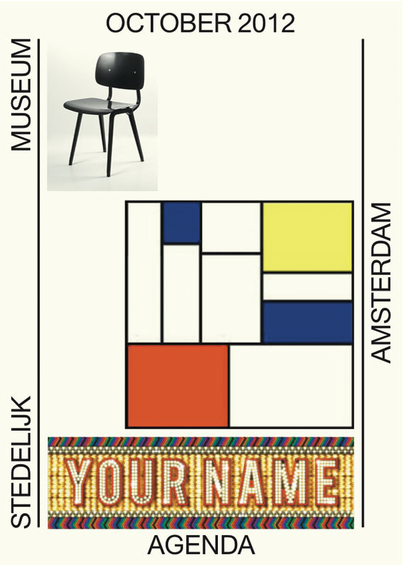
Agenda proposal.
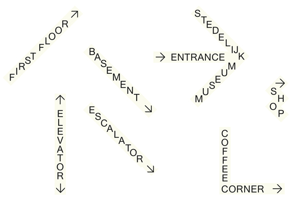
Signage proposal.
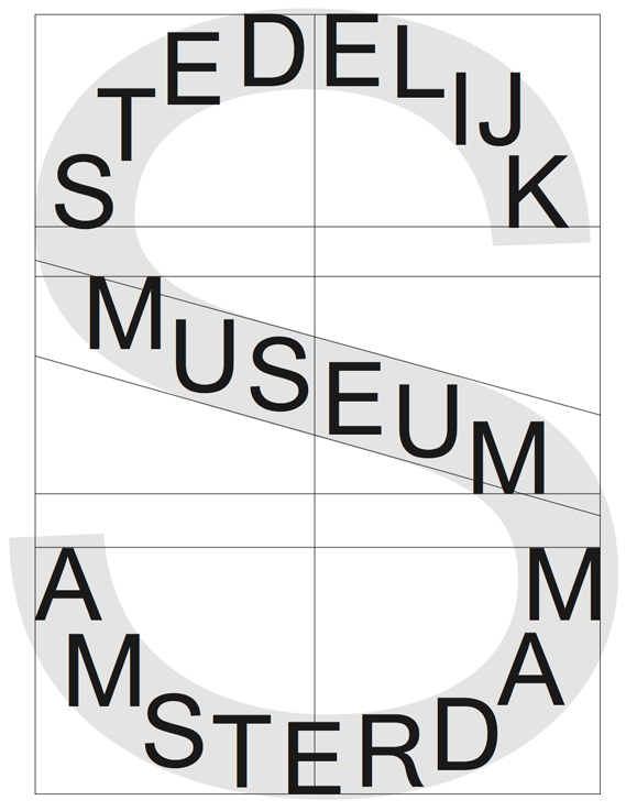
Logo structure.
The readability and typography of Mevis & Van Deursen’s logo has not only led to a heated debate in the Netherlands, but basically wherever it had been posted online (Brand New, Logo Design Love, Vimeo, etc.). Whilst the conceptual idea of the identity was recognized in some circles, its execution failed to find consensus.
Dutch type designer Albert-Jan Pool posted a photo of the logo on his Flickr account, questioning “Who has gone Dutch here? The designers? The museum?”. Pool judged the logo as “far too nerdy and ideosyncratic to be communicative” and pointed out that “graphic design usually communicates better when there is a concept behind it” but “should not be confused with conceptual art.”
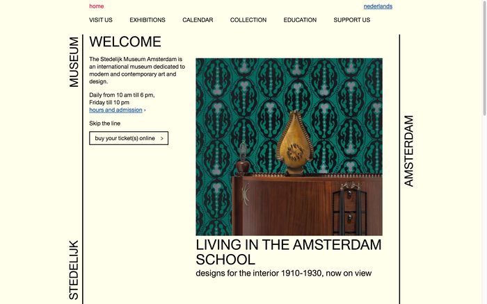
Current website.
Looking back from a 2016 perspective, I see the design as far less “outrageous” or “lazy” than it appeared to some observers in 2012. One can put it in context with a certain anything-goes aesthetic that can be found in all areas of design: for example, in Peter De Potter’s work (which includes the latest Kanye West album cover), or in fashion (such as the Vetements label, who love using ugly Gothic fonts on their very expensive clothing), or in web design (see Brutalist Websites).
Andreas Kofler is an architect, urbanist and freelance writer. Originally from Italy’s German-speaking province of South Tyrol, he worked for several offices in Rotterdam and Paris — STAR, TD, OMA/AMO, l’AUC and DPA — before cofounding Weltgebraus in 2013.
Identity design can be judged not only by its initial launch but by its endurance. We’d love to hear from our readers about this work. How do you see the Stedelijk Museum identity today? If you have visited the museum recently, how did you experience the implementation of the identity within the institution itself? What do you think of its relationship with the design landscape at large? Please post your thoughts in the comments below. — Editors
Formats
- Web (3308)
- Signs (1396)
- Branding/Identity (4774)
Topics
- Institutional (769)
- Art (2766)
Designers/Agencies
Tagged with
- all caps (4076)
- Wim Crouwel (4)
- Experimental Jetset (1)
- logos (2702)
- Stedelijk Museum (7)
- redesign (369)
- minimalist (384)
- type on a curve (610)
- beige (40)
- controversial (14)
- one typeface (1328)
- image made with type (105)
- wayfinding (218)
- modern art museums (10)
- repetition (517)
- rotated type (1309)
- stacked glyphs (308)
- trendlisty (118)
Artwork location
- Netherlands (764)
- Amsterdam (278)















2 Comments on “Stedelijk Museum identity (2012)”
Perhaps referencing M&vD’s temporary identity for the Temporary Stedelijk could be of use as well?
It’s a certificied hood classic