
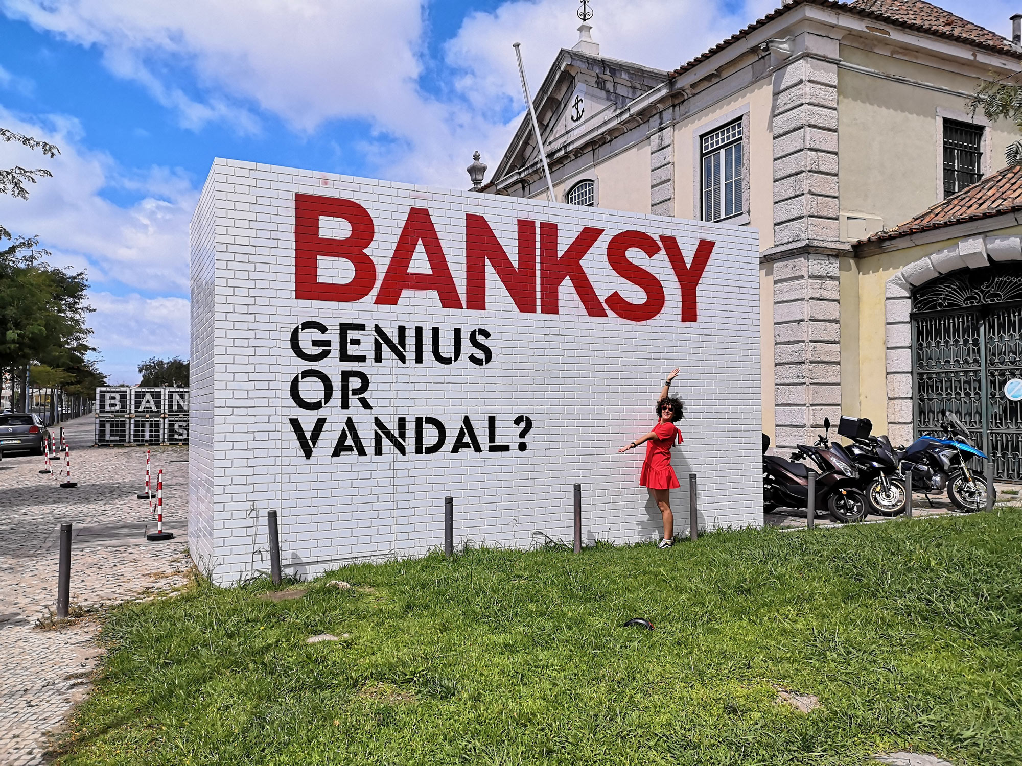
In summer and fall 2019, Cordoaria Nacional is home to the exhibition Banksy: Genius or Vandal?, the first big exhibition in Portugal of the British iconoclast that revolutionized contemporary art and whose identity remains a mystery.
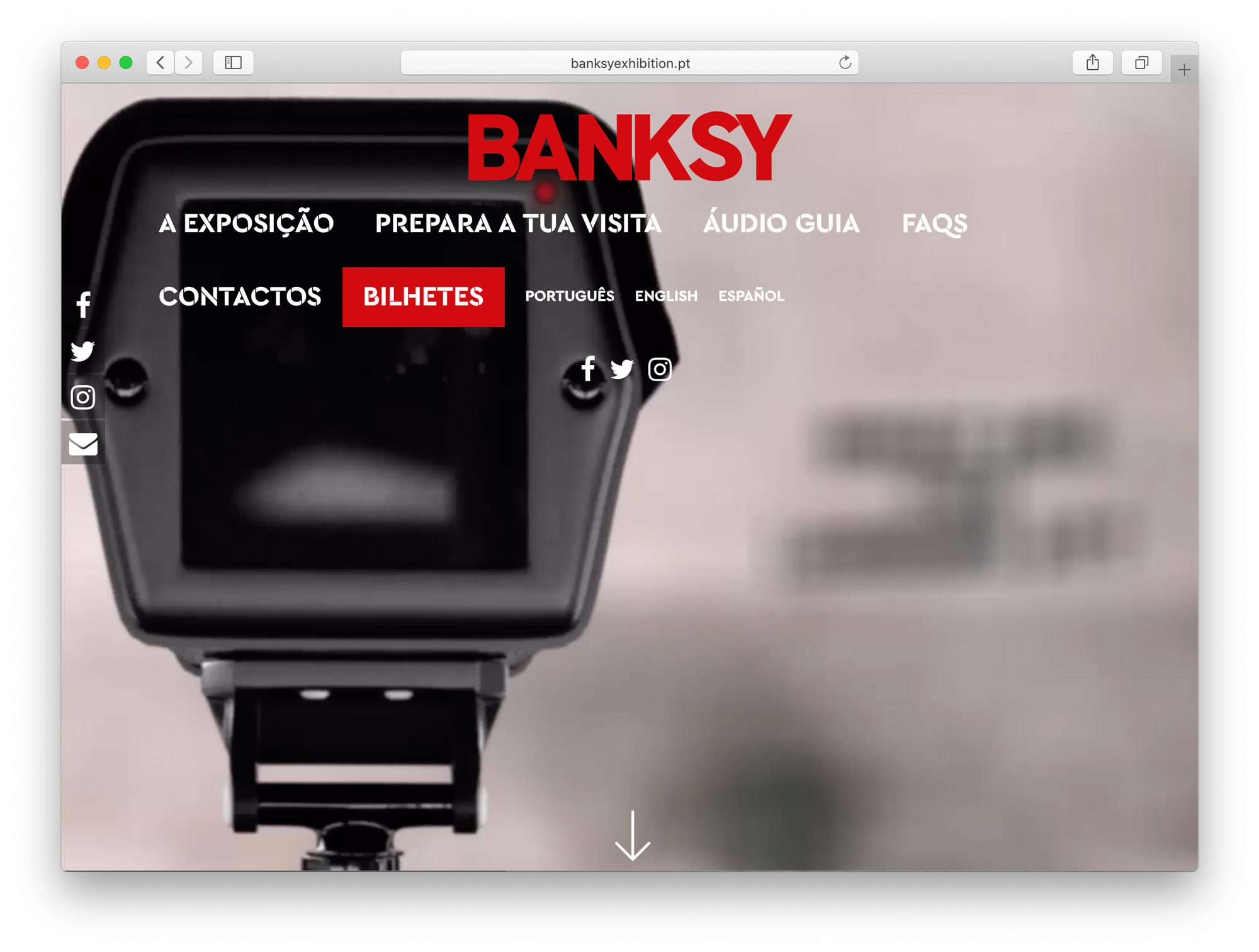
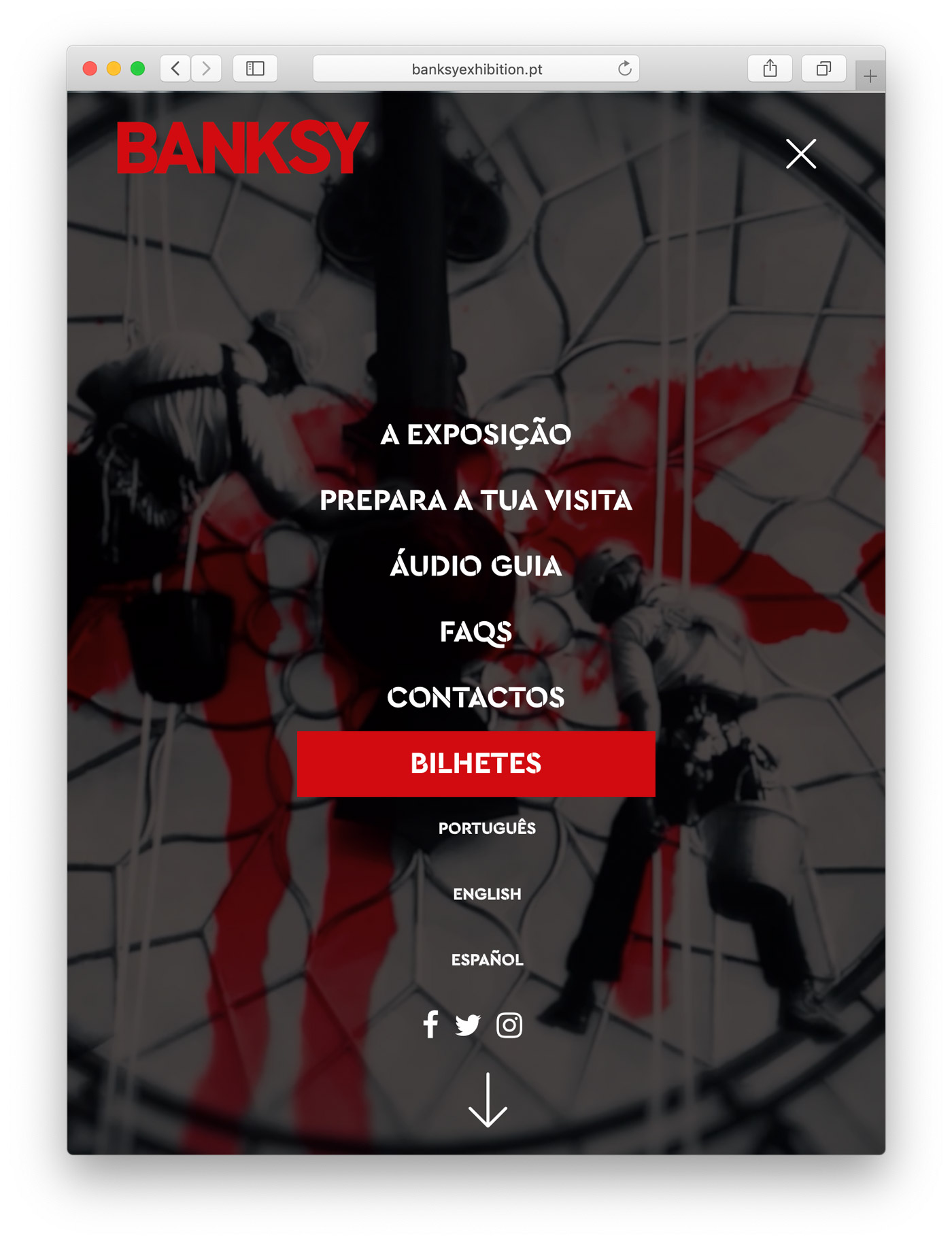
To emphasize the rapid and raw graffiti that has become contemporary art, they use Cera Stencil for the branding on the website, in commercials and for the exhibition design. The typefaces used for the artist’s name and the tagline on posters are yet unidentified.
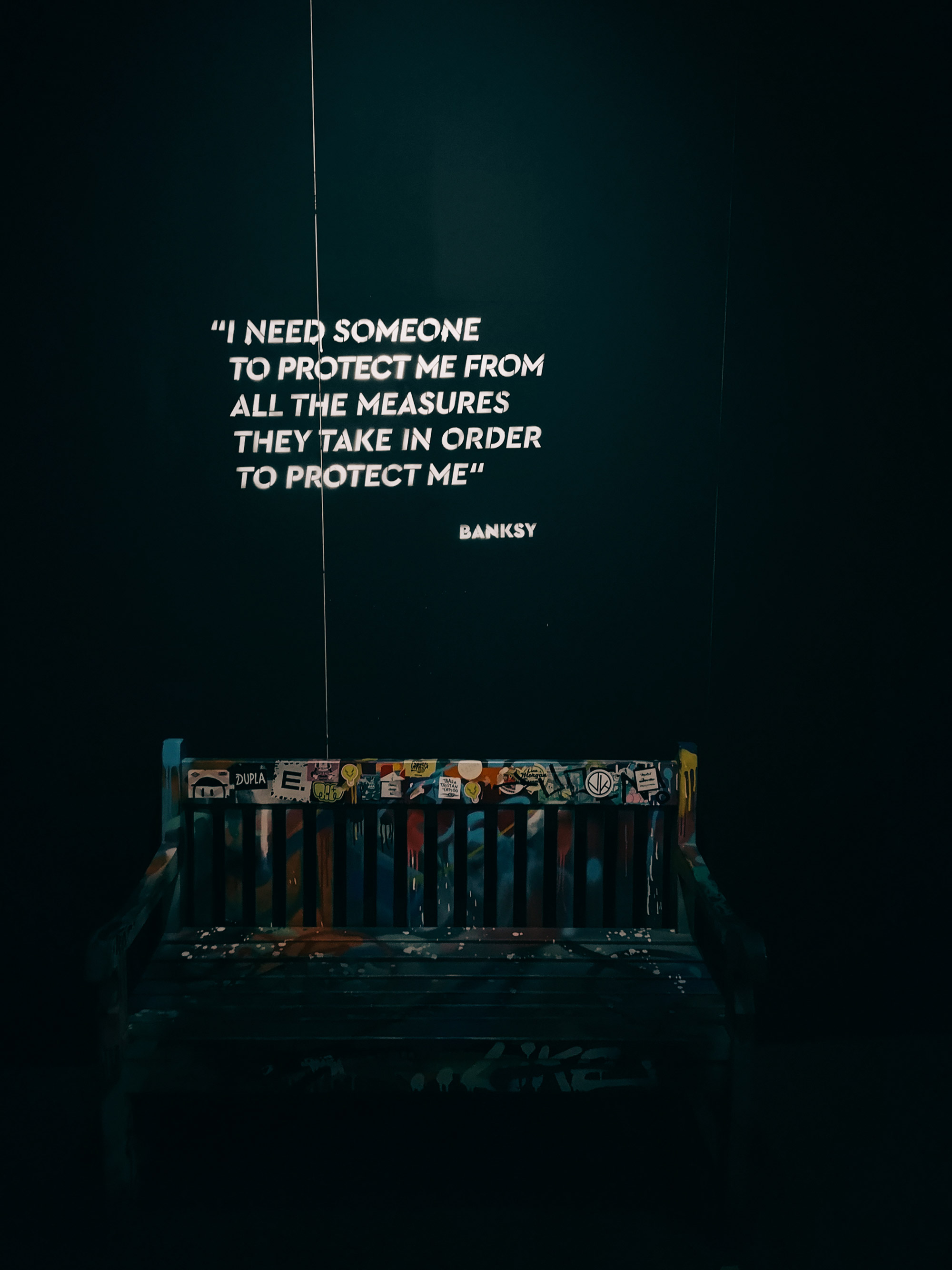
For the quotes, in exhibition design the the font was slanted to a faux italic

Billboards. For some reason, the tag line on the posters uses lettering that is not derived of Cera Stencil, in contrast to the lettering on the wall outside the venue (first image).

Fun fact: since its release, TypeMates used a Banksy quote for Cera Stencil. It seems like a self-fulfilling prophecy now that we’ve come full circle with an exhibition using the stencil typeface.


