
Intertype ads: “Intertype vs Linotype”
Contributed by Stephen Coles on May 28th, 2016. Artwork published in
.
Source: books.google.com Scanned by Google Books. University of Minnesota Collection. License: Public Domain.
Source: books.google.com Scanned by Google Books. University of Minnesota Collection. License: Public Domain.
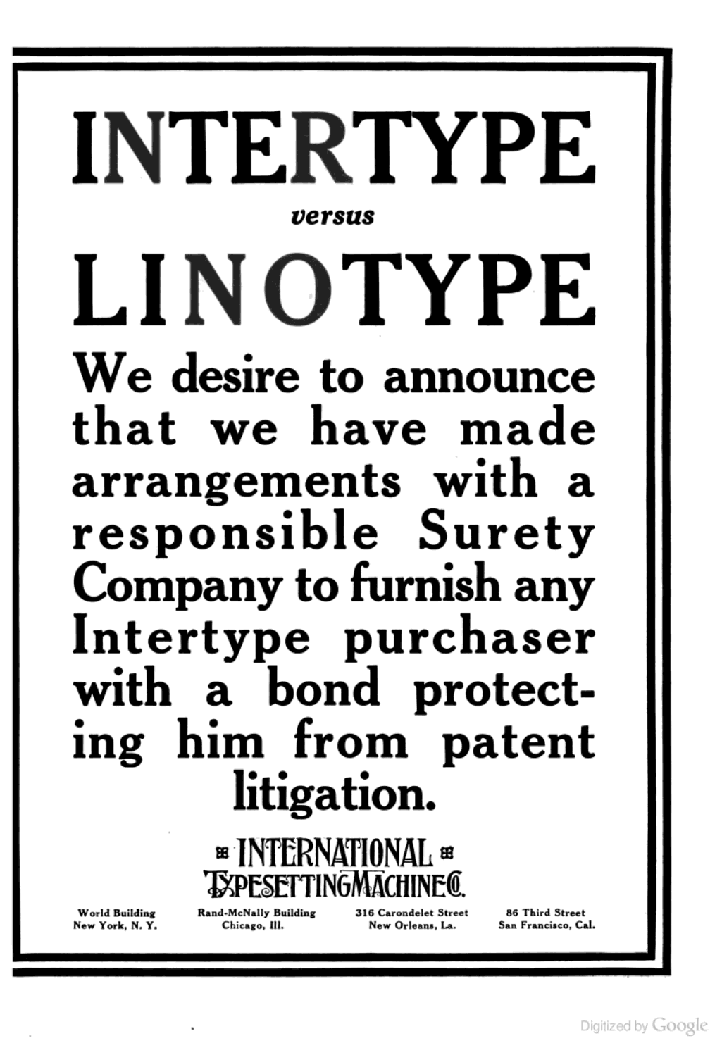
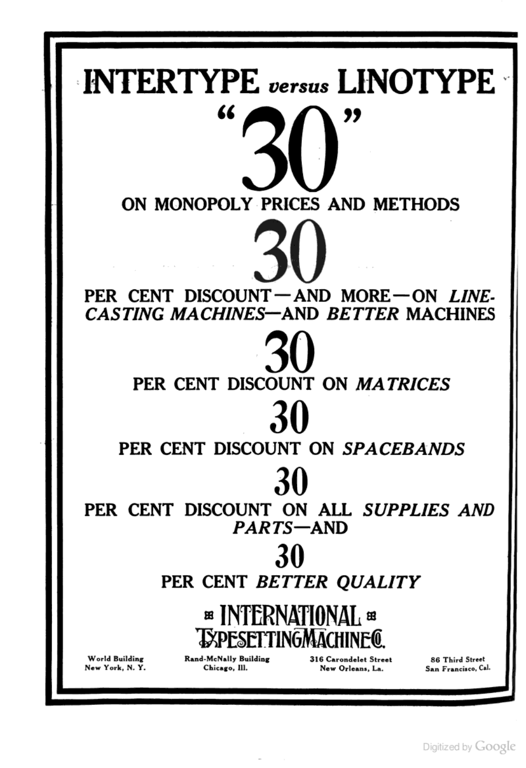
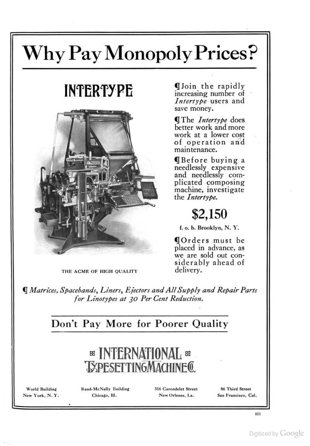
Intertype placed several brash advertisements in The Inland Printer during the trade magazine’s 1913 run. The first ad is a direct response to Linotype’s claim of patent infringement. In a slightly ironic twist, some of the ads (below) use the same typeface as Linotype’s ad, Caslon 3.

Source: books.google.com Scanned by Google Books. University of Minnesota Collection. License: Public Domain.
Source: books.google.com Scanned by Google Books. University of Minnesota Collection. License: Public Domain.


 film titles, posters, soundtrack cover")


