Fact magazine covers
Stark typography to deliver stark criticism in the politically charged 1960s.
Shortly after being sentenced to jail time for the Eros periodical he started with Herb Lubalin, Ralph Ginzburg launched Fact magazine in 1964, again enlisting Lubalin as art director. Fact focused largely on political issues and was known for its scathingly satirical takedowns of everyone from Bobby Kennedy to Reader’s Digest to the entire American automobile industry (a young Ralph Nader contributed research on that topic). One issue focusing on the mental fitness of conservative presidential candidate Barry Goldwater even led to a lawsuit and eventually the closure of the publication.
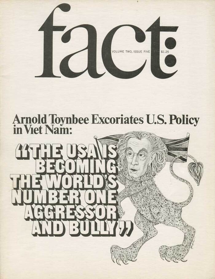
Following the hard-hitting style of the content, the publication’s design is similarly stark and upfront. Especially with the earlier issues, the covers were mostly simple, monochrome, no frills, and purely typographic – using very basic but well-considered settings of Times. Later issues would feature other common typefaces, with only a couple utilizing custom lettering.
As Alexander Tochilosky describes it for Flat File:
Economy was essential for the magazine’s budget, so Lubalin chose a small black and white format. The inside layout was a simple, quiet, two-column grid of Times Roman. The tone however was set by the striking, bold and text-only covers. Lubalin understood that Fact magazine was all about the attitude, and as a great art director knew when design should take a step back.
In typical Lubalin style, many of the covers are set with “TNT” (tight-not-touching) spacing, often with the text filling the page as large as possible.
Most of the type for the magazine appears to come from versions of common typefaces as offered by either Photo-Lettering and/or Aaron Burns & Co, Inc. This isn’t particularly surprising given that Lubalin often worked with Burns and Photo-Lettering’s founder, Ed Rondthaler. (Lubalin, Rondthaler, and Burns would eventually team up to launch ITC in 1970.) A promotional photo of Ginzburg and Fact co-editor Warren Boroson even shows a type specimen booklet from Aaron Burns & Co, Inc. scattered among rulers, sizing gauges, and previous issues of Fact.
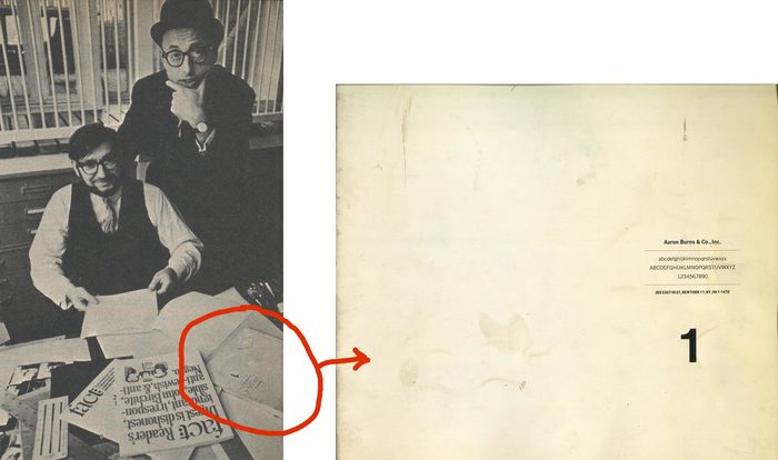
A photo of Ralph Ginzburg (standing, with hat) and Warren Boroson from an ad for The Best of Fact in the final issue of Fact magazine shows a type specimen book from Aaron Burns & Co., Inc.
In Tochilovsky’s write-up of Fact, he also describes the simple ingenuity of Lubalin’s design for the publication’s logo:
It was drawn by Tom Carnase, and based on Caslon 540—with the ‘f’ slightly modified to mimic the ‘t’. But the ingenious part is the addition of the colon. It’s not part of the name, but was Lubalin’s graphic invention. It’s genius because it makes you read the headline of the cover beginning with the word “fact”.
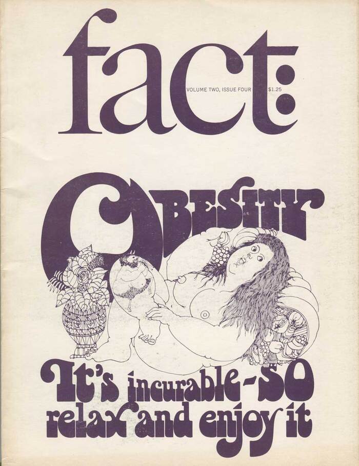
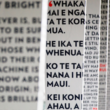
Below are all 23 covers of Fact, including both cover variants for volume 2 issue 2. The scans were made from originals in the Herb Lubalin Study Center of Design & Typography at Cooper Union. Many thanks to Alexander Tochilovsky for being so generous with the Center’s materials.
Formats
- Branding/Identity (4721)
- Magazines/Periodicals (1361)
Topics
- News (444)
- Literature (1902)
- Activism (641)
- Politics (507)
Designers/Agencies
- Herb Lubalin (30)
- Tom Carnase (2)
Tagged with
- Fact (magazine) (1)
- Ralph Ginzburg (1)
- satire (23)
- magazine covers (981)
- tight letterspacing (529)
- phototype (49)
- lettering derived from typeface (479)
- modified typeface (1138)
- simple (50)
- only type (884)
- journalism (49)
- black and white (1459)
- 1960s (498)
- Aaron Burns (1)
- red white and blue (145)
- Warren Boroson (1)
- tight-not-touching (182)
- interlinear ligatures (62)
- text on cover (62)
- colons (12)
- punctuation (10)
- counterculture (32)
- dotless i (6)
- hanging punctuation (40)
- wall of type (234)
Artwork location
- United States (6341)




















8 Comments on “Fact magazine covers”
Wow this very factually helpful lol. Thanks for posting these designs. Please keep posting (Y) great content
The cover of the obesity looks like if had an early “bottleneck” appearence. Take a look to that font that supossedly was designed in 1972, but this look way too similar.
Humberto, we do state on the Bottleneck typeface description:
But it’s true there are elements of the “Obesity” lettering that are more like Bottleneck than Art Tone. It would be interesting to know more about the origin of Bottleneck.
Yeah, Stephen, it supossed that Tony Wenman designed Bottleneck in 1972 for Letraset, but this looks way too similar:
Maybe it was the main inspiration for Bottleneck.
Jerome Snyder is credited as a guest illustrator and the issue is dated July–August 1965 (Volume 2, Issue 4): fact.110west40th.com/volume…, years later (c. 1967) he wrote The Underground Gourmet with Milton Glaser as co-author, with a cover using Chwast Art Tone https://www.miltonglaser.com/the-work/c:books-and-magazines/374/the-underground-gourmet-cover/
Maybe Lubalin took the idea to Wenman or maybe is just a coincidence, I really would like to know.
Iván, were you able to get in touch with Wenman; is he still around?
Lubalin was a member of the panel that selected the faces for the Letragraphica range initiated by Letraset in 1970. In this function, would he have suggested ideas for typefaces to Letraset’s type design team? Or would he have kept rather for his own ventures, LSC and later ITC? The first issues of Letragraphica contained typefaces by Lubalin, like ITC Avant Garde Gothic.
One thing’s for sure: Letraset in the UK kept a close eye on trends in lettering styles, including faces that emerged at Photo-Lettering, Inc. in NYC. Two other, more obvious examples are Candice (1976) vs. Benguiat Charisma Script (before 1971, see comparison) and Lazybones (1972) vs. Cooper Nouveau Swash 10, ca. 1965, see comparison). Such “inspiration” was not a one-way street: PLINC’s British Inserat is a copy of Letraset’s first original, Compacta. Keep in mind that, unlike the vast majority of digital fonts today, the offerings by these two companies were not direct competitors. Photo-Lettering as a NYC-based typesetting studio and Letraset as a producer of dry-transfer sheets were in different markets. As an end user, you couldn’t buy (or license) a PLINC typeface. Instead, you could order a setting from them, and even that was largely limited to local clients.
Thanks, Florian, I wrote to Mike Daines and he told me this (just today):
So now we can estimate a date of birth at around the year 1947 and that he designed Bottleneck, Buster, Camellia and Stripes at age 26–27, which is very impressive.
And then we know he likes waves, I always though of Stripes as the flowing of water in rivers, I think he would like to know of the greek range extension in Octothorpe, although we now know a lot more about this origins and work at Letraset, there’s not much about his current location.
Oh, smashing! Thanks for digging deeper and for sharing the info provided by Mike Daines here, Iván. From typeface designer to surfing instructor – that’s quite something.
Mr. Wenman, if you should come across these comments, please say hello. We’d love to hear from you. And thanks for your typeface designs!