
Typographische Mitteilungen, vol. 17, No. 7, July 1920
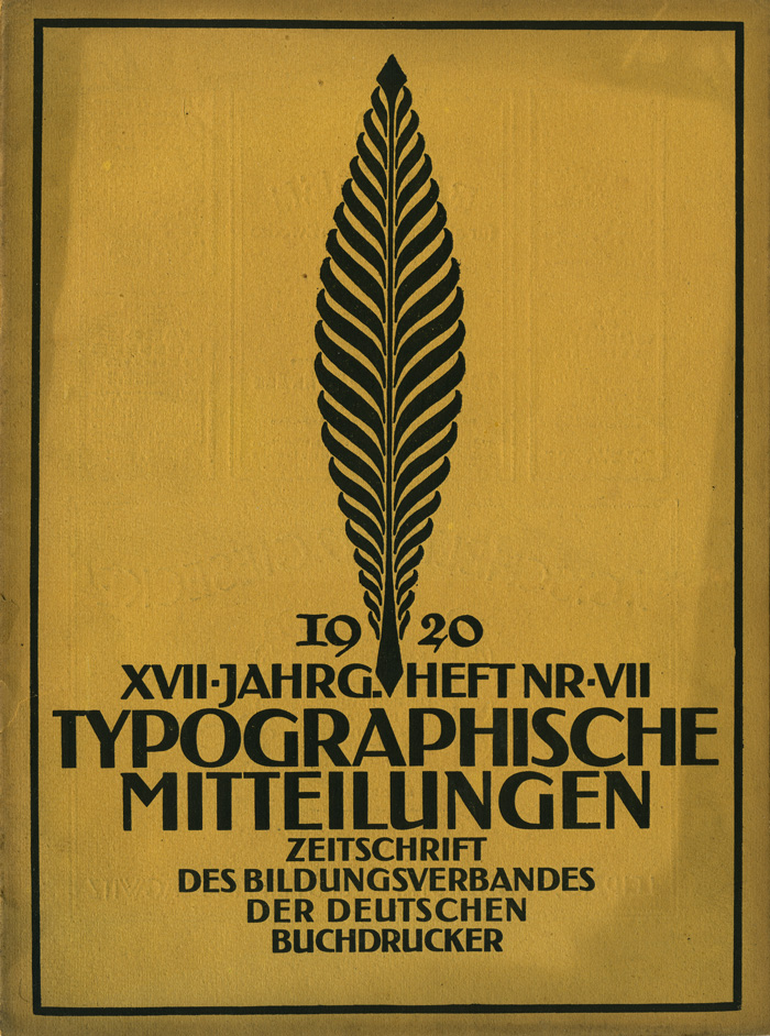
The German typographer’s trade journal Typographische Mitteilungen: Zeitschrift des Bildungsverbandes der Deutschen Buchdrucker (Typographic Messages: The Journal of the Education Association of German Printers) was founded in Leipzig, the capital of German printing in 1903. As an “educational” tool for printers and typographers it covered type, printing, illustration and trademark design.
Typographische Mitteilungen was an important platform for the new typography movement. Two years after the 1923 Bauhaus exhibition, Jan Tschichold was invited to serve as guest editor for the October 1925 issue, for which he designed a twenty-four-page special issue entitled “elementare typographie” (elemental typography).
The designer of the cover of this issue from July 1920 is not credited. The typeface is Feder-Grotesk (“feather grotesque” or “pen grotesque”), designed by Jakob Erbar and first cast in 1909 by Ludwig & Mayer. The bold (as used here) was added in 1910, and the Kursiv (actually an extrabold italic) followed in 1925.

")


")


")


1 Comment on “Typographische Mitteilungen, vol. 17, No. 7, July 1920”
Thank you for your lovely contribution, Kirsten!
Feder-Grotesk is a fascinating typeface. I have no hard proof, but I’m convinced that the name refers to Feder as in quill or pen, alluding to the high contrast that is atypical for a Grotesk. Ludwig & Mayer also had a Feder-Antiqua in their library, drawn by a different artist and first cast in 1911. This design is not directly related, but it also exhibits a distinct vertical contrast, emulating a (broad-nib) pen.
Feder-Grotesk comes with a narrower alternate ‘C’. This glyph is used for the ‘CH’ and ‘CK’ pairs in “Buchdrucker”, but not in the three instances of the ‘SCH’ trigraph. Chances are it was mainly employed to get a nicely balanced alignment, with a short last line. The tighter spacing suggests this as well.
There are two digitizations of the regular weight of Feder-Grotesk, Federo (Olexa Volochay for Cyreal, 2011) and Romanovsky (Vasily Biryukov for ParaType, 2013). The latter is loosely based on a Russian typeface cast in 1910 by the Lehmann foundry in St. Petersburg, with the Latin part derived from Feder-Grotesk. The brief comparison above shows that Federo (2) has narrower glyphs, but a looser spacing than the original (1 – taken from a large 84p showing). It has more compact extenders. Its ‘a’ and ‘e’ are less faithful to Erbar’s design than the digital Romanovsky (3), which in turn clearly deviates in ‘i’ or ‘g’ (among other glyphs not shown here). Romanovsky is even more open in the spacing. The last line shows Sonrisa Regular (CastleType, 2011), which is only indirectly related to Feder-Grotesk: It is part of a 7-weight family built upon “the skeletal structure of Jakob Erbar’s Koloss”. Koloss was originally released by Ludwig & Mayer in 1923 and advertised as the extrabold companion to Feder-Grotesk. Oddly enough, the extrabold italic was not named Koloss-Kursiv, but Feder-Kursiv (1925).
To my knowledge, there is no digitization of the bold weight of Feder-Grotesk as used on this cover (1). The closest option is Romanovsky Bold by Olexa Volochay (2). It is lighter and wider, with several details off, see ‘G’ or ‘P’. Sonrisa Bold (3) has the right weight, but is essentially a condensed version.