
Münster Urban, issue 2
Contributed by Jakob Runge on Jul 26th, 2016. Artwork published in
.

Photo: Jakob Runge. License: All Rights Reserved.
Münster-based agency Heithoff & Companie introduced the city magazine Münster Urban in 2016. This magazine is not an event schedule like most city magazines. It focuses on detailed stories on the life and characters living in the city of Münster, Germany.
The printed magazine and the website use FF Franziska for text, Cera for headlines as well as for captions, and Playfair Display for partial headlines and typographical highlights.

Photo: Jakob Runge. License: All Rights Reserved.
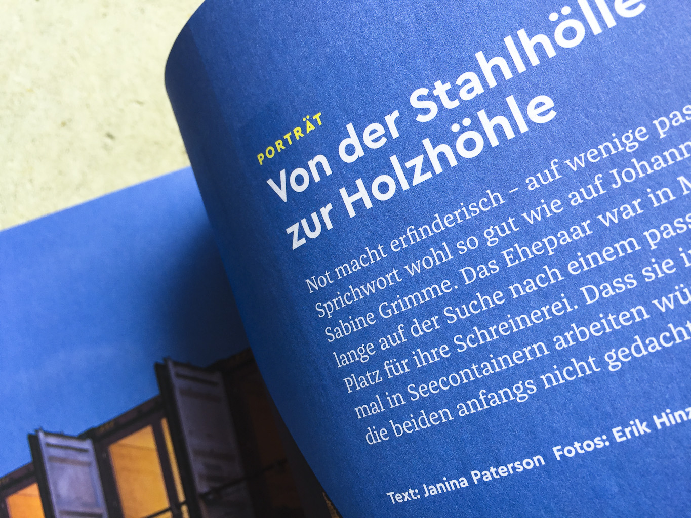
Photo: Jakob Runge. License: All Rights Reserved.

Photo: Jakob Runge. License: All Rights Reserved.

Photo: Jakob Runge. License: All Rights Reserved.
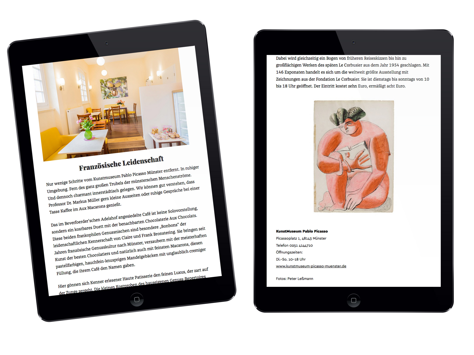
Photo: Jakob Runge. License: All Rights Reserved.
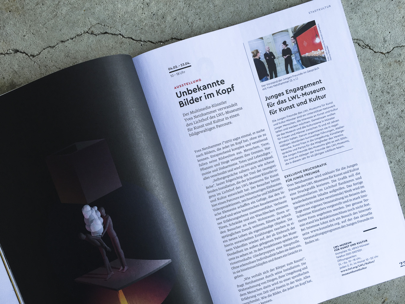
Photo: Jakob Runge. License: All Rights Reserved.
Photo: Jakob Runge. License: All Rights Reserved.

Photo: Jakob Runge. License: All Rights Reserved.
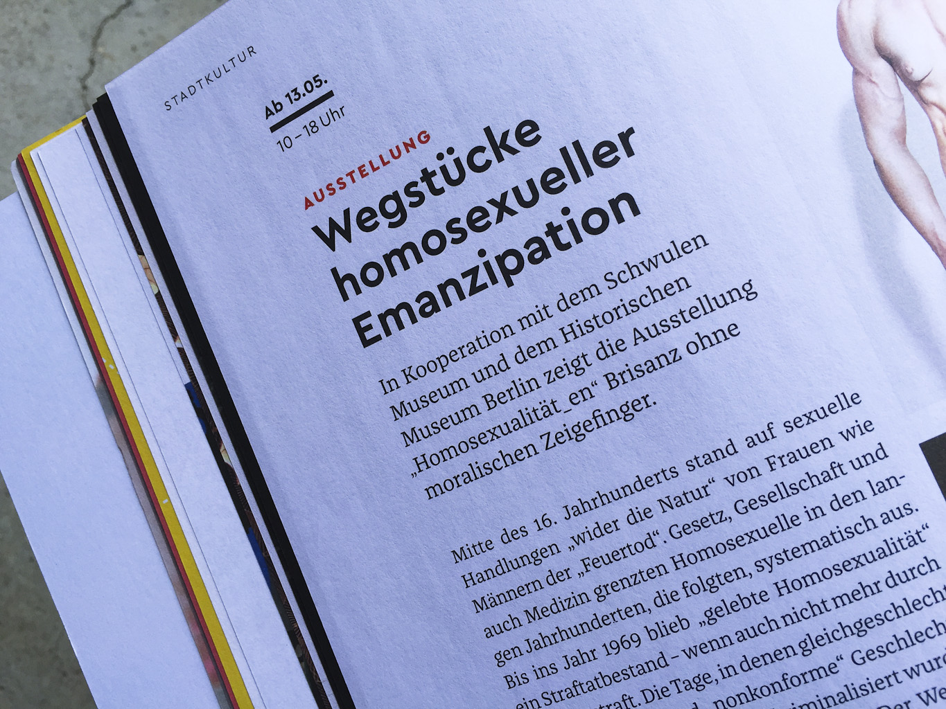
Photo: Jakob Runge. License: All Rights Reserved.

Photo: Jakob Runge. License: All Rights Reserved.

Photo: Jakob Runge. License: All Rights Reserved.
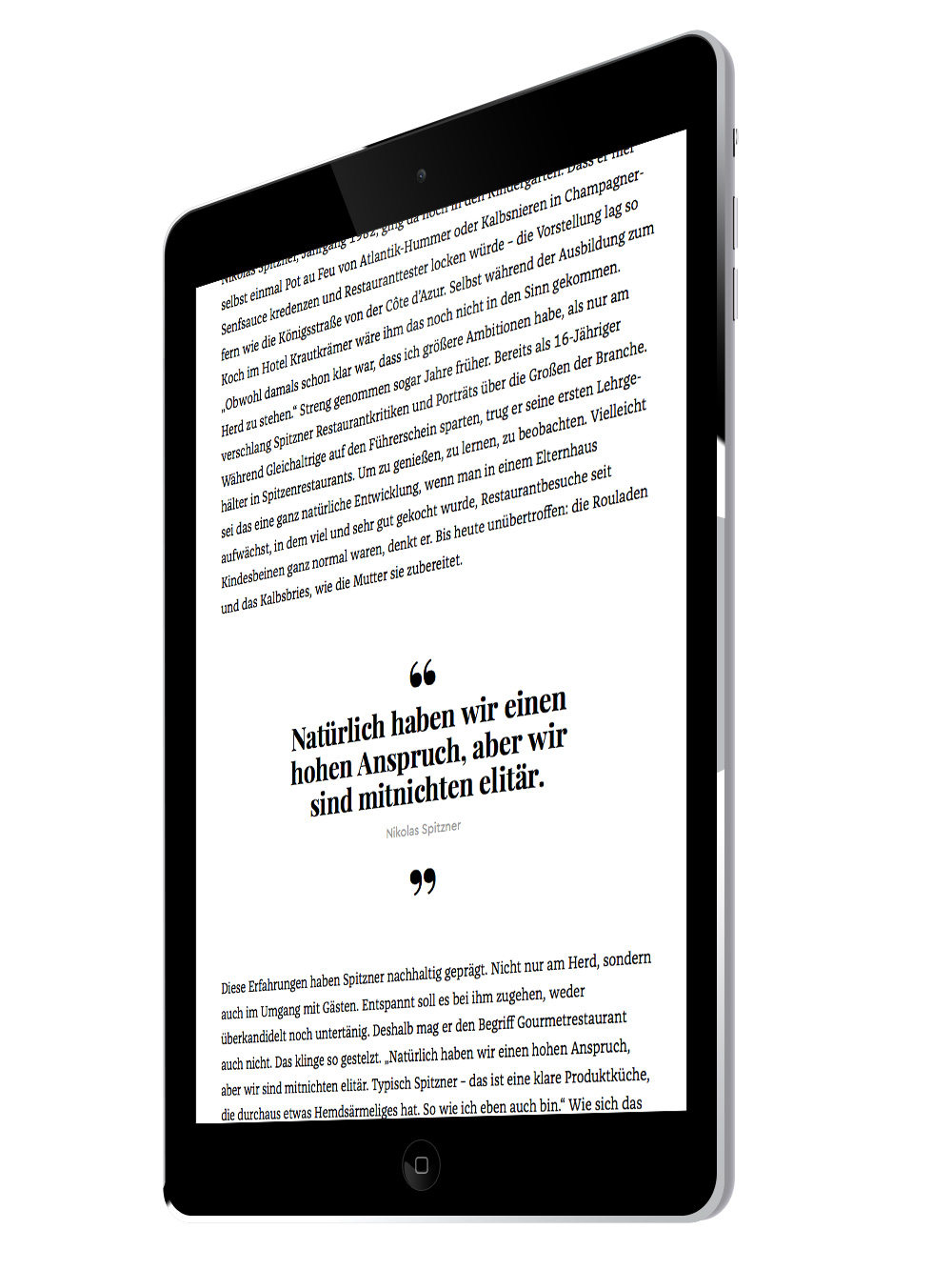
Photo: Jakob Runge. License: All Rights Reserved.
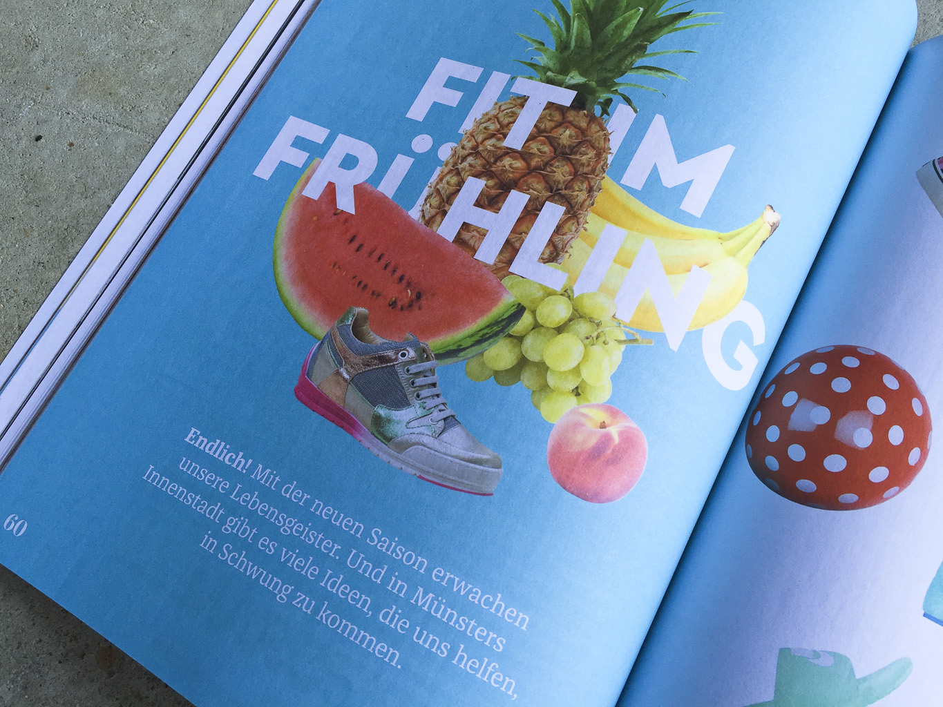
Photo: Jakob Runge. License: All Rights Reserved.
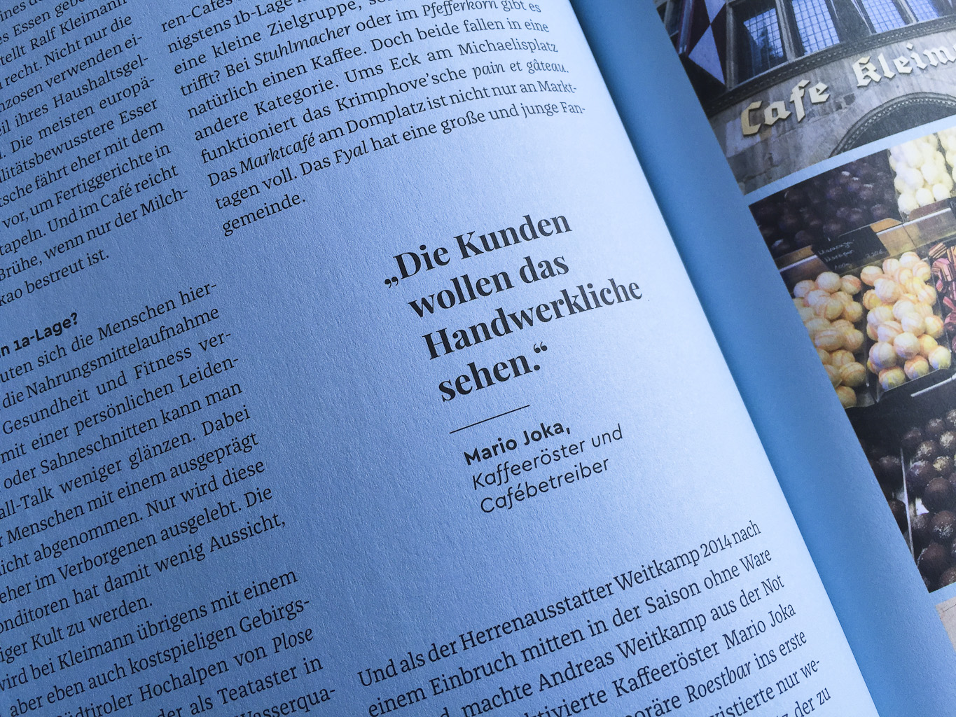
Photo: Jakob Runge. License: All Rights Reserved.

Photo: Jakob Runge. License: All Rights Reserved.

Photo: Jakob Runge. License: All Rights Reserved.


</span>")


")
")


1 Comment on “Münster Urban, issue 2”
I couldn’t find a match for the Fat Face used for the stacked ‘MU’ initials. Falstaff or Wood Type Bodoni JNL come pretty close.