
Stranger Things

“Stranger Things is a supernatural horror television series created by the Duffer Brothers. The show is set in 1980s Indiana, where a young boy vanishes mysteriously, and a telekinetic girl appears, who helps the boy’s friends in their attempt to find him. The show was released by Netflix on July 15, 2016. It was met with positive reviews by critics, and was praised for its characterization, pacing, atmosphere, acting, and homage to 1980s Hollywood.”
The main title sequence was created by Imaginary Forces:
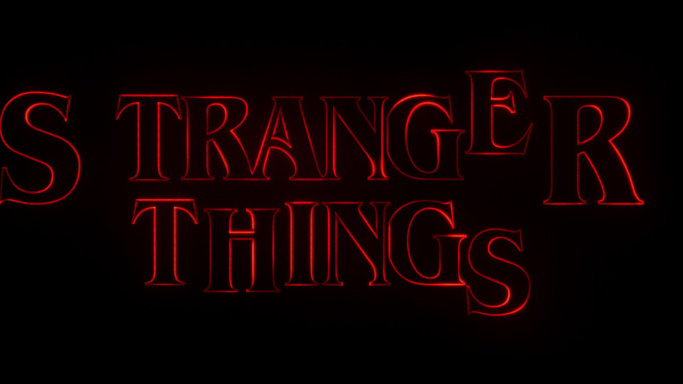
A disjointed version of the title starts the sequence which typographically sets the tone for the show. Imbuing the opening with a sense of unease, the music informs the movement of the type as the letterforms slide together to form the title. … mimics an optical look which reflects the time period of the show, it also seems as if light is passing through film, creating a lush haptic quality.
The Duffers cite Richard Greenberg’s iconic title designs as being an influence on their direction for the titles:
There was a two-fold inspiration. One was, in terms of the font [ITC Benguiat] and the title design, going back to those old vintage Stephen King books. We sent 12 different old covers to Imaginary Forces, who were designing the titles — we wanted it to be in the style of these novels. There’s something about when we were kids, when you would open up one of these big fat Stephen King novels that we loved. We wanted the show to have that sort of feeling every time you got to a new chapter.
So that was for the font. Then for the actual design, we’re pretty obsessed with this designer Richard Greenberg who did so many great title sequences back in the day, whether it was Alien or The Untouchables or The Goonies or Superman. Altered States. What he specialized in was using just graphics: title graphics, titles over titles. That’s something we really wanted to do. Part of it was, it felt it represented the show well. Title sequences are so great nowadays, but it’s almost like they’re getting more and more elaborate and trying to top each other. As opposed to trying to top these amazing title sequences, what if we just go back to the simplicity of these great titles we loved growing up? There’s something to us that feels epic about those titles. Something like The Untouchables which is just basically just a font. It’s so epic and memorable, so we wanted to go back to that simplicity.
See also Stephen King’s The Dead Zone, for which Greenberg did the title sequence for the film adaptation.

Poster.

Stills from titles.


")


 movie poster")


 TV series titles")


 movie posters")


 movie artwork")


")
 titles")


")


15 Comments on “Stranger Things”
ITC Benguiat encouraged tight, all-caps setting from its very beginning. Here’s an ad in U&lc that appeared shortly after the typeface’s launch:
Here’s an example of the typographic style that inspired the Stranger Things title: centered caps with large first and last letters, middle letters shifted up. Many of the 1980s covers for Stephen King novels are set in this template, regardless of typeface.
From Sarah Gless’ nice post, a relevant overview of Stephen King covers with the interlocking style of typesetting.
Also shares a similar style to the old Choose Your Own Adventure books:
See also:
Almost identical font to this Stephen King cover of Needful Things
Source: http://en.wikipedia.org/wiki/Needful_Things
Not sure if the letterforms on the cover of Needful Things are from a font. If so, then they were heavily modified, maybe based on a version of Latin. See also Stephen King’s The Dead Zone featuring the related Cortez.
The second season of Stranger Things was released last week and there was just one obvious adjustment to the titles and logo: the addition of a giant Benguiat 2:
The designers modified the numeral a bit, adding a spiky serif to the top to replicate the one on the baseline. Here’s ITC Benguiat Condensed Bold out of the box:
Hi,
any idea what font the ‘Original music by…’ words would be in?
Hi Koen, that’s ITC Benguiat Bold.
What font is used in the end credits of Stranger Things?
Hi Rayyan, the end credits use Benguiat Bold. I have added a video of the end credits to the post.
Anyone knows what’s the font used for the alphabet on the wall ?
This one? I highly doubt it’s a font. A set designer probably painted the letters onto the wall, without referencing an existing typeface. It could very well be that a fan later created a font based on that alphabet. I’m not aware of such a font, though.