
Dawn of the Dead (1978) movie posters
In memoriam George A. Romero, “Father of the Zombie Film”
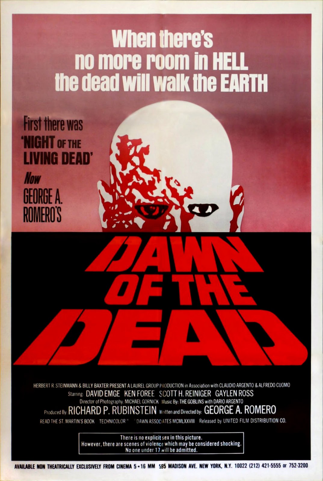
US poster by United Film Distribution Co., 1978
Dawn of the Dead from 1978 is the second film made in George A. Romero’s Living Dead series after Night of the Living Dead (1968). It is also known internationally as Zombi(e). Looking at the various international posters reveals that the film has at least four different typographic identities.
The iconic US poster shows the title in a skewed perspective. The capital sans serif letterforms (in red or green) are probably lettered, and not derived from a typeface. Only the letter ‘D’ has a stencil-like bridge. The typeface used for the tagline (“When there’s no more room in HELL, the dead will walk the EARTH”) is Anzeigen-Grotesk. The tertiary text on the left is in one of the styles from Filmotype’s “G-series”, see Giant.
Some French, Spanish and German posters feature a very different but likewise non-typographic logo, with hand-drawn caps on a curve, dripping with blood, shaded and sometimes additionally outlined in venomous yellow (not pictured here). Note that in the German version, the ‘Z’ gets a crossbar (in line with the local preference in handwriting and signpainting). This splattery approach comes closest to the stereotype nowadays associated with zombiesque type.
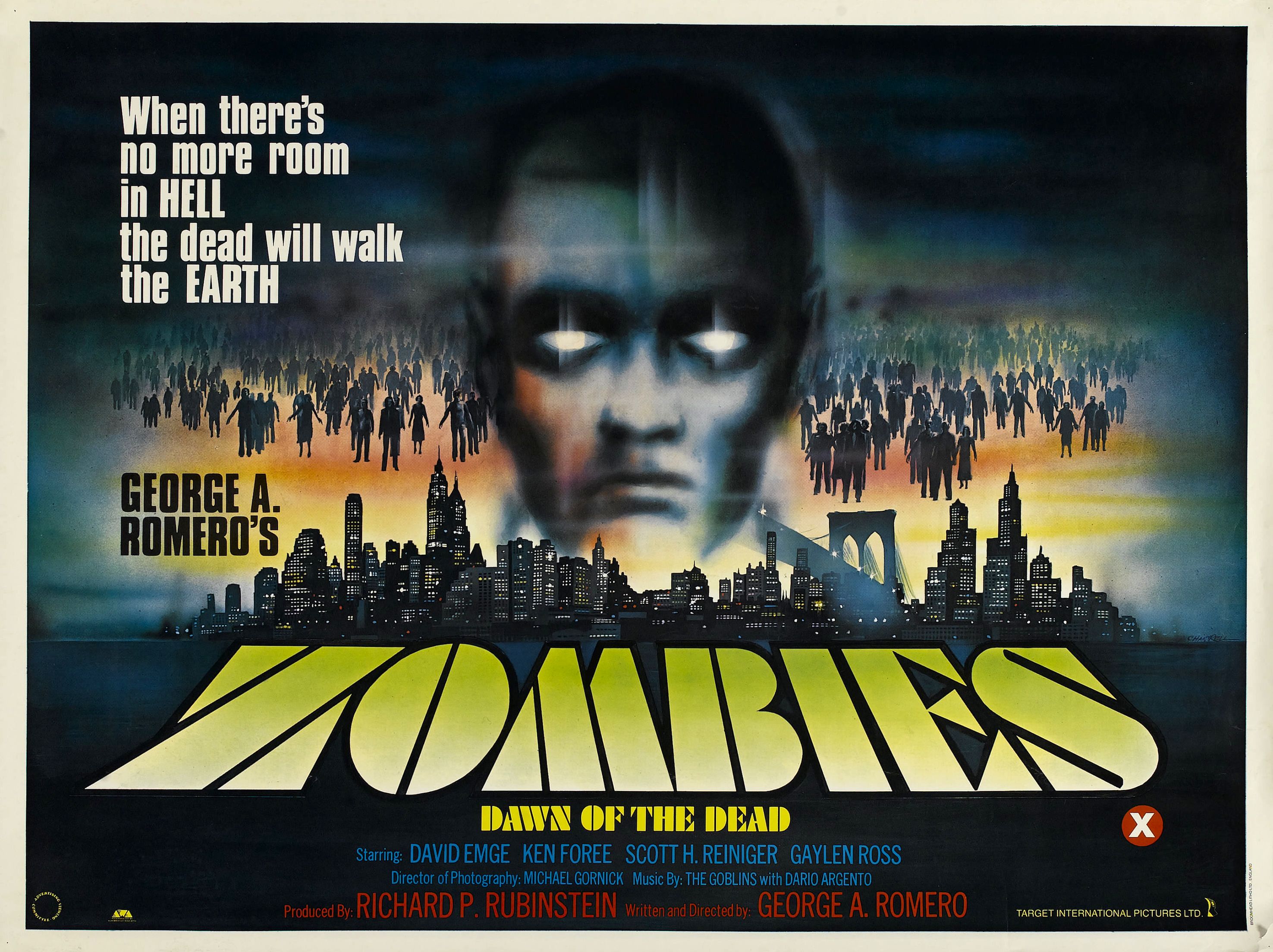
Poster by Target International Pictures, UK, 1979. Artwork by Tom Chantrell. Printed by Broomhead Litho Ltd.
The UK poster by Tom Chantrell picks up the dramatic perspective effect of the US version, but applies it to an identifiable typeface: Here it is Paul Renner’s Futura Black that hints at the dark future to come. The secondary typeface is the squarish British Inserat.
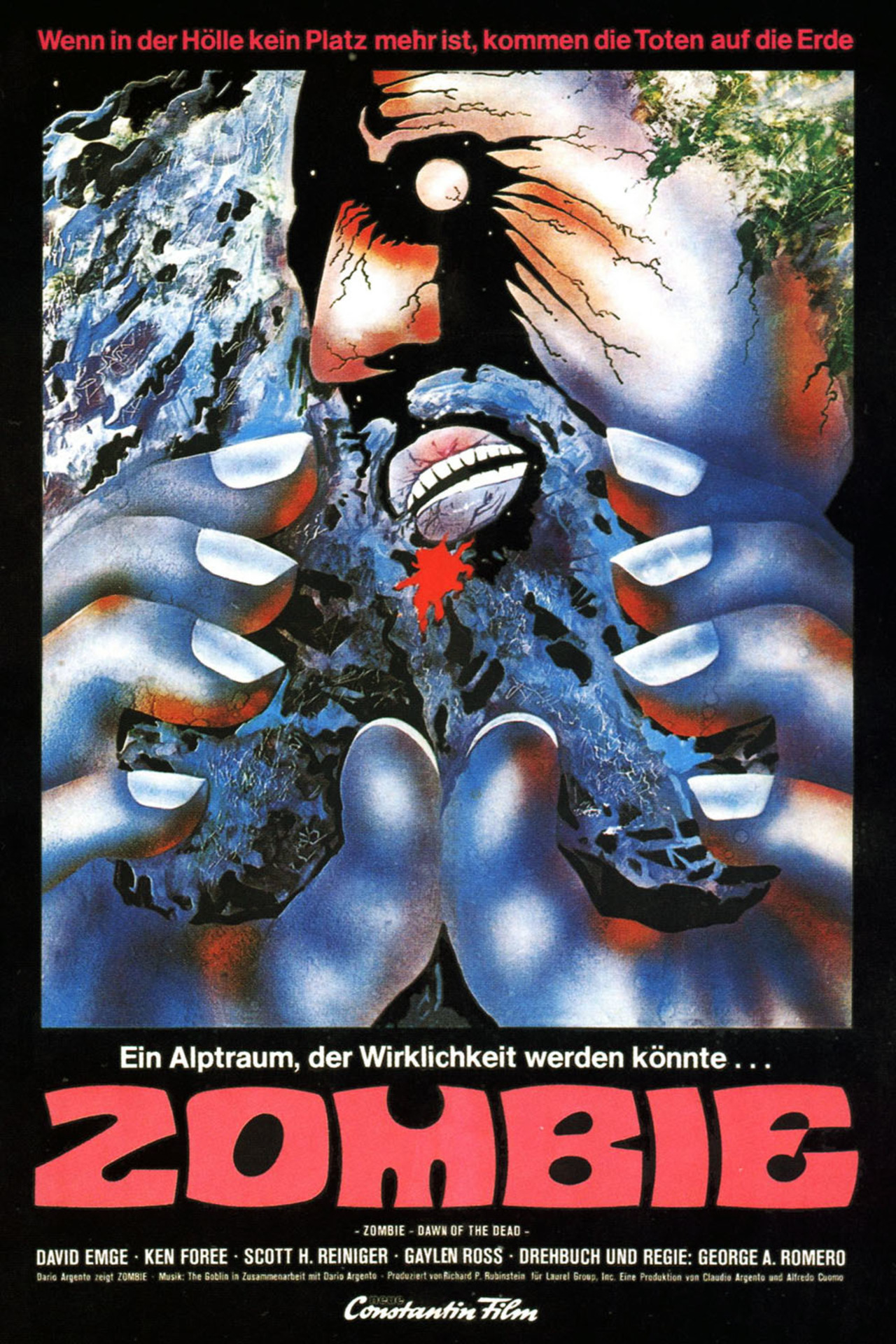
Poster by Constantin Film, Germany. Who took a bite out of the ‘M’?
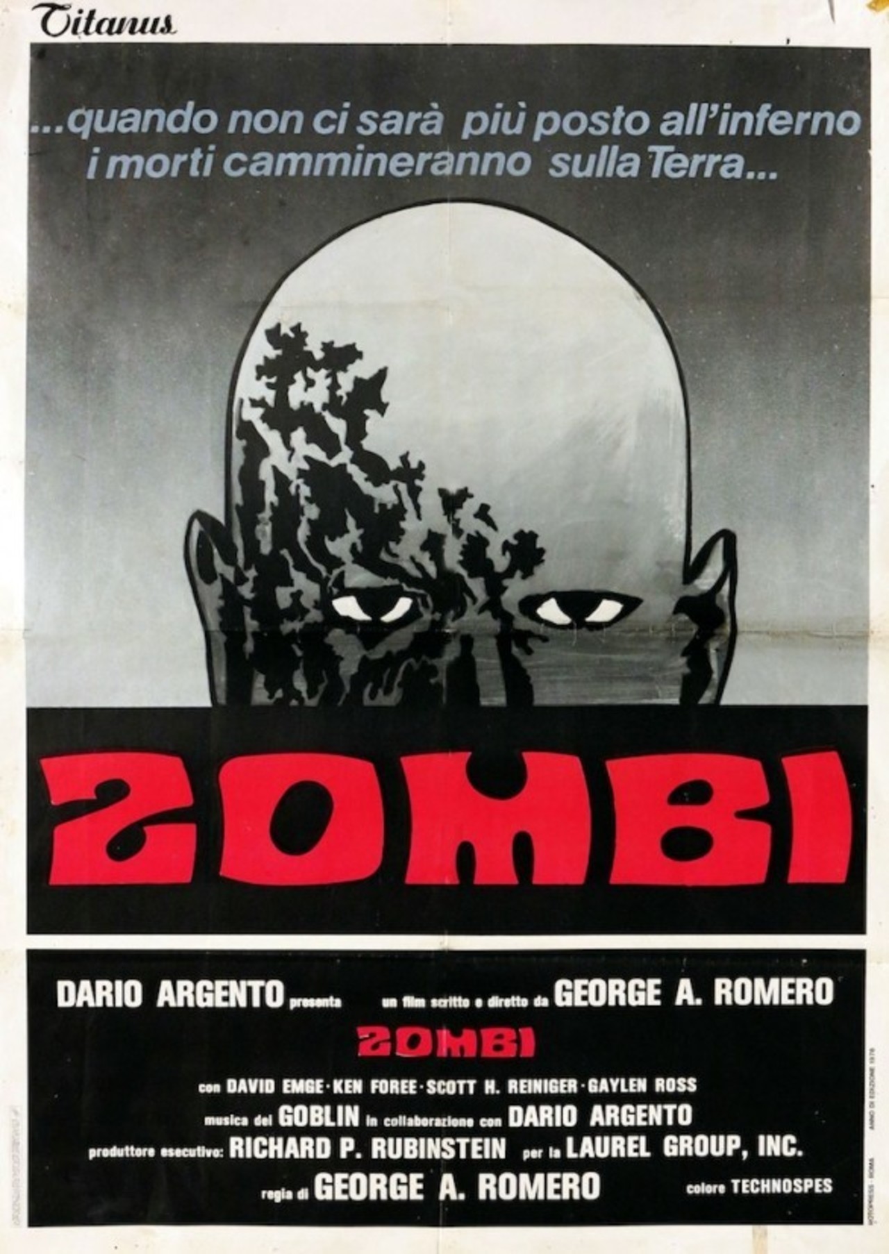
The fourth interpretation of what zombie typography could look like can be found on various European posters. The set of crude blocky caps — deformed to have concave lefts and convex rights — was designed by Meyer “Dave” Davison and issued by Photo-Lettering, Inc. as Davison Psyche in c. 1968. It soon after was adopted by Mecanorma under the name Contest.
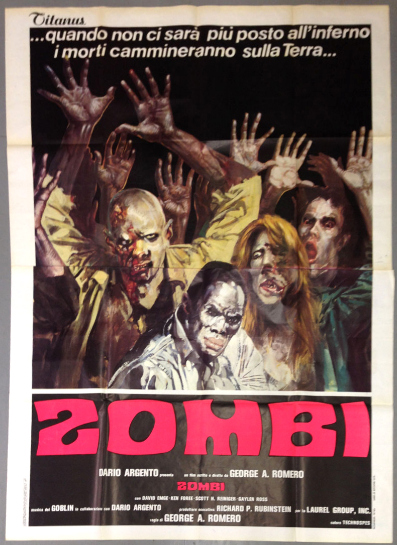
Large-format poster by Titanus, Italy. Davison Psyche/Contest is spaced less tightly than in the German version.
Another poster by Titanus, Italy, with the zombie head from the US poster rendered in black and white.
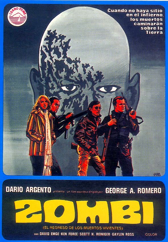
Poster by Ízaro Films, Spain. Davison’s letterforms were mindlessly redrawn, with all life sucked out of them.

Alternative poster by Ízaro Films, combining the “Zombi” logo in Davison Psyche with the original US version.
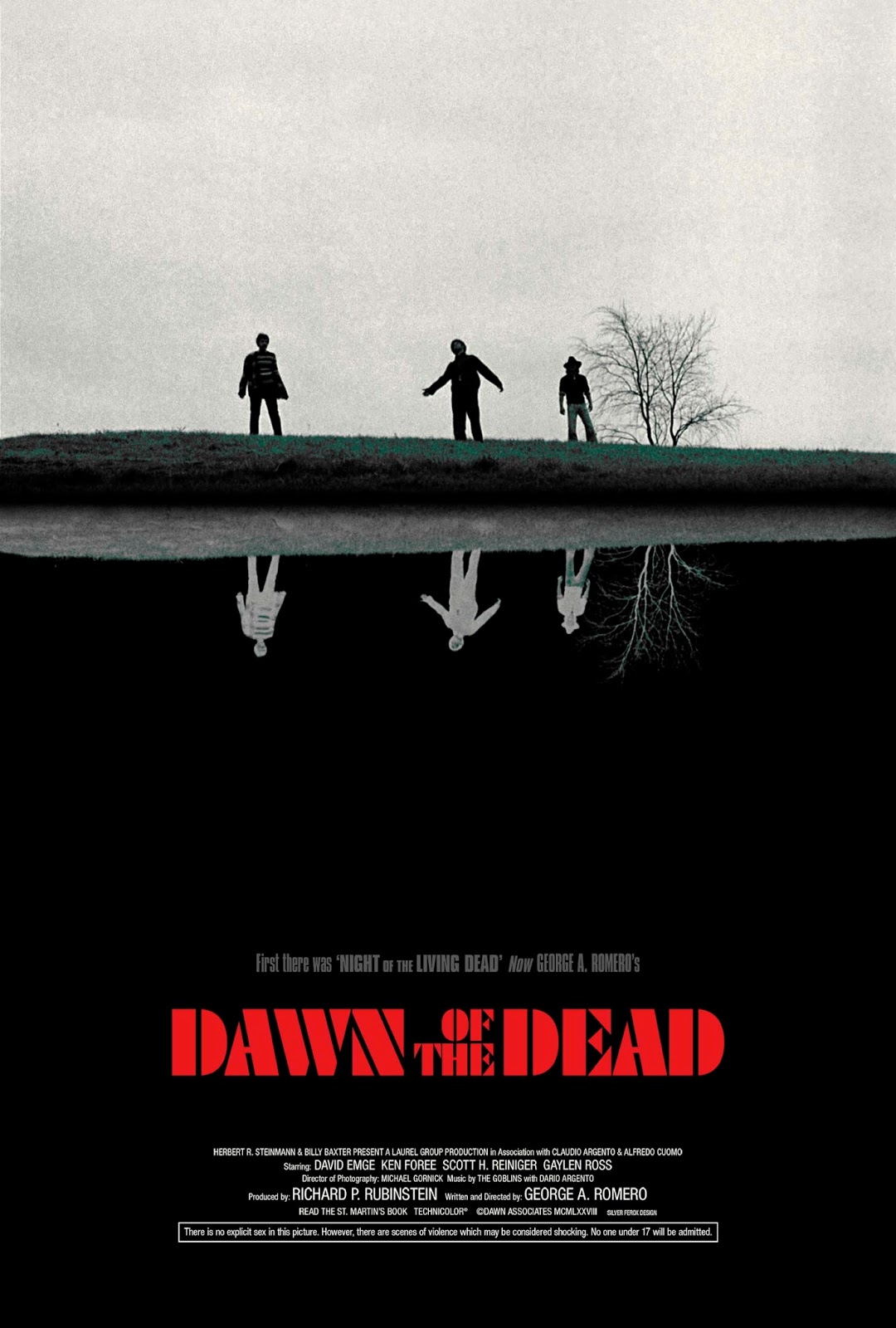
In a series of (more recent) alternative posters, Silver Ferox Design echoes the type choice of the original UK version. See more gory posters on their website.


")


")


 teaser poster")


 TV series")

")


