
The Hague’s Finest
Contributed by Matthijs Sluiter on Oct 15th, 2016. Artwork published in
October 2016
.
Source: www.studiohetmes.nl License: All Rights Reserved.
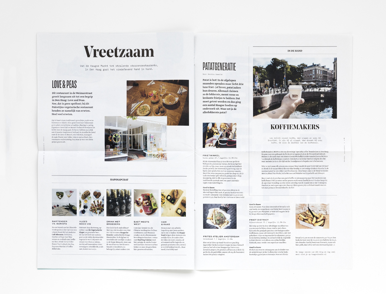
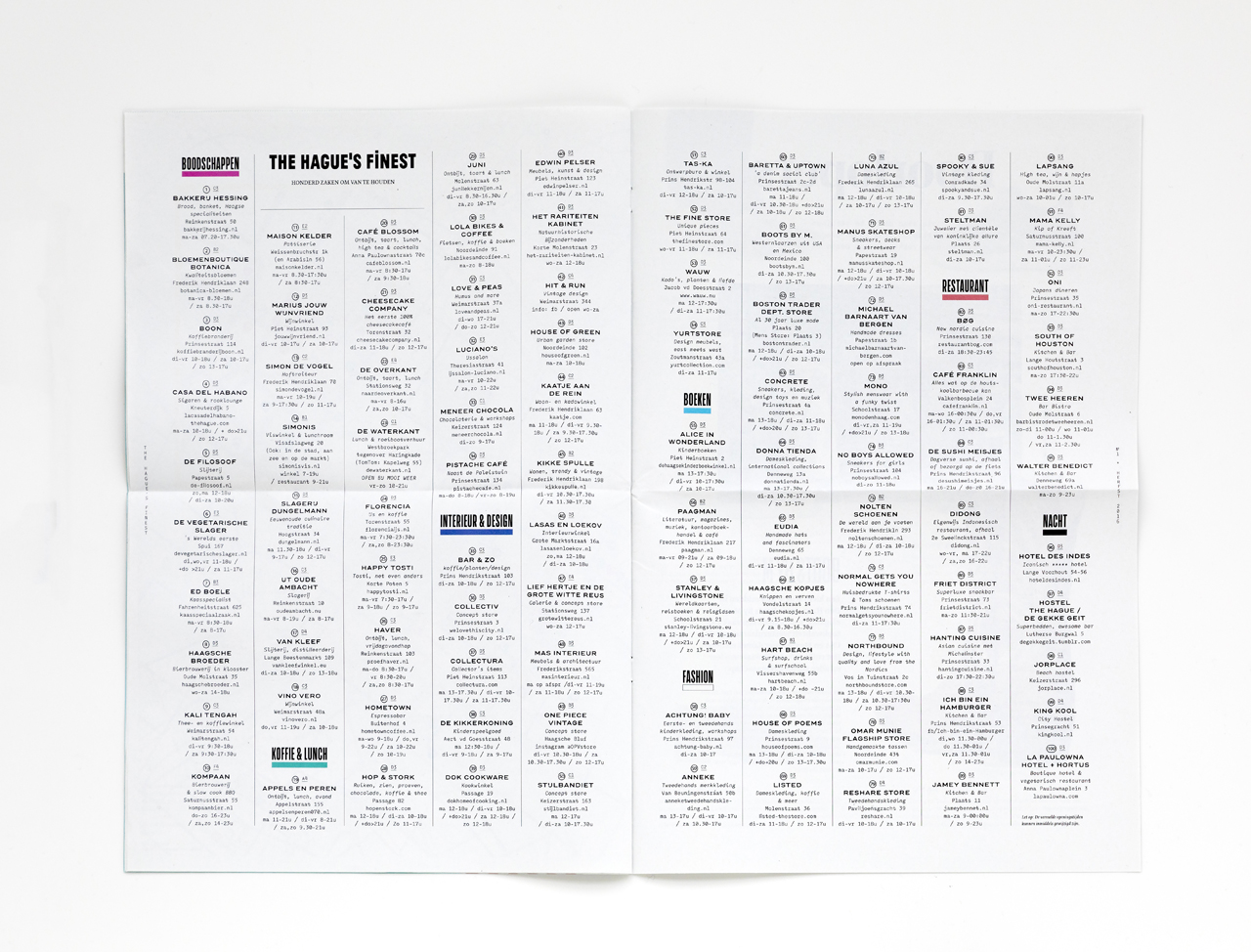
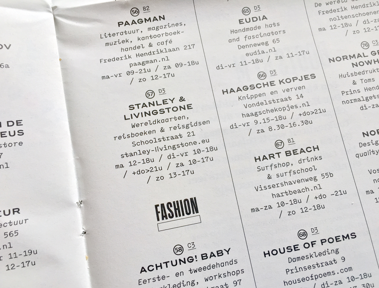
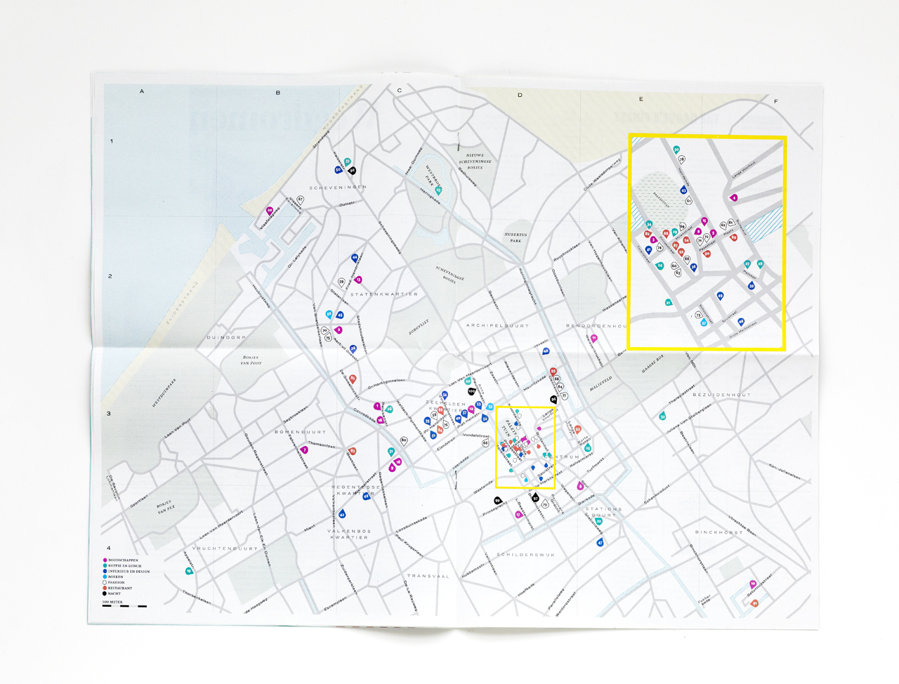
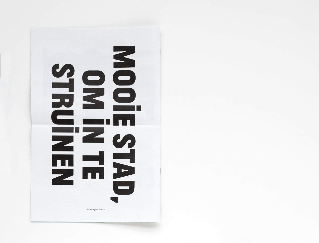
A free newspaper with a map and address list as a means of stimulating both tourists and residents of The Hague to visit more local makers and shops outside the main streets. It was a logical choice to limit the type palette to fonts made by designers who work(ed) or studied in The Hague. A decision that left us with way too much typefaces that easily work together – the work of established type designers and their students share some logic or vision, more than we expected. We settled for recent typefaces form the last 5 years or so, that could cope with large pages and short texts. On a detail level, choosing ‘local’ type shows in the text with plenty of Dutch ij-ligatures, (plus one j-acute just for fun).

Source: www.studiohetmes.nl License: All Rights Reserved.

Source: www.studiohetmes.nl License: All Rights Reserved.
Source: www.studiohetmes.nl License: All Rights Reserved.
Source: www.studiohetmes.nl License: All Rights Reserved.
Source: www.studiohetmes.nl Photo: Matthijs Sluiter. License: All Rights Reserved. Artwork by Matthijs Sluiter.
Source: www.studiohetmes.nl License: All Rights Reserved.

Source: www.studiohetmes.nl License: All Rights Reserved.
Source: www.studiohetmes.nl License: All Rights Reserved.


")


