
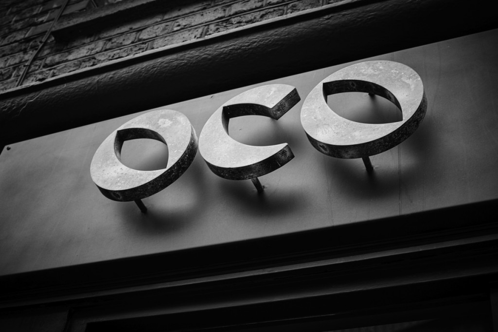
OCO Glasses
Contributed by Gareth Hague on Oct 28th, 2016. Artwork published in
.
License: All Rights Reserved.
What does OCO (pronounced “Oh Co”) stand for? Nothing. We just chose the word because it looks a bit like two eyes and a nose, and it’s similar to the word for “eye” in many European languages. What more could we ask for? —OCO
Harbour’s lower case o and c characters make a distinctive logo for OCO Glasses. For the shop signage the logo is an acid-treated metal, raised from the shopfront.
License: All Rights Reserved.


2 Comments on “OCO Glasses”
I can see two myopic/squinty eyes, but I’m struggling with the nose.
@Simon It’s sort of an upturned nose.