
Drake’s Brewing Co. label redesign
Contributed by Frank Grießhammer on Jan 2nd, 2017. Artwork published in
.

Photo: Frank Grießhammer. License: CC BY-SA.
Old label on the left, new one on the right
Local brewery Drake’s has re-designed their labels – for the better.
The hodgepodge selection of typefaces on the old label (Memphis + Archer!) was cleaned up, the color palette much improved. The “INDEPENDENT” badge on the new label reminds me a lot of House Industries’ factory logo, but I am not bothered by it.
The typeface used for the old DRAKE’S is probably Group Type’s Raleigh Gothic Condensed or a modified FB Agency.
I have to admit I’m buying much more Drake’s than I did before. Drink Local!
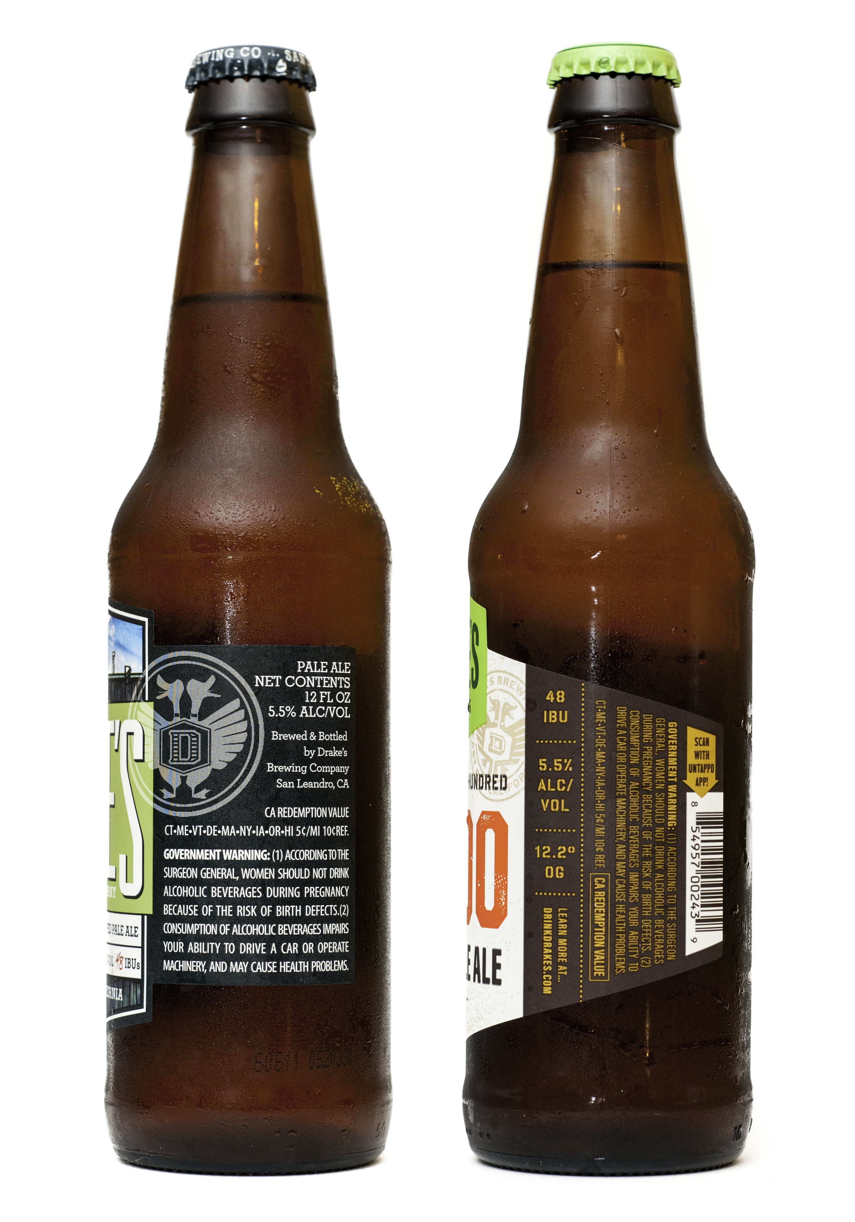
Photo: Frank Grießhammer. License: CC BY-SA.
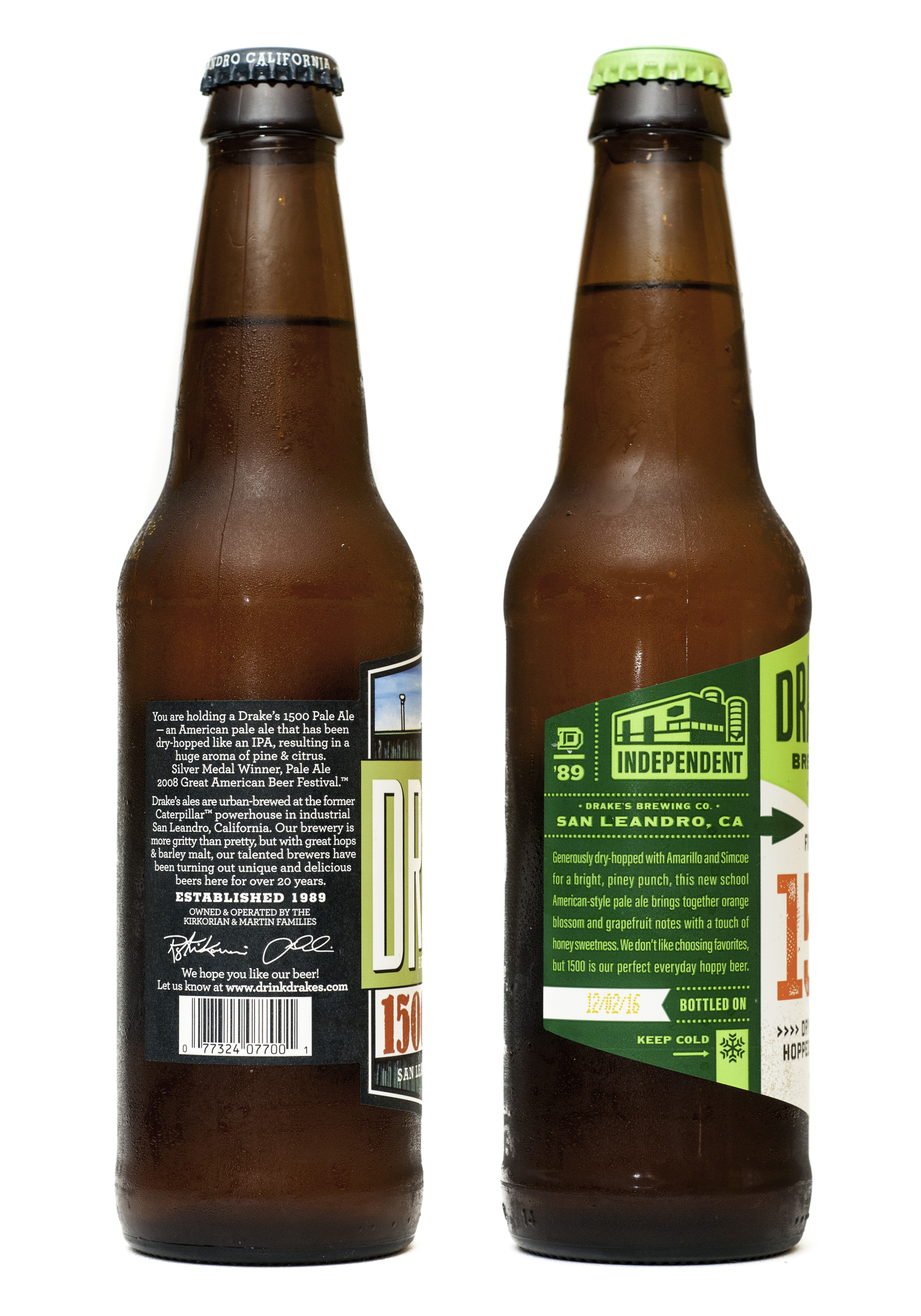
Photo: Frank Grießhammer. License: CC BY-SA.


