

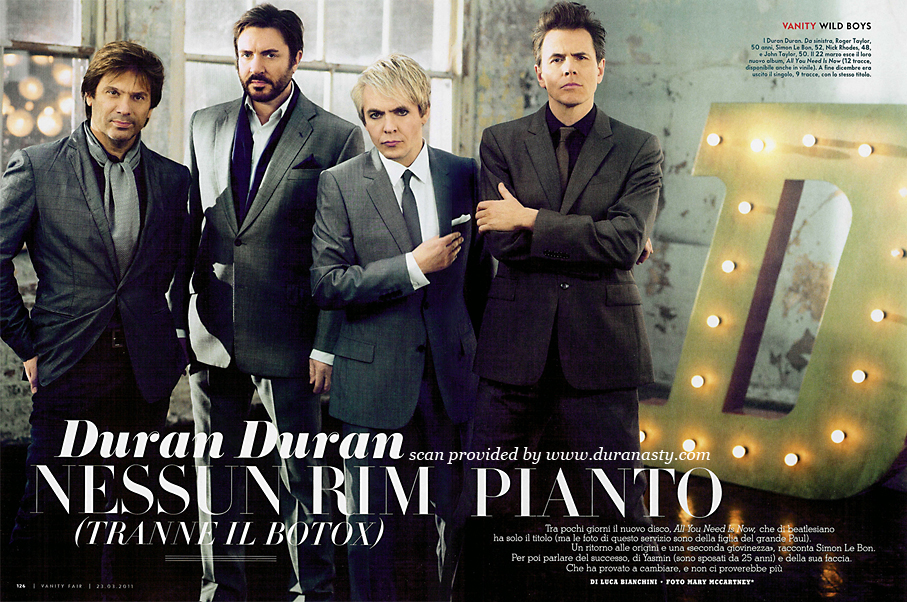
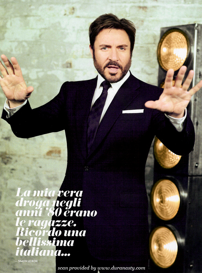
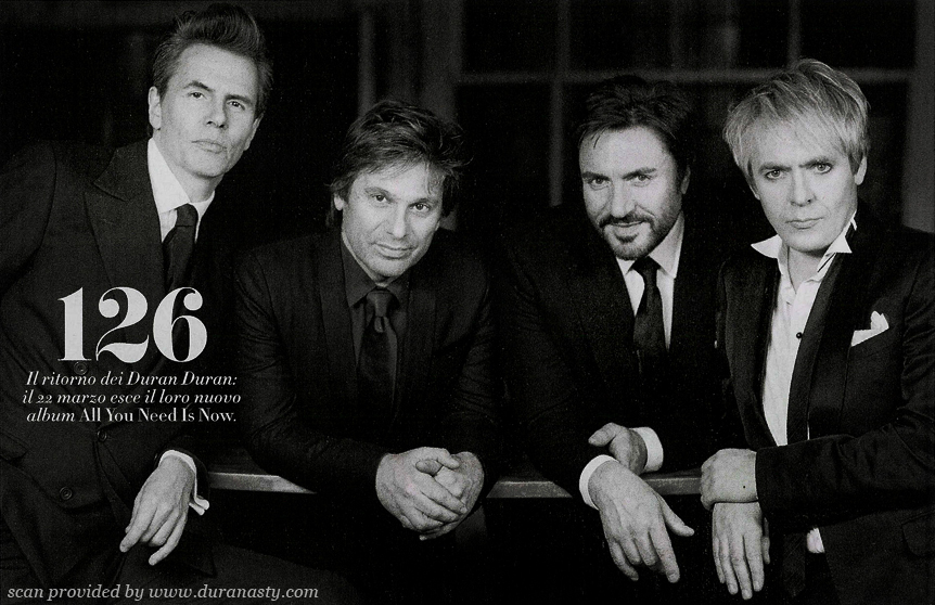
Italian Vanity Fair (2011)
Contributed by Stephen Coles on Jun 17th, 2012. Artwork published in
.
Source: www.duranasty.com License: All Rights Reserved.
Source: www.duranasty.com License: All Rights Reserved.
Source: www.duranasty.com License: All Rights Reserved.

Source: www.duranasty.com License: All Rights Reserved.

Source: www.spetteguless.it License: All Rights Reserved.

Source: www.derfilmriss.de License: All Rights Reserved.


")


, 13–16 June 2013")


2 Comments on “Italian Vanity Fair (2011)”
It’s a pity there are no ultra bold weights in H&FJ Didot. Eloquent just doesn’t have the elegance and refinement it takes to be seen next to Hoefler’s Didot. And that tightly spaced Stymie is really not so good for text.
I have to disagree about Eloquent. I think it is really beautiful and elegant. Maybe not refined but it looks great in big sizes. Maybe not suited for VF, but still, really nice font.
Although I have to agree, it does not go well with Didot.