Rollin ad: “A Coupe of Unmistakable Smartness”
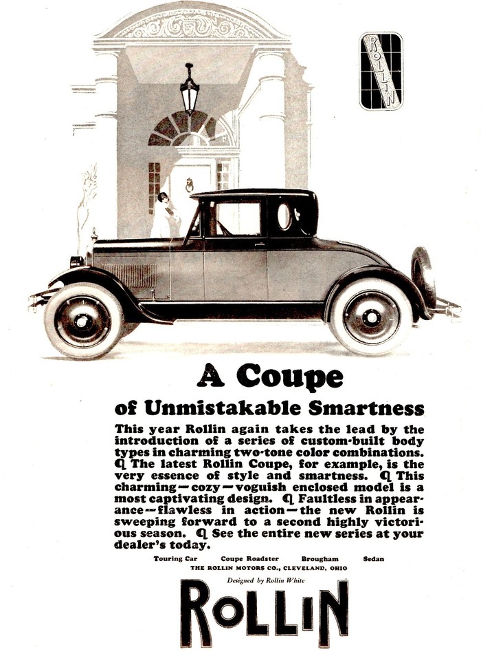
Here’s a rather early use of Cooper Black, in an American car ad from 1925. The super-black typeface was first issued by Barnhart Brothers & Spindler in 1922. Richard N. McArthur, sales manager at BB&S, who had “requested that the typeface be drawn bolder and bolder” [Ian Lynam], “described it as ‘the selling type supreme … it made big advertisements out of little ones’”, while designer Oswald Cooper “was heard to say that his invention was ‘for far-sighted printers with near-sighted customers.’” [Steven Heller in Eye no. 7 vol. 2, 1992] It was an immediate hit and “became the foundry’s best selling type before its merger with ATF seven years later, and ATF’s all-time second-best-selling type (after Copperplate Gothic).” [Mac McGrew] Not only did the novelty design quickly find its way into the type drawers, it also fed back into the realm of lettering, see e.g. an O’Sullivan’s ad from 1924 with freely drawn letterforms apparently modeled after Cooper’s typeface design.
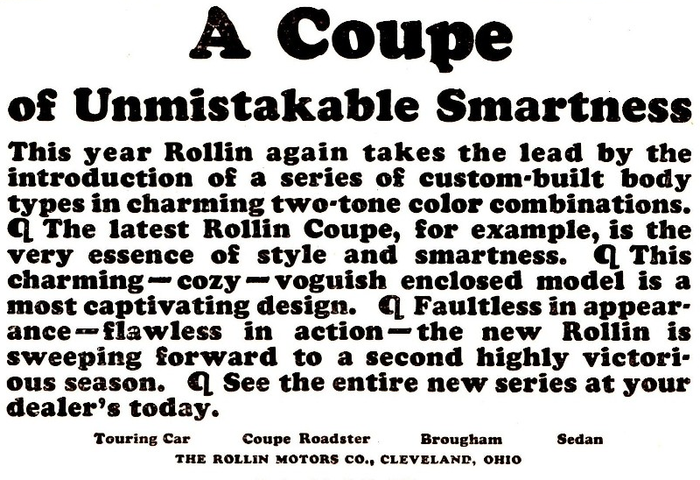
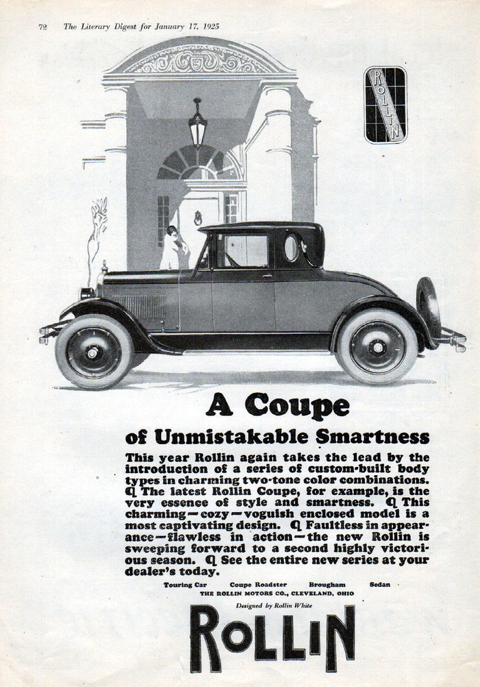
Most of the many ads from the mid 1920s use the juggernaut only sparingly, typically for no more than one or two lines, and often in caps only. This one by The Rollin Motors Co. is different. It features the typeface for almost all of the copy; from the headline to the fine-print company name, in a total of five sizes. “Cooper Black looks best in solid masses—thin spacing between the words and not much leading between the lines.” At least the second part of this advice from a specimen was heeded here. The lengthy justified block of text is broken up by the rarely seen pilcrow (¶), one of the few special characters included in the font, and together with the ampersand and maybe the ‘Q’ the only glyph that nowadays still gives away the true age of this typeface. Of the many digital versions, Wordshape’s appears to be the only one to include the original pilcrow.
On Flickr, Alden Jewell AKA Autohistorian notes that the 1925 Rollin Coupe was “a small, high quality 4-cylinder car designed by Rollin White, former Chief Engineer of The White Company. Only 8500 Rollins were built in 1924 and 1925 before the company went bankrupt.”
Formats
- Advertising (1402)
Topics
- Product (985)
- Automotive (204)
Tagged with
- magazine ads (226)
- cars (117)
- 1920s (78)
- pilcrows (25)
- Rollin (1)
- early uses (1253)
Artwork location
- United States (6349)
- Cleveland (8)


















3 Comments on “Rollin ad: “A Coupe of Unmistakable Smartness””
Now I have seen enough Cooper Black for the rest of my life.
Well played.