
The Beer Institute
Contributed by Stephen Coles on Aug 2nd, 2013. Artwork published in
.
Source: www.whois3.com License: All Rights Reserved.
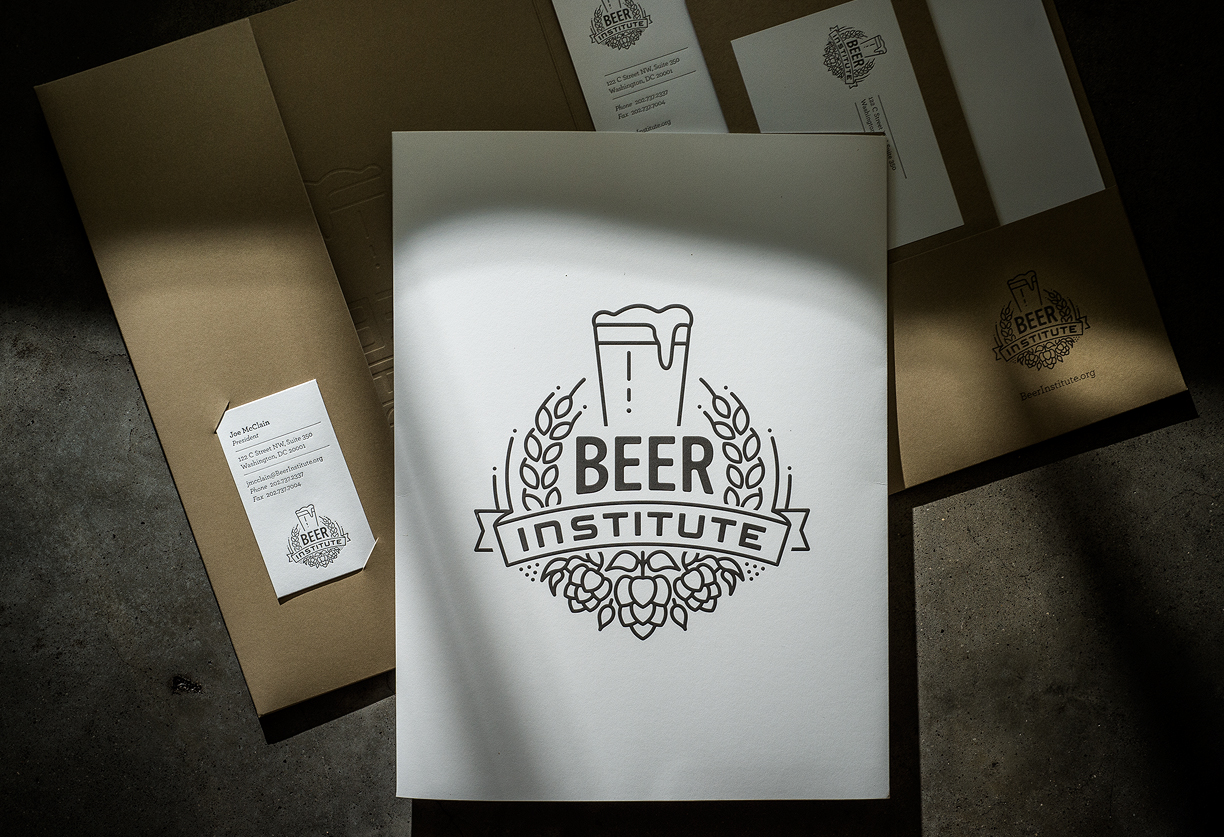
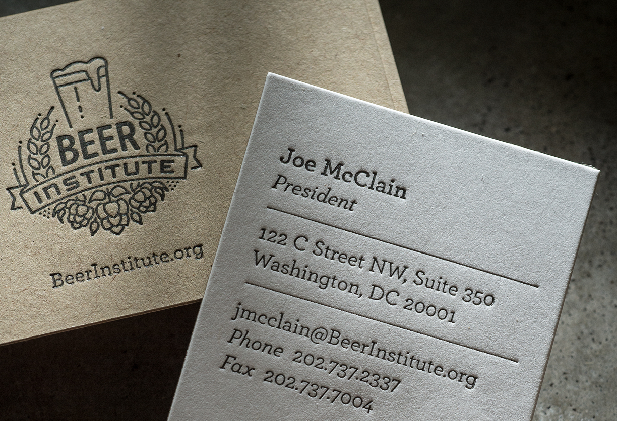
The Beer Institute was organized in 1986 to represent the beer industry in the US. They recently got a new identity and website from 3 Advertising. The logo — featuring Mayo, a softened Trade Gothic Bold Condensed No. 2, and a nice pictogram-style illustration representing basic beer ingredients — is fashioned in the Hip Traditional style currently favored by craft brewers and their customers.
Supporting the identity in the stationery is Archer. The typeface may be a tad twee for beer folk, but it does echo the monoline strokes of the logo. It also survives an extra-deep letterpress impression on the business cards.

Source: www.whois3.com License: All Rights Reserved.
Source: www.whois3.com License: All Rights Reserved.
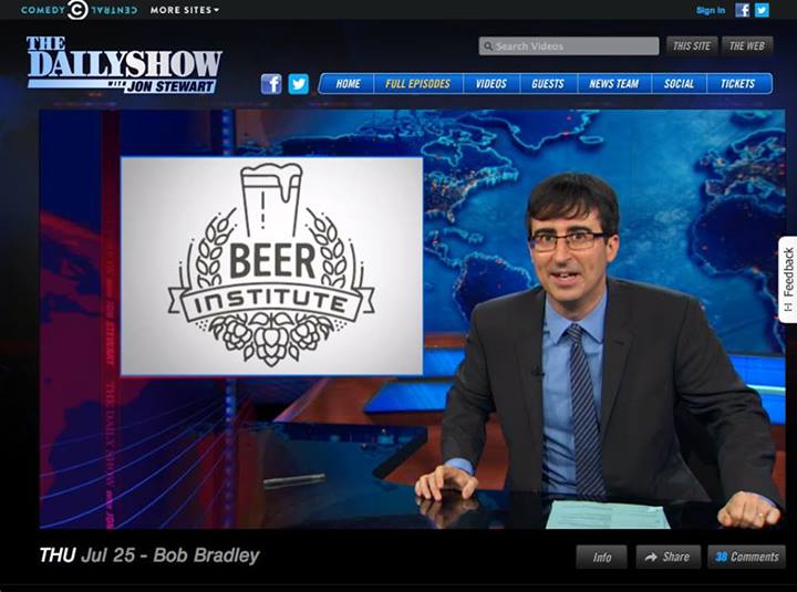
The logo starred in a segment on The Daily Show.


")


")


