An independent archive of typography.
to participate.
Topics
Formats
Typefaces

EGYD studio identity

Contributed by EGYD on May 14th, 2017. Artwork published in .
    EGYD studio identity 1
    Source: www.egyd.studio Photo: EGYD. License: All Rights Reserved.

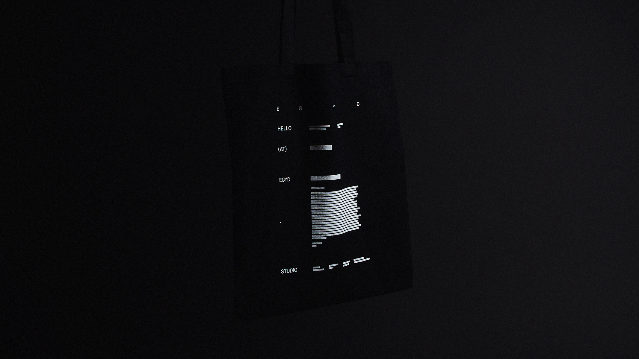
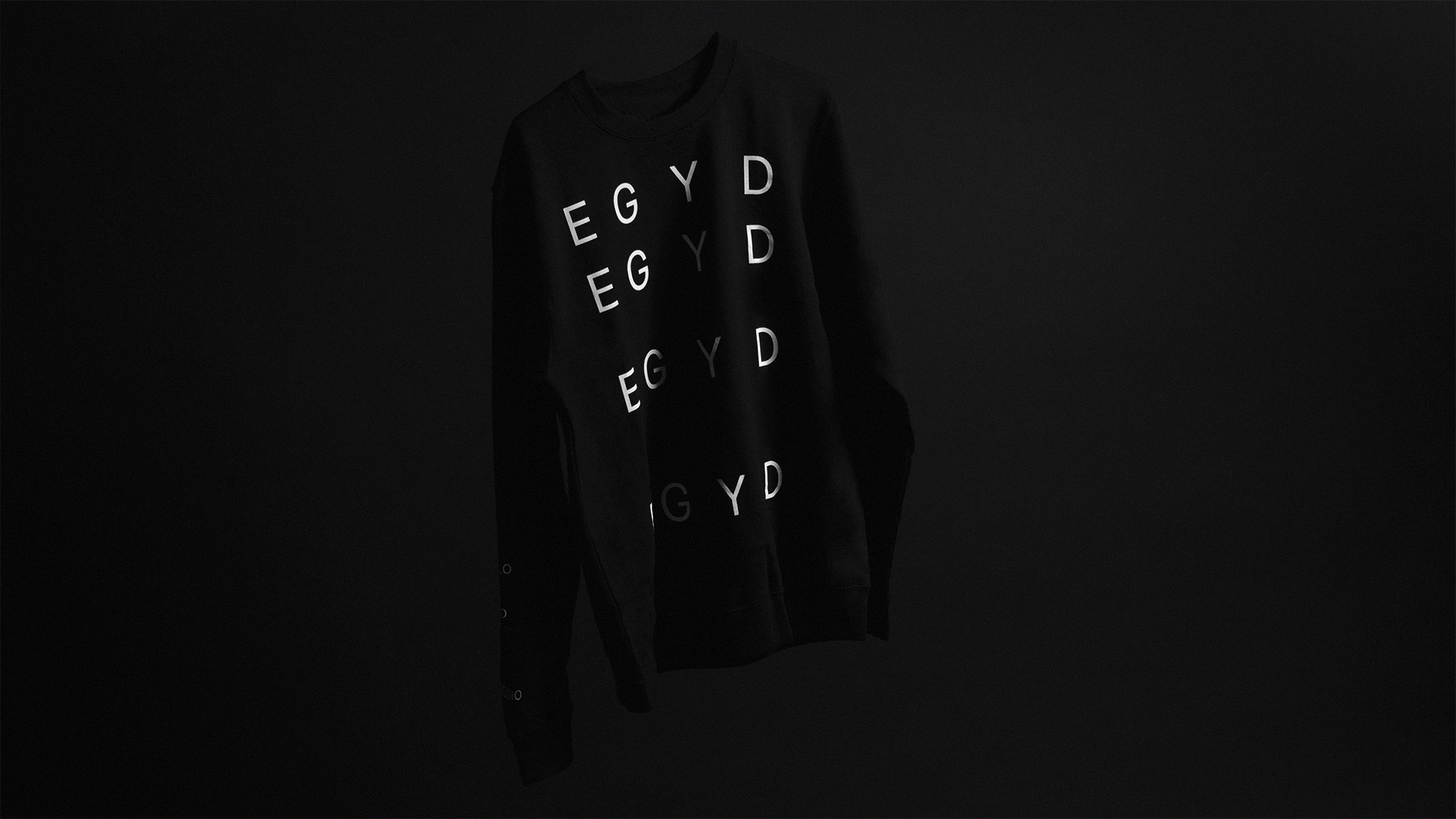
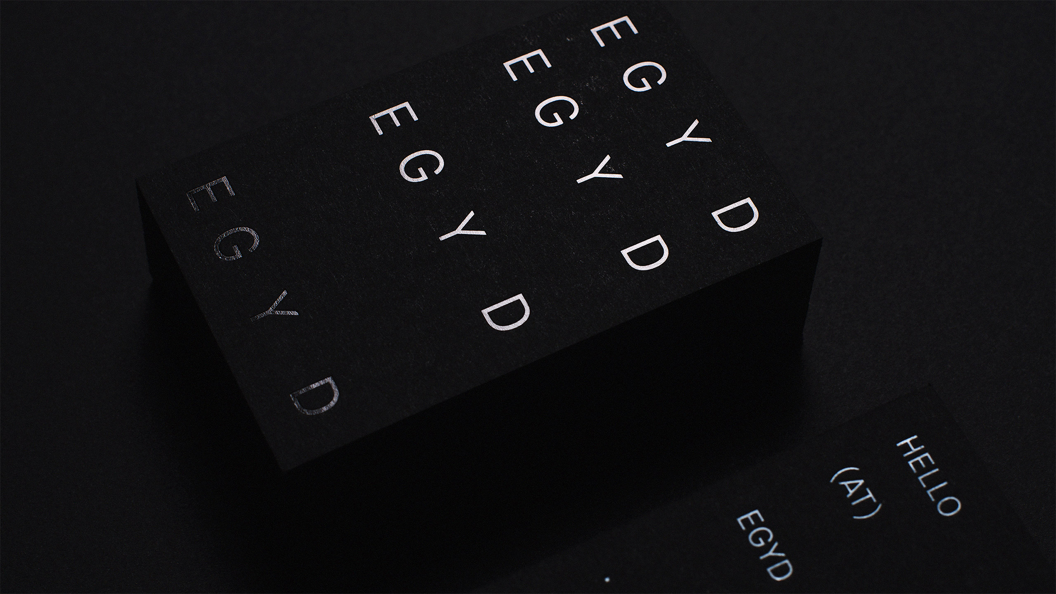
    Modest and outstanding, balanced yet differing, repetitive but unified. As a typographic principle for the word mark, steadily increasing spaces and line distances deliver the foundation for the use of text elements. Our email address establishes our unconventional method and reveals our domain, company form, and location. To solidify our presence, we are committed to the use of minimal yet highly tactile materials like reflective hot foil and ultra black paper. The resulting analog visual appearance was also applied to our website to unify our overall identity.

    More about this project on our website.

    EGYD studio identity 2
    Source: www.egyd.studio Photo: EGYD. License: All Rights Reserved.
    EGYD studio identity 3
    Source: www.egyd.studio License: All Rights Reserved.
    EGYD studio identity 4
    Source: www.egyd.studio Photo: EGYD. License: All Rights Reserved.
    EGYD studio identity 5
    Source: www.egyd.studio Photo: EGYD. License: All Rights Reserved.
    EGYD studio identity 6
    Source: www.egyd.studio Photo: EGYD. License: All Rights Reserved.

    Typefaces

    • Maison Neue

    Formats

    Topics

    Artwork location

    Post a comment