
“Designing a smarter planet”, IBM campaign

From the Office blog:
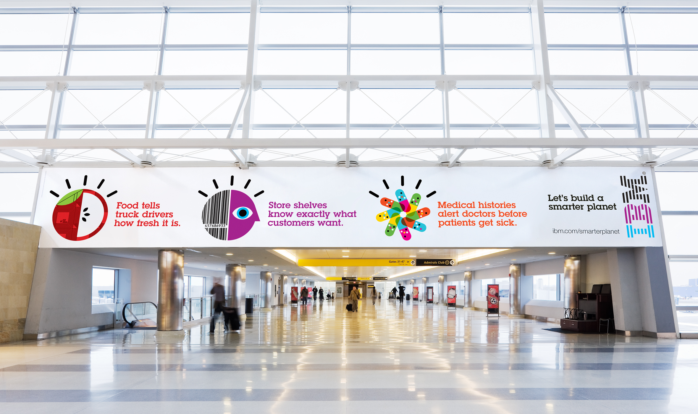
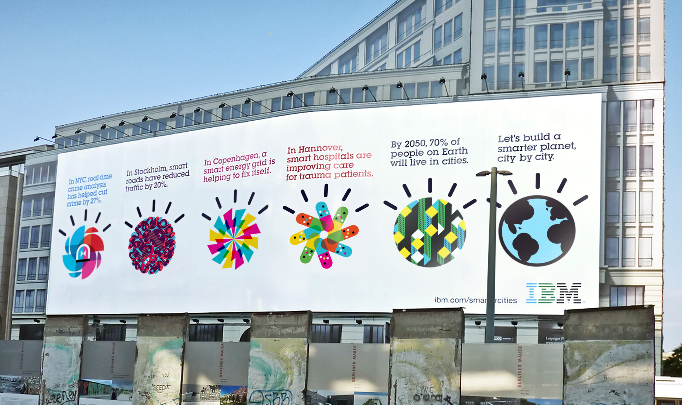
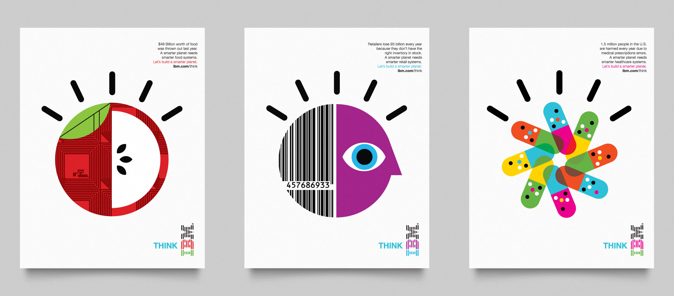
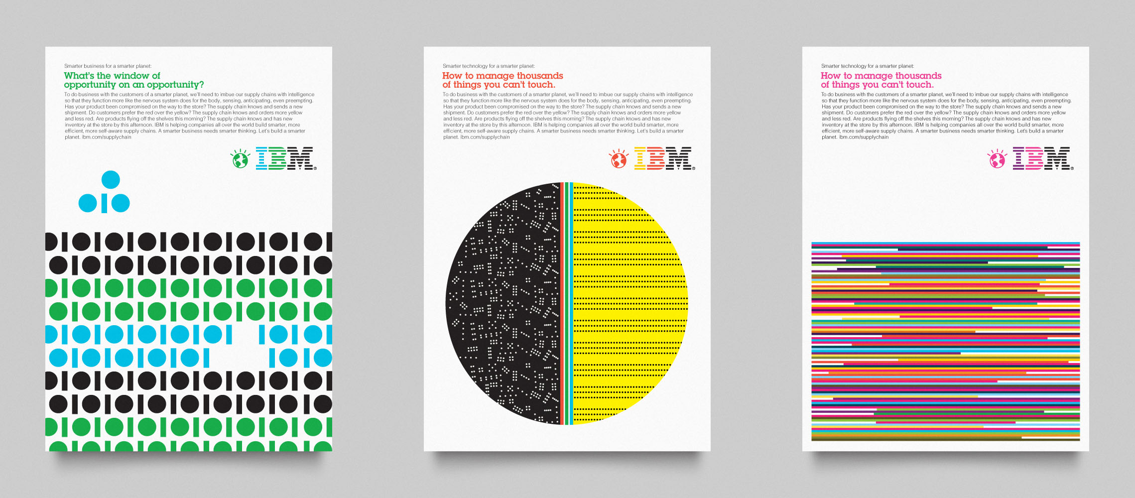
In the midst of the meltdown of the U.S. financial system, the ongoing consequences of a global energy crisis, and a broken health care system, IBM recognized a unique opportunity to provide new leadership. The timing was right to show how technology and data could solve some of the world’s biggest problems and create new opportunities. Ogilvy & Mather New York and IBM developed the concept of “Let’s Build a Smarter Planet” — a campaign that was about sharing and encouraging new ideas, rather than selling a product or service. Early in the concepting phase, Ogilvy asked Office to develop the campaign’s visual language.
Inspired by the creative vision that designer Paul Rand developed for IBM in the ’50s, ’60s and ’70s, the Office team adopted Rand’s boldness and “wink” to help grab people’s attention in a way that was vibrant, energetic and unusually approachable for big tech.
The campagain uses primarily the IBMs house cuts of both Neue Helvetica and ITC Lubalin Graph.


")


")

")


