

Pacioli presentation, Kerning 2017

Here we feature a use of Halyard in all three subfamilies (Display, Text, and Micro) in slides used for a presentation at Kerning Conference 2017. As an advising designer in the creation of Halyard, Antonio Cavedoni’s use demonstrates an intimate knowledge of how to use the Halyard superfamily to optimal effect.
Halyard is a perfect match for Cavedoni’s talk, in which he discusses the importance of scale to letterforms: “Shapes that work at one size don’t necessarily work for others. Adjusting letters for the distance, scale, and the viewing conditions that they will be read at is a primary concern.” Among contemporary sans serifs, Halyard is revolutionary in offering purpose built optical sizes, each of which was separately designed to be optimized for a specific range of viewing size. He illustrates his point with an animation showing Halyard’s three optical sizes:
Halyard’s Micro, Text, and Display are shown at the same size, so that their respective size-specific characteristics and adjustments can be examined and compared.
Cavedoni’s use of Halyard illustrates that the subfamilies are designed to maintain a consistent personality when they are used in their the intended sizes which creates the impression of a single type design. Small text like captions and map labels are set in Halyard Micro; quotes, lists and and other medium-sized elements are in Halyard Text; and large names and headings appear in Halyard Display. By “keeping it in the family”, all text elements are in harmony, and at the same time each one appears appropriate in terms of personality, proportion, spacing and clarity.

In this map, Cavedoni uses Halyard Micro Light, Medium, and Bold to create a clear hierarchy using the typographic variables of weight, size, letter-spacing, capitalization and color.

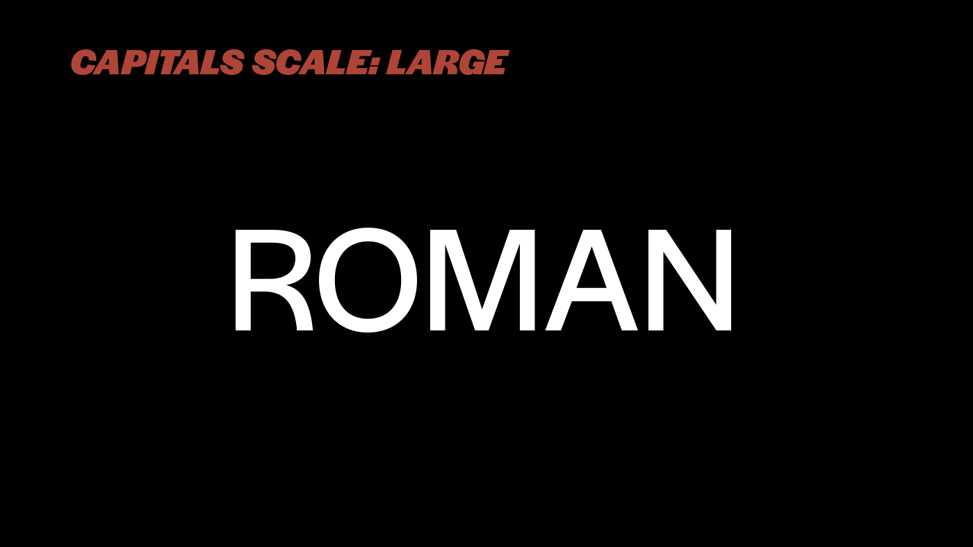
For the headings of his talk, Cavedoni chose italic caps — a less common yet attractive stylistic device that adds vigor — in Light and Black weights: “I tend to use fonts in a way that will make them do most of the work for me. I try to favor the more extreme styles for that reason, and I really enjoyed the look of Halyard’s Black Italic caps.”
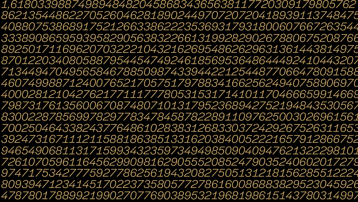
This slide shows the golden ratio, or divine proportion, calculated to a few hundred decimal places. The typographic pattern and texture created shows the tabular numerals from Halyard Display Book Italic to striking effect.
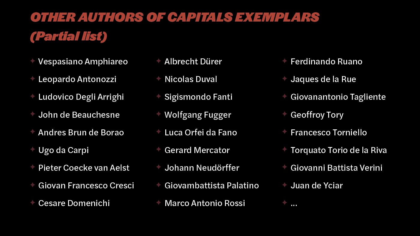
The heading is in Halyard Display Black Italic. The list of names set in Halyard Text. Note that the parenthesis is one of the few places to feature the former’s lowercase in a heading.
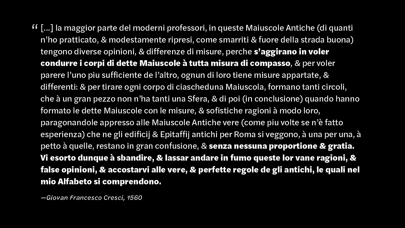
The slideshow includes a few longer quotes in Halyard Text, with the most important bits highlighted in a Black rather than the Bold weight. This increased contrast in style was clever choice in the context of both a briefly presented image and a reversed color layout that using white text on a black background. The attribution is set in Halyard Micro Italic.
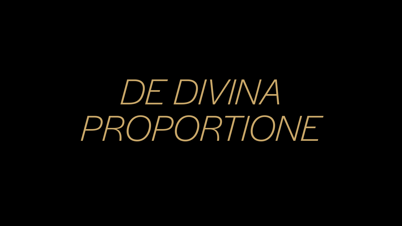
The words “The Divine Proportion” are set in Halyard Display Light Italic.
Grazie, Antonio, for putting Halyard to great use!


