
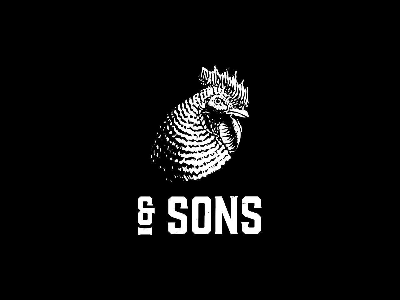
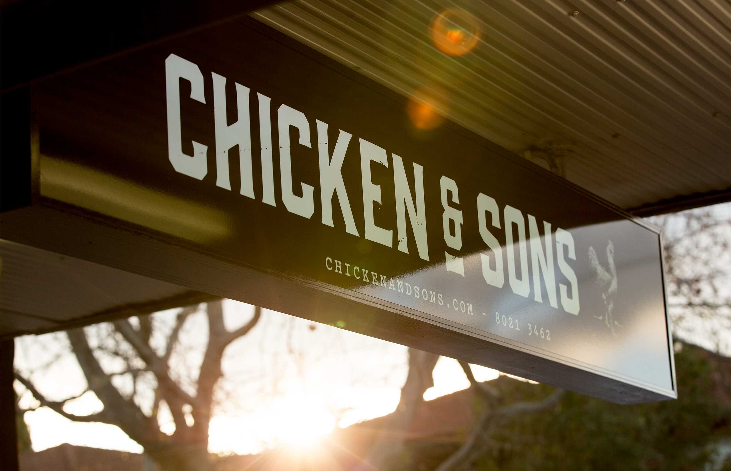
Chicken & Sons
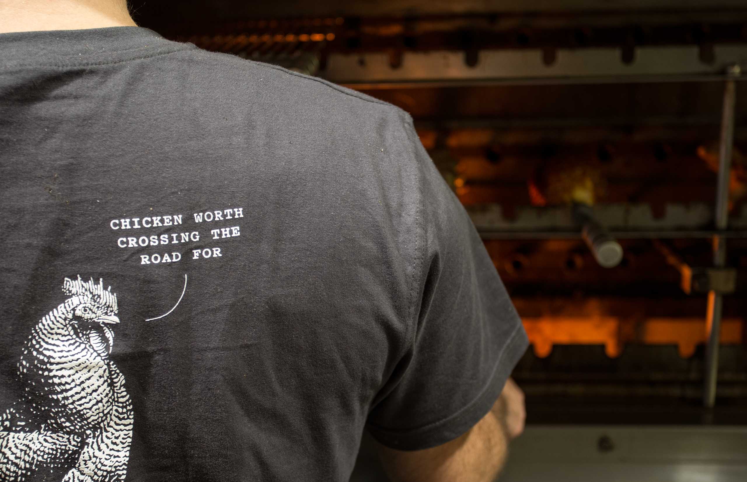
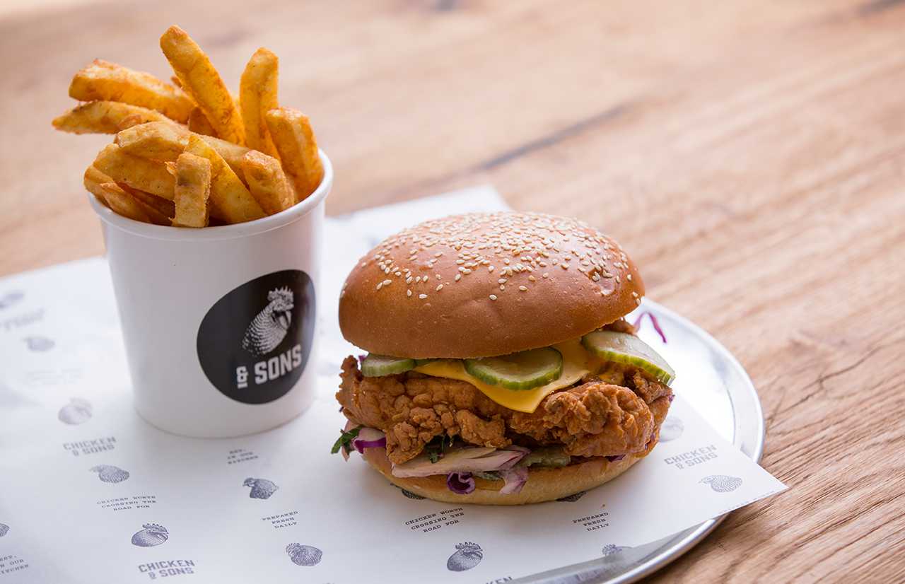
Started by two guys with a passion for providing quality food for all, Chicken & Sons is proud to offer a new take on the classic chicken shop. All their food is prepared with love and care using only the finest ingredients. I was commissioned to design a brand identity that would reflect the authentic approach to their food. The result is a brand identity that harks back to the days before mass produced fast food chains.
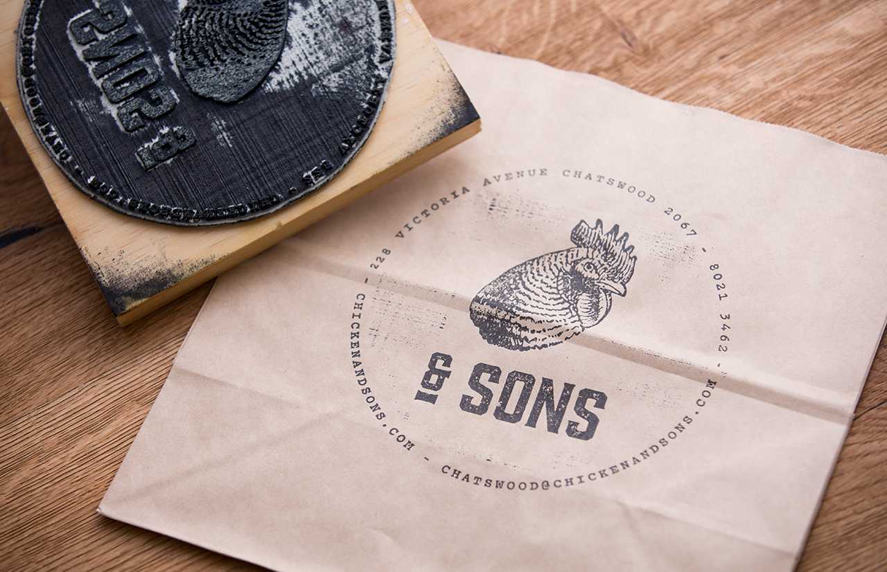
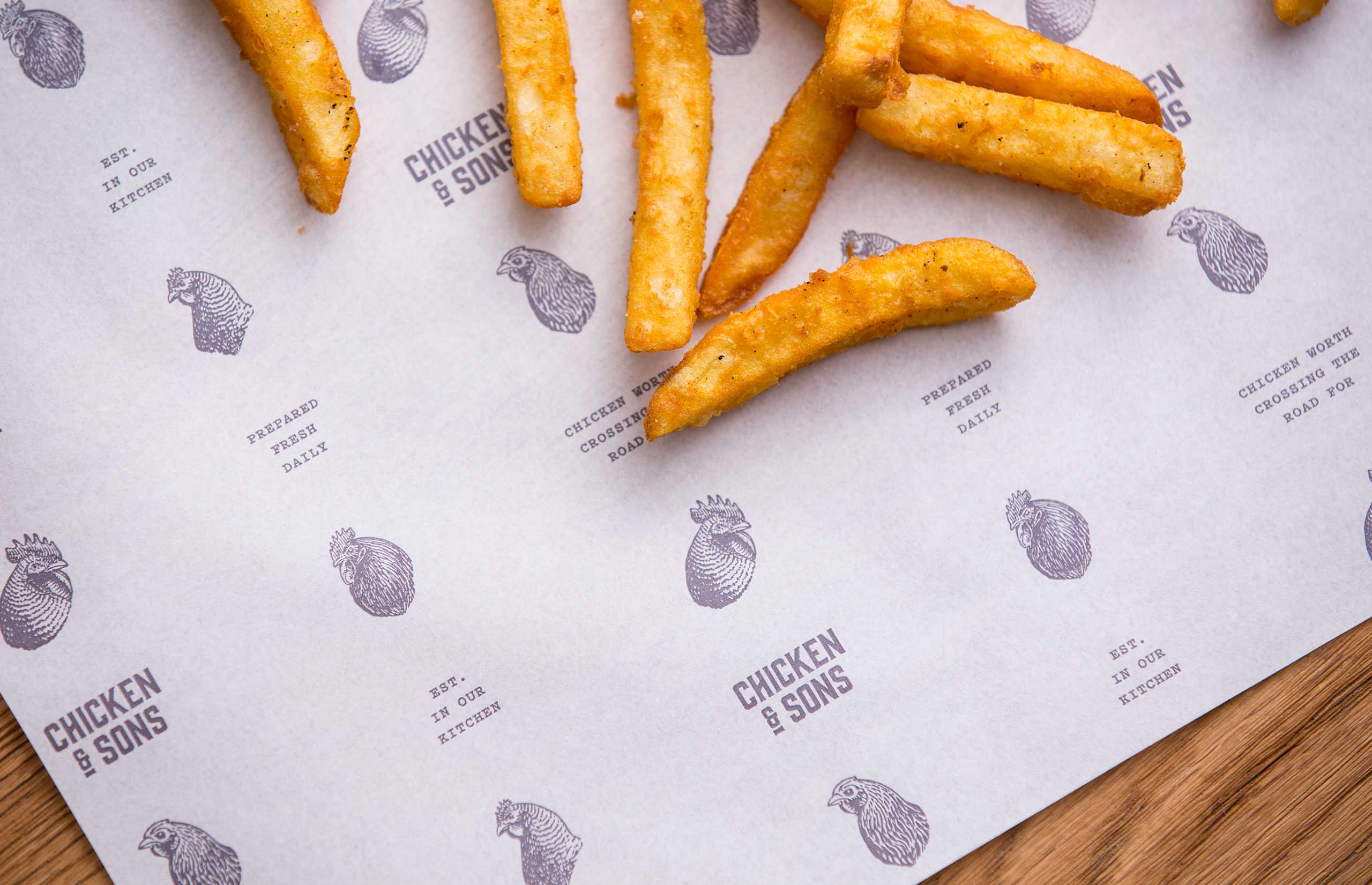
The primary logo replaces the word chicken with a chicken’s head, the brand identity also makes use of turn-of-the-century illustrations of chickens that appear to be talking. I came up with the line “Chicken worth crossing the road for” which sums up this new street front eatery. Using craft paper and stamps helps reflect the ethos of Chicken & Sons while being a cost effect solution.
Photography: Christopher Ireland.


![Promo for [tri:], vegetarian restaurant in Kiev](https://assets.fontsinuse.com/static/use-media-items/67/66228/thumb/5adb237f/@2x/68889c8139693-560c08479b083.webp "Promo for [tri:], vegetarian restaurant in Kiev")


")


