Calvin’s Institutes of the Christian Religion, Jean Crespin edition, 1560 (and remakes)
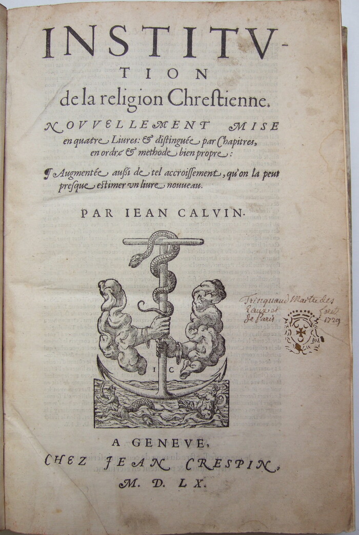
You’re not supposed to use swash capitals in a row, or throw them in whenever you feel like it. You’re not supposed to use terminal forms at the end of every word, or use an ‘ß’ to print French. You’re not supposed to change font size before you’ve even finished the first word of your title. And if you must do these things, the title page of an edition of Calvin is certainly not the obvious choice as a site to deploy such excesses.
Good job nobody told printer Jean Crespin, who does all of those things together on one page on his edition of the Institutes of the Christian Religion and … well, I’m not sure I’m going to say he gets away with it, but presumably he didn’t get hauled off to prison, so we’re counting that as a success, right? Crespin clearly was keen to show off the increasingly intricate italics of his time in his typography to celebrate his friend’s magnum opus.
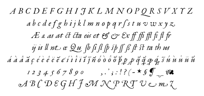
The character set of Robert Granjon’s Paragon Italic. See also The Golden Compasses by Leon Voet, Digitale Bibliotheek voor de Nederlandse Letteren
So what font is this? It looks a lot like Robert Granjon’s Paragon Italic (c. 20 pt), shown in Professor Hendrik Vervliet’s monumental Palaeotypography of the French Renaissance — it is the only font in the book that seems to include all the ligatures, terminal forms and swash capitals Crespin uses. (With two exceptions: it doesn’t include the ligature for ‘es’ and the second swash cap ‘M’ with a centre loop. Vervliet mentions but does not describe an alternate swash ‘M’ that was in circulation from the 1560s. Unfortunately I haven’t been able to see a reprint of the specimen in which he mentions this appears.) Supporting this, he lists that the font reached Geneva and the printing of Jean Crespin in 1558, two years before this edition. The 'a’ in the largest line of roman type also looks a lot like it might be font C in this picture, a 48pt, which Vervliet also mentions Crespin using. (One development in this period of printing Vervliet mentions is use of increasingly larged-size mixed case on title pages rather than exclusive use of titling capitals, although in this case the largest sizes are caps-only. And in practice, many of the example uses Vervliet shows do use letterspaced swash capitals, although this is one of the most ostentatious I’ve seen, and particularly in a font that — unlike many other italics of the period — included non-swash capitals as an option.)
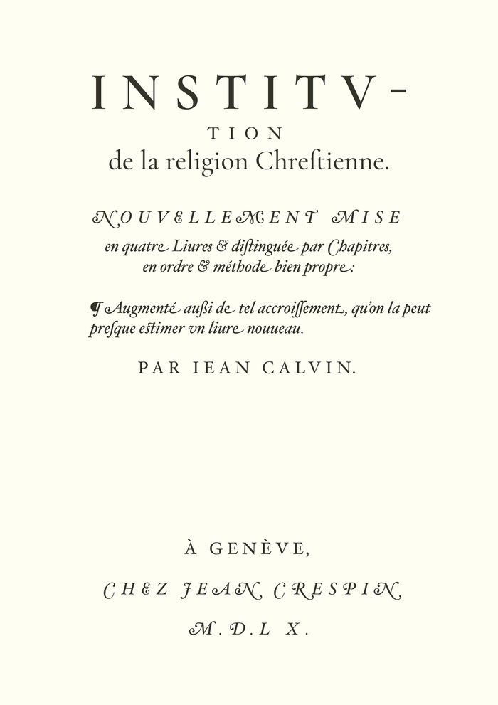
A remake in Hoefler Text and Cormorant Garamond. While Hoefler Text has not really the same colour on the page, it contains almost all the crazy alternates.
Can modern typographers replicate this? Very closely, actually. Shown above is a remake in Hoefler Text (and Cormorant for the largest type), which has almost everything you need, including both swash Ms, terminal forms, the ampersands and long s — pretty much the only things missing are the italic ‘at’ and ‘th’ ligatures. Two and a half decades on, it’s startling how comprehensive the feature set of Hoefler Text is in replicating the Renaissance style — in an interview Hoefler has mentioned as an early influence ATF’s legendary 1923 specimen which shows ATF Garamond’s many italic alternates — although the general build of Hoefler’s italic is darker and higher-contrast than this. Adobe’s Garamond Premier (below) is even closer in build but doesn’t include the ligatures for ‘es’ and (terminal) ‘nt’, nor the centre-loop swash ‘M’. More stylised digital fonts in this vein with a lot of loopy alternates are Garalda and (more condensed) Thesaurus, although I haven’t used either.
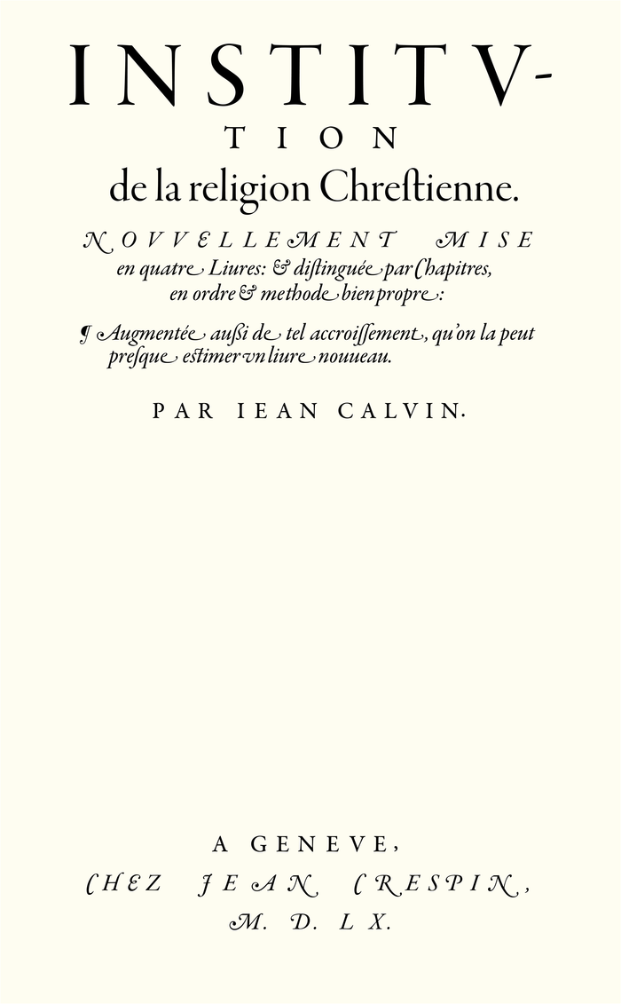
Another replica using Garamond Premier, with adjusted spacing. The italic display and subhead styles of Robert Slimbach’s revival are directly based on Granjon’s Paragon Italic (see Paul Shaw’s Revival Type) and thus come very close in regard to the shapes.
Crespin seems to have liked letterspaced swash capitals when he could get them — I add below an additional image of a different book printed by him the year before using what looks like the same italic. Unfortunately I haven’t been able to find any articles discussing his aesthetic choices and how they fitted (or didn’t fit) usual tastes in Calvinist printing of the period. I’ll add anything I find at a future date in the comments section.
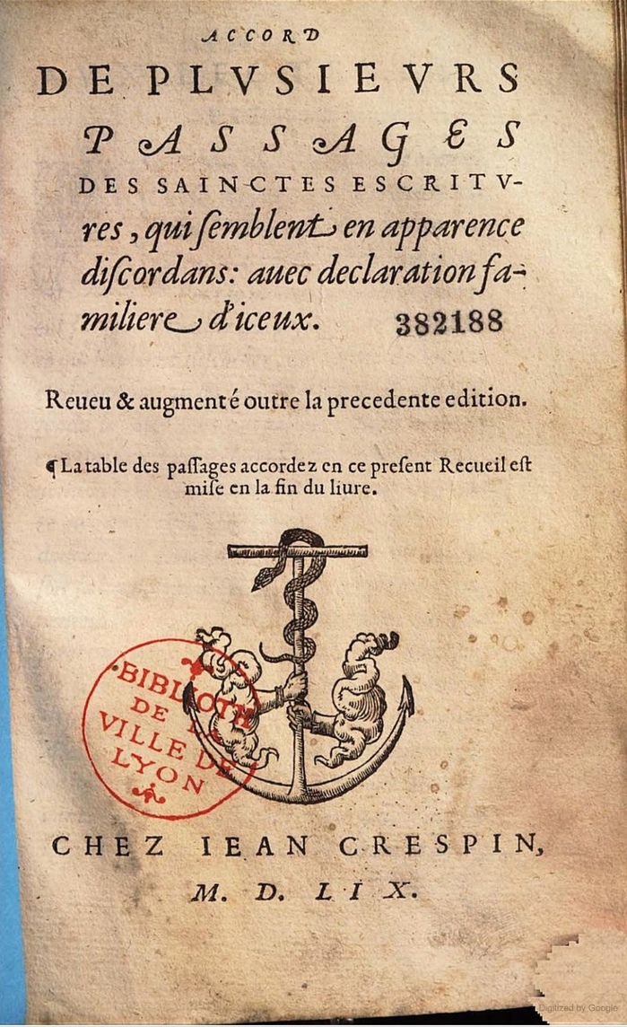
Accord de plusieurs passages des Saintes escritures … — a different book printed by Jean Crespin in 1559, using what looks like the same italic.
A slightly earlier edition of Calvin’s Institutes of the Christian Religion (in Latin) was that printed by Robert Estienne, a leading printer of the period and another defector from Paris to Calvin’s Geneva, who had died the year before Crespin’s edition was published. Its use of roman only on the title page, like most early Calvin editions, seems more in line with what modern audiences might expect the printing of a Christian text to look like.
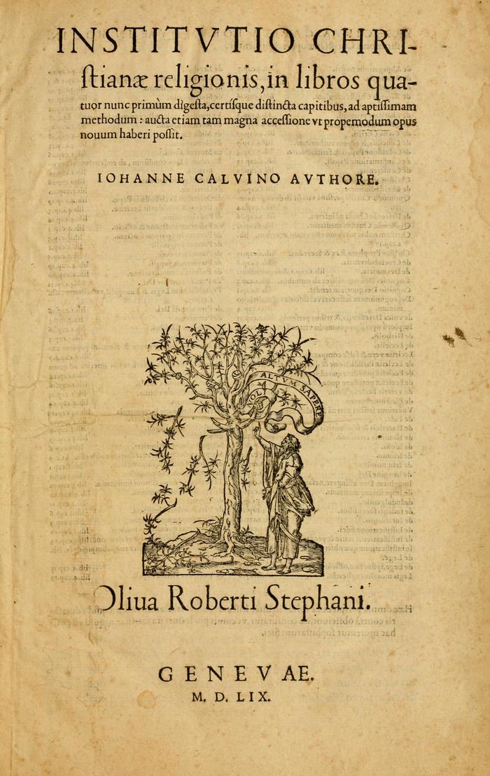
Another edition of Institutio christianae religionis, printed in 1559 by Robert Estienne (Robertus Stephanus)
Typefaces
Formats
- Books (3999)
Topics
- Religion/Spirituality (249)
Designers/Agencies
- Jean Crespin (1)
Tagged with
- swashes (431)
- Christianity (67)
- eszetts (3)
- center-aligned text (1165)
- pilcrows (26)
- title pages (525)
- alternate glyphs (752)
- anchors (5)
- snakes (28)
- terminal forms (20)
- Calvin (1)
- all caps italics (199)
- French (language) (1252)
- Latin (language) (18)
- Protestantism (8)
- theology (5)
- 1500s (2)
Artwork location
- Switzerland (666)
- Genève (50)


















4 Comments on “Calvin’s Institutes of the Christian Religion, Jean Crespin edition, 1560 (and remakes)”
[translated from German]
1530 Garamond (Ross Mills for Tiro Typeworks, 1994) probably comes closest, in case someone is looking for a very similar font.
Unfortunately, I miss the long s, which can usually be accessed by alt plus S.
You refer to the roman, right? The italics in 1530 Garamond are quite different.
There might be quite a few (early) digital fonts which misuse unrelated codepoints for accommodating the long s, but it’s a hack and should be avoided. In my setup, alt+S is linked to the single low-9 quotation mark (U+201A). The long s should be included under its designated codepoint (U+017F), and may additionally be made accessible via OpenType features like Historical Forms.
This isn’t the only example I’ve seen of ß replacing ss outside German, incidentally. Porter Garnett’s A Documentary Account of the Beginnings of the Laboratory Press, Carnegie Institute of Technology (effectively a 1927 showcase for the printing school of what is now Carnegie Mellon University) uses it, among a plethora of other crazy uses of alternate characters. It’s a stunning example of the historicist printing style of the period, mostly in handset ATF Garamond. (I’ve quoted his very interesting account of ATF Garamond’s genesis on Wikipedia-he also mentions also badgering poor ATF to give him matching text figures and “Qu” ligatures…)
Has anyone seen any others?