
Live At The Montague Arms, Vol. 1–4
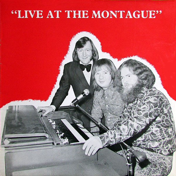
Vol. 1 was a T.M.C production released in 1971 on Map Records. No sleeve designer credited. The typeface appears to be a version of Plantin Bold in all caps.
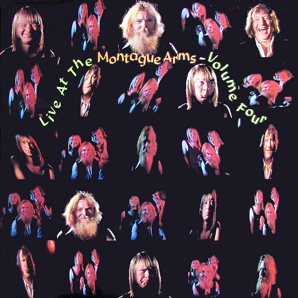
The Montague Arms is a music and comedy venue in south east London. In the 1970s, The Montague Arms published a series of recordings by Jimmy Jones, Peter London, and Peter Hoyle — Live At The Montague Arms. The cover designs of Volumes Two to Four are credited to Ed. Berry.
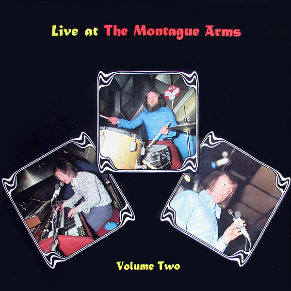
Vol. Two (1972) uses Imre Reiner’s Matura.

The psychedelic cover of Vol. Three (1972) features yellow caps from Mania Contour.
Source: www.flickr.com Uploaded to Flickr by Dame Agnes Guano and tagged with “flambard”. License: All Rights Reserved.
It gets weirder: Vol. Four (1973) shows Flambard set on a path between photos, with bouncing baseline.


![<cite>Kosher Symbols [1–148]</cite>](https://assets.fontsinuse.com/static/use-media-items/88/87670/thumb/5ccb0fb8/@2x/Goldman_Bentzion_web_03.webp "<cite>Kosher Symbols [1–148]</cite>")


")


")


3 Comments on “Live At The Montague Arms, Vol. 1–4”
Transpontine has more info about The Montague Arms and additional images of these records, including the cover of a follow-up release from 1977, named “Live at the New Montague Arms”. The sleeve again is credited to “Ed Berry for Pineburn Press Ltd.” I’m not sure whether these letterforms are from an obscure predigital typeface, or custom drawn. As always, pointers are welcome.
Sources on News Plantin date it to 1979 (which is the date given in Slinn/Carter/Southall) or 1978. It originated with the Observer newspaper’s installation of a Monotype Lasercomp (1976) for page makeup. (According to Paul Luna’s fascinating 1986 Designer article on contemporary newspaper design, Small Print, they commissioned it since Monotype didn’t have a lot of newspaper faces available, because of their prior specialism in book printing.)
Thank you, Blythwood! I’ve changed News Plantin to Plantin for this entry and also for the other one that predates the creation of News Plantin.