
Post Office Nineteen Fifty One, Review of Post Office Activities
From Mikey Ashworth:
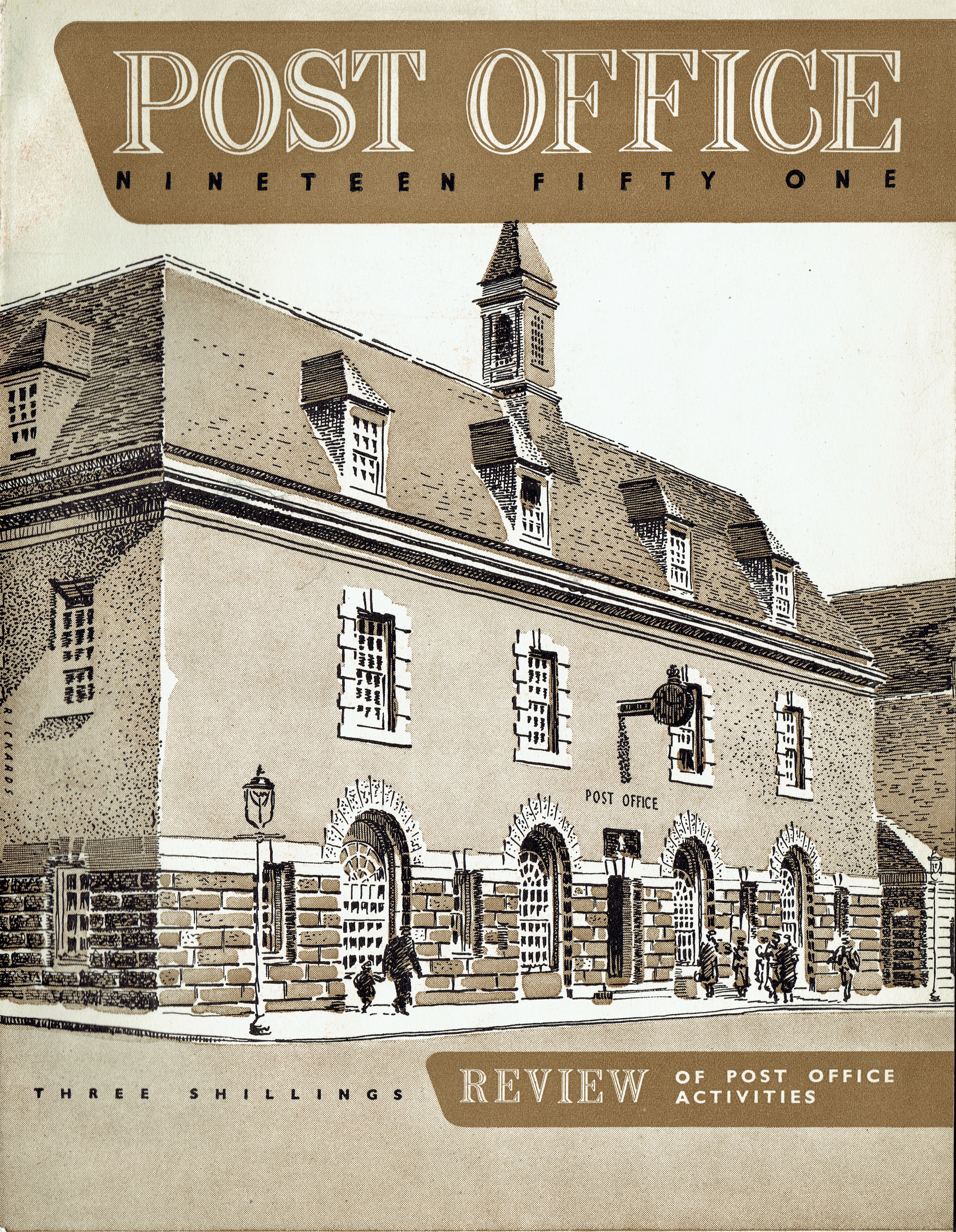
One of a series of Annual Reviews issued by the UK Post Office that at the time was responsible for the Post Office, Royal Mail and the telephone system. The front cover shows this illustration of the new Falmouth Post Office by artist Maurice Rickards. The building was designed, very typical of the PO ‘look’, by the Ministry of Works architects division as they were ‘government’ buildings. The building still stands but in the new world cull of Post Office buildings it is now a restaurant. Of more interest is the artist – Maurice Rickards (1919–1998). From a rather tough London upbringing Rickards became an artist and photographer, a political animal and Conscientious Objector, with his own studios but is better recalled as being one of the pioneers of the collecting of ephemera.
The titling typeface is Chisel, conceived by Robert Harling as an inline version of an existing face. It was cut by a punchcutter named Gurner and issued in 1939 by Stephenson Blake. Here its caps peculiarly are shown white on brown, which takes the game of figure–ground perception to a whole other level. In fact, Stephenson Blake explicitly recommended this effect:
Chisel is the result of intelligent refining of an old and rather unattractive face, Bold Latin Condensed, which was cut by Stephenson, Blake & Co. about seventy years ago [in 1870]. It is a brave, bold face and stands out well in press advertisements or in the very different context of book wrapper. It is effective when used in reverse.


 and covers (1978–1983)")


")


2 Comments on “Post Office Nineteen Fifty One, Review of Post Office Activities”
Gurner was H. Karl Görner, who had trained as a punchcutter in Frankfurt. He moved to Sheffield and took up a post at Stephenson Blake, where he spent the rest of his career. (Sources on him are James Mosley on Typophile and Roy Millington’s history of Stephenson Blake, page 129, which says he was recommended to them by his half-British employer in Frankfurt, William Kirkwood.) That they called him that doesn’t imply much good about SB’s internationalization efforts…
Outstanding — Görner, of course! Thank you, Blythwood. I’ve amended the info on the typeface page.