The World Goes Pop
Accompanying a major exhibition at Tate Modern, this dazzling catalogue reveals an unknown side of global pop.
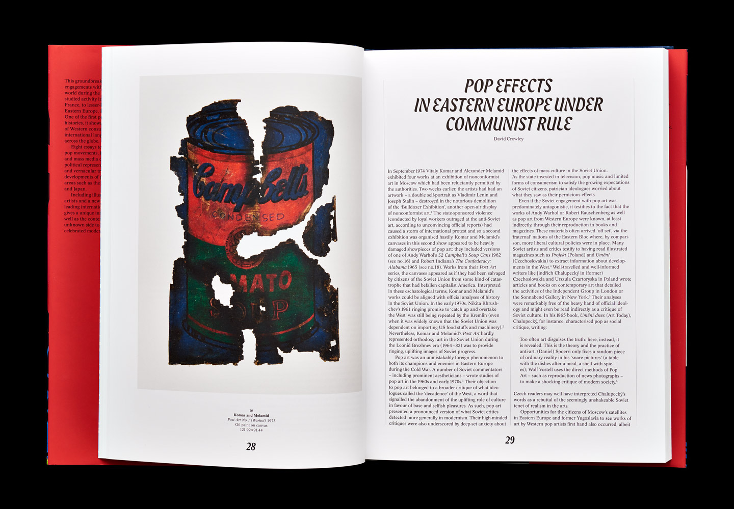
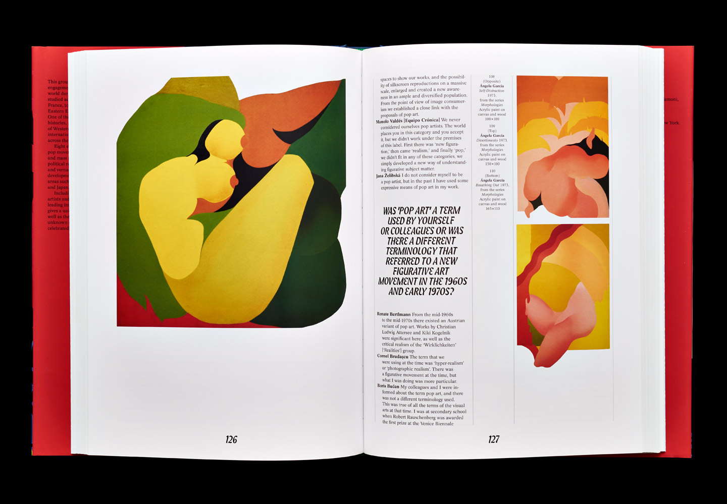
The World Goes Pop explores the engagements with pop throughout the globe, concentrating not only on the relatively well-covered activity in the US, UK and France but also on developments throughout Central and Eastern Europe, Latin America, Asia, Africa and the Middle East.
This unique book offers an opportunity to examine the origins and socio-political side of Pop, including pop and the political representation; pop and the new sexual politics; seriality, distribution and the role of print production.
Featuring the work of over 65 artists, six newly commissioned essays and brand new artist interviews, The World Goes Pop is the first book to rely on primary sources to re-evaluate Pop art throughout the globe. — Tate
Alias Aspic is used for headline type throughout.