
The Stranglers band logo and early record sleeves
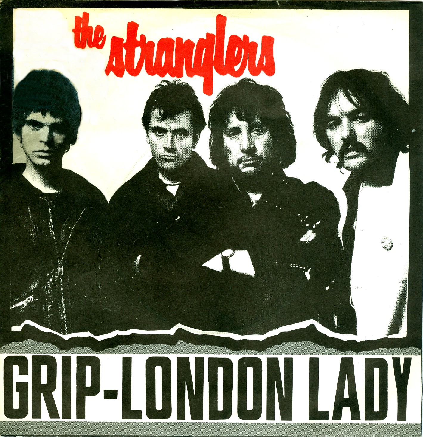
Debut single “Grip” with B side “London Lady”, United Artists Records (UK, Jan. 1977). Photo by Chris Gabrin. The angular sans serif used for the titles is Filmotype Glenlake.
This month, I’ve been asked twice for a font ID for the Stranglers logo, likely prompted by the sad news of David Greenfield’s death. There’s a lot of inaccurate information on that question to be found on the internet, so I thought it’s about time to set this straight.
The Stranglers logo uses Filmotype Harper. The reason why this typeface often is misidentified is that it never made it to digital, and maybe also that it originated at a relatively obscure company, at least in comparison to ITC or Letraset. Filmotype was an American firm that sold a manually operated phototypesetting machine of the same name, accompanied by a library of typefaces. Issued in the first half of the 1950s, Harper is the most condensed member in their series of bold brush scripts. It was available for VGC’s Photo Typositor under the alias A-16 and also was distributed by various phototypesetting studios in Europe. Photoscript in London was one company that offered Filmotype faces in the UK.
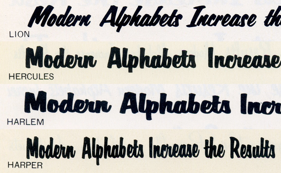
Lion, Hercules, Harlem, and Harper form Filmotype’s series of bold brush scripts. The latter three are all distinguished from similar faces by a g with a straight, hookless descender (the q curves to the right). I can very well imagine that Harper was picked for this unusual letterform, which adds a curt accent to the center of the wordmark. Image compiled from a c.1958 specimen.
Chances are it was here that Kevin Sparrow, the logo designer, found Harper. In Peaches: A Chronicle Of The Stranglers 1974–1990, Robert Endeacott mentions that the artist was recruited in the summer of 1975. The logo was used for the band’s very first release from January 1977, and probably already before that, on posters etc. Sparrow is officially credited with the sleeve design of the band’s third album Black and White from May 1978, and likely had a hand in other releases as well. The flatmate of Chrissie Hynde died prematurely in 1979.
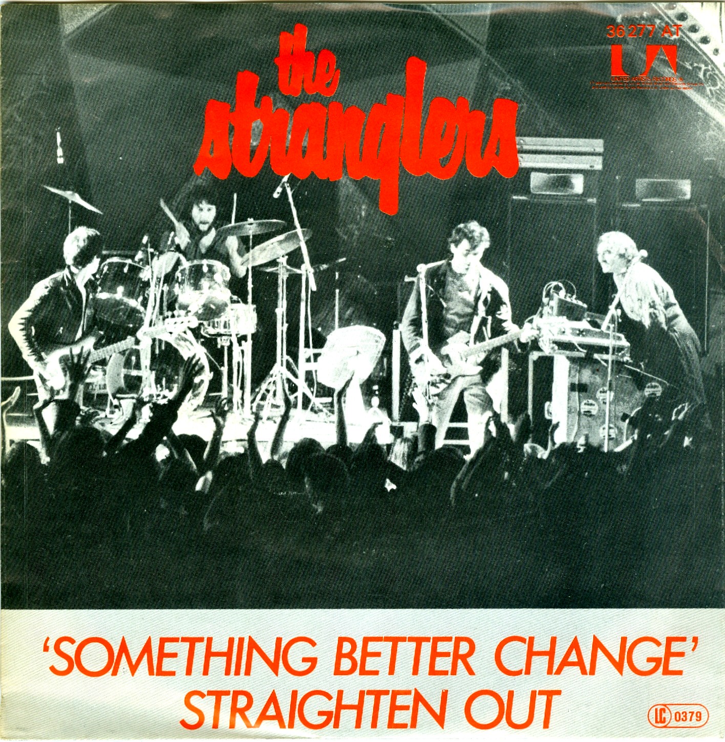
“Something Better Change” / “Straighten Out”, United Artists Records (Germany). The UK release (July 1977) uses the same artwork. Photo by Robert Ellis, titles set in tightly spaced caps from Futura Italic. The article in the band logo has been moved to the right in this version.
Something Better Change EP, A&M Records (USA, Nov. 1977). The track list uses all-caps Grotesque No. 9 with headings in Flash.
Phil Knight, author of Strangled: Identity, Status, Structure and The Stranglers notes:
Despite their diverse backgrounds, The Stranglers looked oddly apposite together, and were compellingly photogenic. Always dead-eyed and looking right through the observer, they resembled a team of assassins, each of whom specialised in a different means of killing.
Of the many outstanding English bands that emerged in the 1970s, The Stranglers are not among my personal favorites. This has also to do with their “seedy and intimidating demeanor, and well-deserved reputation for misogyny and violence” that Knight describes. However, it’s no question that they built a strong visual identity, which, according to Knight, “crystallized in the brash font of the band’s logo.” Now you know the name and origin of this font.
![“Nice ’n’ Sleazy” / “Shut Up”, United Artists Records (UK, 1978). The cover is a reproduction of a poster designed by Kevin Sparrow for a gig at the Hope & Anchor in 1976, depicting a murdered woman. The warning “Coming your way” misled some people into thinking that this was the title. [Endeacott] It’s set in caps from .](https://assets.fontsinuse.com/static/use-media-items/113/112045/full-1404x1428/5eb6a995/5480064831_a9025e4142_h.jpeg)
“Nice ’n’ Sleazy” / “Shut Up”, United Artists Records (UK, 1978). The cover is a reproduction of a poster designed by Kevin Sparrow for a gig at the Hope & Anchor in 1976, depicting a murdered woman. The warning “Coming your way” misled some people into thinking that this was the title. [Endeacott] It’s set in caps from Folio eng.
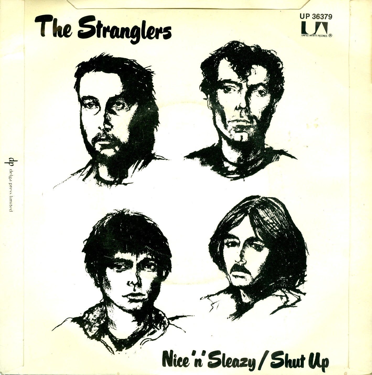
The back side features Husky, another brush script by Filmotype.
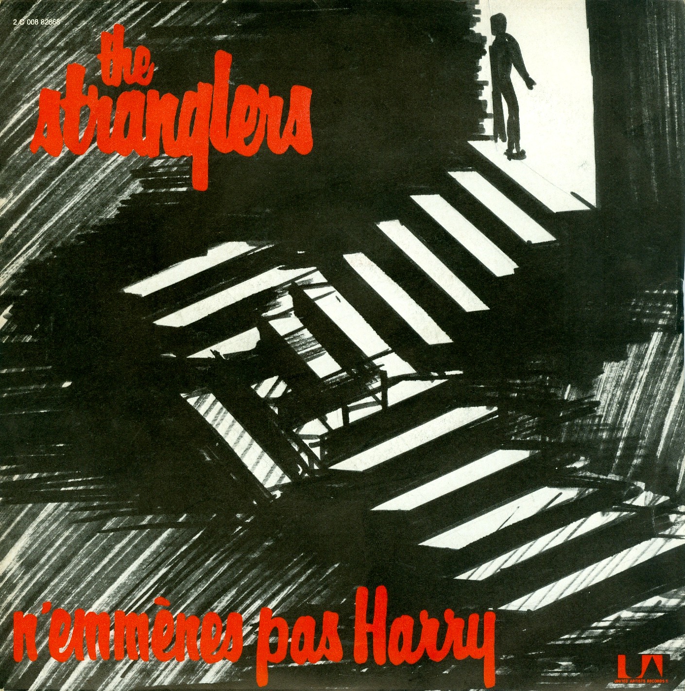
“N’Emmènes Pas Harry” (“Don’t Bring Harry”) with B side “Livin’ In a Bear Cage”, United Artists Records, distributed by Pathé Marconi (France, 1980). The uncredited designer aimed to use the same style as seen in the logotype. Judging from the differences in repeating letters, this is hand lettering.

Promo sticker for the Feline album (Epic, 1982, art direction by Nick Marchant).
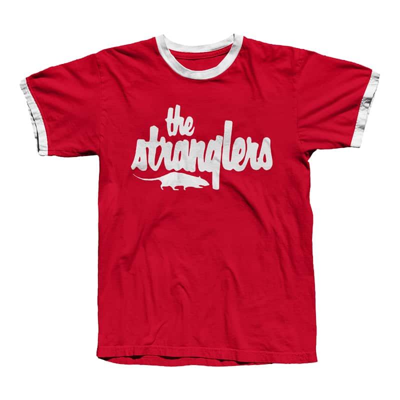
Band T-shirt as sold in the official merch store in 2020. The rat is a mirrored adaptation of the album cover for Stranglers in the Night (1992), designed by Cactus.


")


")


3 Comments on “The Stranglers band logo and early record sleeves”
In Filmotype By The Letter – The Complete Illustrated History (2009), Stuart Sandler mentions that Filmotype Lion was “inspired when Ray [Baker] came across an advertisement for the 1952 Ford Mercury with Merc-O-Matic Transmission”. This suggests that the inclined Lion came first, and Baker (or another lettering artist at Filmotype) later added the upright Hercules and its condensed and extended variants, Harper and Harlem. The hand-lettered script in the Ford ad has the hookless g. This form can’t be found in Lion, but is included in Hercules, Harper, and Harlem. One could argue that the hallmark letterform in the Stranglers logo is indirectly derived from this car ad.
In fact, the logotype is so distinctive that it often was emulated when Filmotype Harper was not available. See e.g. this German poster with the band name set in the similar Brody, the cover for a live bootleg album with electronically condensed Cascade Script, or an official live album with equally squooshed Dom Bold.
Fantastic research totally accurate too.
Thank you for this.