
The cover shows Landi Echo metal type from the collection of Tipoteca Italiana.
Initiated by Claudio Rocha and published by the Tipoteca Italiana, the third issue of Tipoitalia is entirely dedicated to 20th-century Italian typography. Fourteen contributors collaborated with the editorial team, made up of Sandro Berra, Massimo Gonzato, Riccardo Olocco and Claudio Rocha.
![Titles and page numbers set in TIF Balilla. Summary and captions in Semplicità [digital revival by Studio Di Lena]](https://assets.fontsinuse.com/static/use-media-items/64/63221/full-1600x1067/5a8c258d/01_tipografia_italiana.jpeg)
Titles and page numbers set in TIF Balilla. Summary and captions in Semplicità [digital revival by Studio Di Lena]
Contents and contributors
The cover of TipoItalia 3 and letterpress-printed insert by Archivio Tipografico are dedicated to Alessandro Butti. Traces of his personality and work appear in the articles by Enrico Tallone and Alessandro Colizzi, but his name also reappears on many other pages of this issue. It’s hinted at in Lucio Passerini’s overview of twentieth-century Italian type, in Michele Patanè’s critique of digital versions of a few Nebiolo typefaces, as well as in Riccardo De Franceschi’s piece on Veltro. And it pops up again in the pages written by James Clough (followed by Akira Kobayashi’s contribution on the genesis of Eurostile Next), which compares Novarese’s Eurostile with Microgramma and its other somewhat squarish predecessors. For this issue of TipoItalia Clough also covers an extraordinary selection of Fascist-era wall texts in an excerpt from his recent book Signs of Italy. Our journey through twentieth-century Italy also features Fortunato Depero’s bolted book [see the article on Fonts In Use], Carlo Frassinelli’s graphic design revolution, the vicissitudes of Francesco Simoncini’s foundry (now forty years after his death), and the rationalist saga of modular type, with texts by Gianluca Camillini, Carlo Vinti, Alessio D’Ellena, and Luciano Perondi. Type design and rationalism are also discussed in Mauro Chiabrando’s article on Reggiani and his foundry, whose special series of typefaces included Triennale. Claudio Rocha, in addition to the graphic design, is also the author of a reconsideration of vintage typographic decorations and ornaments.

Set in Zenon by Riccardo Olocco/CAST
Typography
Rocha set the texts in many different fonts with priority given to digital versions of historical typefaces discussed in several articles. These are: TIF Balilla, Semplicità, Paganini, Palatino Nova, Palatino Sans, Monotype Dante Pro, Mefistofele, Monotype Pastonchi Pro, Veltro, Egizio, Eurostile Next, FB Forma. Other texts are dressed in some very recent original fonts such as Brevier, Zenon and Gramma by Riccardo Olocco/CAST; Dic Sans by Luciano Perondi/CAST; GFT Lespresso Sans by Giangiorgio Fuga; Font Serif and Sans (unreleased) by Michele Patanè/Monotype.


Set in Palatino Nova and Palatino Sans by Hermann Zapf and Akira Kobayashi/Linotype
![Titles and summary set in Semplicità by Alessandro Butti/Nebiolo [digital revival by Studio Di Lena]; text in Monotype Dante Pro [original font by Giovanni Mardersteig/Monotype]](https://assets.fontsinuse.com/static/use-media-items/64/63226/full-1600x1067/5a83520e/06_insegne.jpeg)
Titles and summary set in Semplicità by Alessandro Butti/Nebiolo [digital revival by Studio Di Lena]; text in Monotype Dante Pro [original font by Giovanni Mardersteig/Monotype]
![Titles set in Mefistofele by Claudio Rocha and Lucas Franco [original font by Fonderia Reggiani]; text and captions in Gramma and Brevier by Riccardo Olocco/CAST](https://assets.fontsinuse.com/static/use-media-items/64/63227/full-1600x1067/5a8c313d/07_reggiani.jpeg)
Titles set in Mefistofele by Claudio Rocha and Lucas Franco [original font by Fonderia Reggiani]; text and captions in Gramma and Brevier by Riccardo Olocco/CAST
![Titles set in Fluidum and Semplicità by Butti/Nebiolo [digital revivals by Monotype and Studio Di Lena]; text in Paganini by Butti/Nebiolo under direction of Raffaello Bertieri [digitally revived by Canada Type]](https://assets.fontsinuse.com/static/use-media-items/64/63228/full-1600x1067/5a7b40f3/08_butti.jpeg)
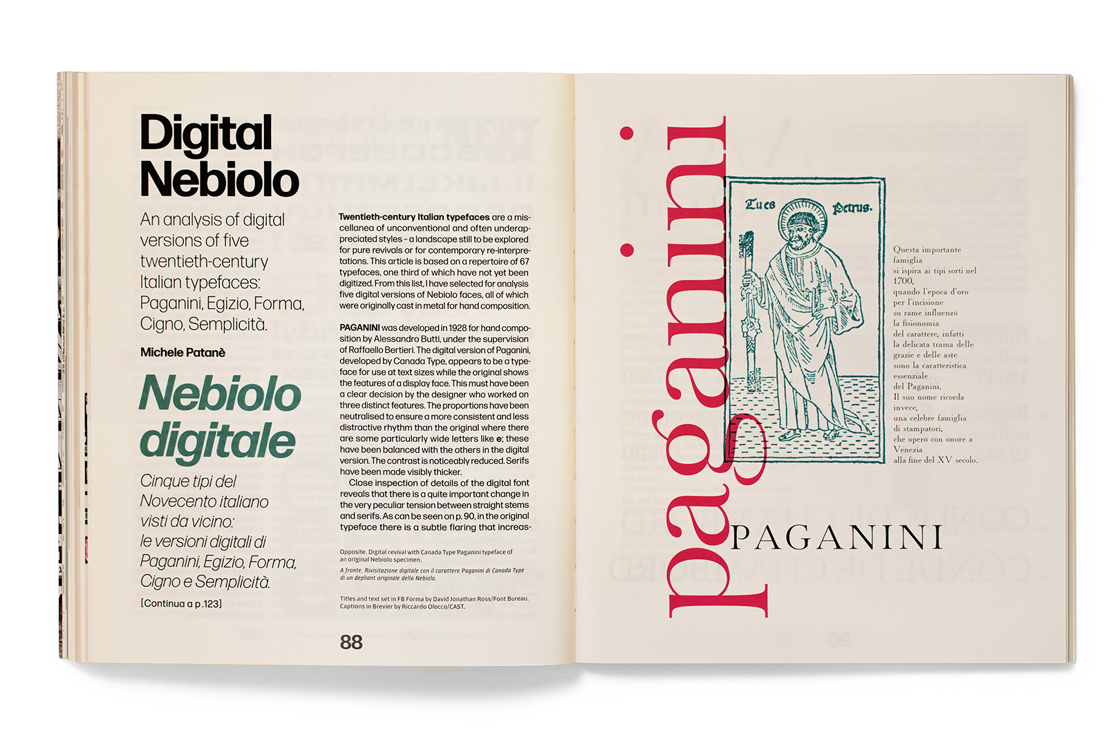
Titles set in Fluidum and Semplicità by Butti/Nebiolo [digital revivals by Monotype and Studio Di Lena]; text in Paganini by Butti/Nebiolo under direction of Raffaello Bertieri [digitally revived by Canada Type]
![Set in Monotype Pastonchi Pro [original font by Francesco Pastonchi and Eduardo Cotti]](https://assets.fontsinuse.com/static/use-media-items/64/63229/full-1600x1067/5a7b4136/09_pastonchi.jpeg)
Set in Monotype Pastonchi Pro [original font by Francesco Pastonchi and Eduardo Cotti]
![Titles set in the author’s digital version of Veltro Nera; text in Egizio by Aldo Novarese/Nebiolo [digital version by URW++]; captions in Semplicità by Alessandro Butti/Nebiolo [digital revival by Studio Di Lena]](https://assets.fontsinuse.com/static/use-media-items/64/63230/full-1600x1067/5a7b41ea/10_veltro.jpeg)
Titles set in the author’s digital version of Veltro Nera; text in Egizio by Aldo Novarese/Nebiolo [digital version by URW++]; captions in Semplicità by Alessandro Butti/Nebiolo [digital revival by Studio Di Lena]
![Set in Eurostile Next by Akira Kobayashi/Linotype [original font by Aldo Novarese/Nebiolo]](https://assets.fontsinuse.com/static/use-media-items/64/63231/full-1600x1067/5a7b4230/11-eurostile.jpeg)
Set in Eurostile Next by Akira Kobayashi/Linotype [original font by Aldo Novarese/Nebiolo]
![Set in Font Serif and Sans by Michele Patanè [not yet released]](https://assets.fontsinuse.com/static/use-media-items/64/63233/full-1600x1067/5a7b42cb/13_simoncini.jpeg)
Set in Font Serif and Sans by Michele Patanè [not yet released]


")


")


