Rabit tour poster (2015) vs. Drake – Scary Hours cover art (2018)
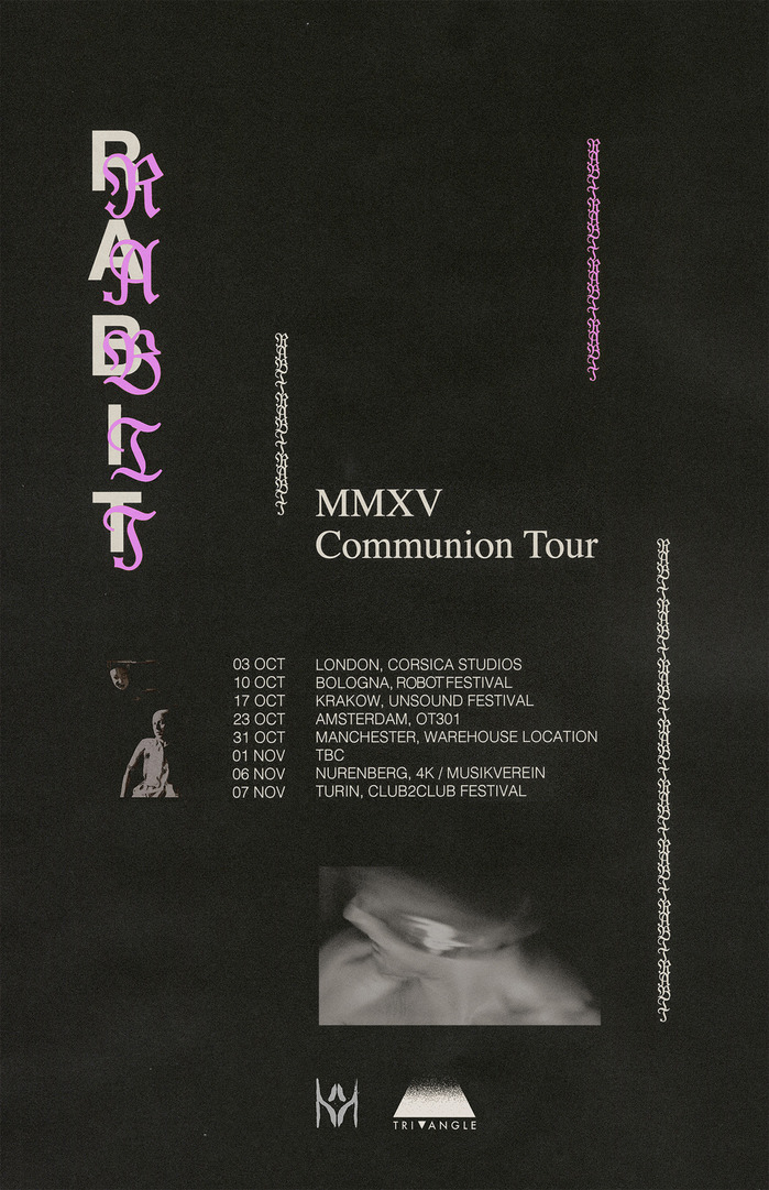
Poster designed by Collin Fletcher for Rabit’s Communion Tour MMXV (2015), featuring Modern Blackletter, Helvetica and Times.
today I wake up to see OVO has redone one of my 2015 tour posters designed by @collindfletcher for Drake’s new single. Poor Collin is always having his style stolen?lol BUT I love being part of a team that’s so creative and iconic???? #drake #ovo #rat #roach #simp – *Rabit – Les Fleurs Du Mail available now* – Rabit, 20 Jan 2018, Instagram
And so began the first type controversy of 2018, a story of appropriation, subversion and theft. You might not have heard of Rabit, a fantastic Texan electronic musician who works in the loose context of what people have began to call “deconstructed/experimental club”. Silly as semantics can be, the artists included under this umbrella make some of the most exciting sounds to emerge in a long time, questioning the both rigid, codified rhythms of dance music, while at the same time returning it to a politicized, often queer form. Aesthetically transgressive, these artists “pioneered” the visual post-default technopunk that has since experienced a commodification by the global style of contemporary “street”wear and its proponents.
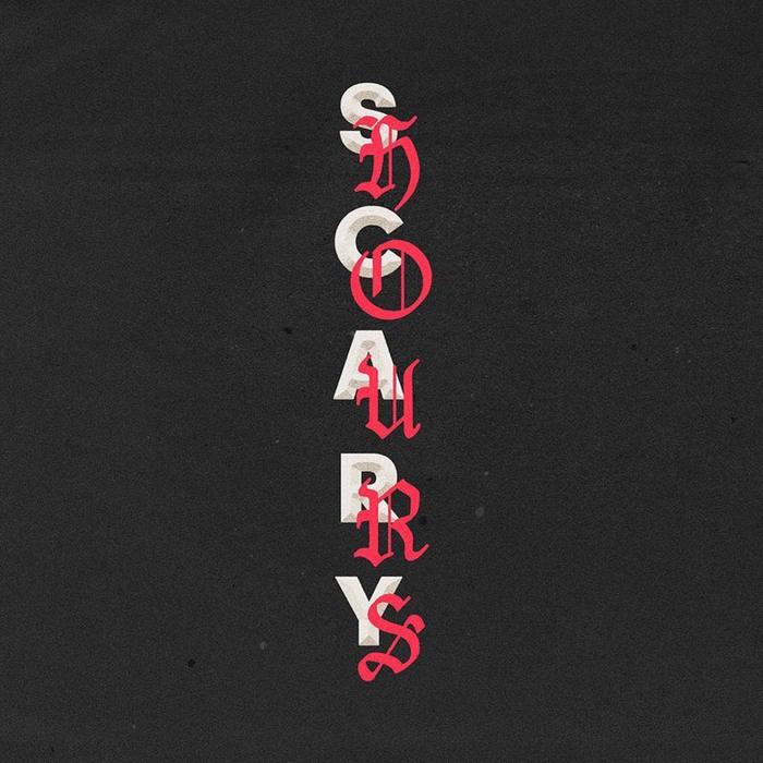
Cover for Drake’s Scary Days single (2018), designer unknown, for OVO. Features OldHaroldRee and a yet unidentified sans serif.
With this in mind, it should come as no surprise that we find ourselves in a place where mega popstar Drake starts of the year by dropping a single so explicitly appropriating an obscure, 2015 gig-poster. Collin Fletcher’s original design is one I very much enjoy, a dynamic composition that in many ways crystalizes the aesthetic tropes referenced above. We have the use of repetition — propelled into the mainstream by Kayne West’s Life of Pablo —, an exploration of system fonts (such as Times for Kendrick Lamar’s DAMN.) and the stiff all caps setting of (early) digital Helvetica. Herein lies the main feature of the work: A superimposition of this towering grotesque with the comparatively sleek and grace fraktur. The prime mover of post-war modernity, violently pitted against a transgressive memory of the past.
Neither Drake nor his record label OVO commented on the matter. According to Pitchfork “OVO did not commission the artwork; the source says it was presented to them along with other pieces to choose from.” Who designed it we might never know, was it homage or just a semi-lazy attempt to get the job? (There is a quote about great artists stealing in here somewhere.) What we do know is that our anonymous creator changed the type, swapping the partly romanized fraktur forms of the obscure Modern Blackletter for the equally arcane OldHaroldRee, a clumsily drawn interpretation of an Old English (compare the fluid, snake-like character of the former to the stricter geometry of the latter). Do note the faceted treatment of the yet unidentfied (custom?) sans serif — a nice touch.
What can we learn from all of this? Probably a lot, but I’ll let our OG victim Fletcher do the endnotes.
This is a story that too many artists, musicians, and designers identify with. Hopefully this results in a larger conversation about popular culture’s relationship to underground artists.
Formats
- Posters/Flyers (3475)
- Album Art (2587)
Topics
- Music (3862)
Designers/Agencies
- unknown (2138)
- Collin Fletcher (1)
Tagged with
- controversial (14)
- reversed type (1932)
- all caps (4034)
- stacked glyphs (304)
- repetition (515)
- system fonts as primary type (141)
- OVO (1)
- Drake (2)
- faceted (11)
- tour posters (59)
- Rabit (1)
- romanized blackletter (12)
- blackletter (180)
- pink (306)
- red (598)
- single records (649)
Artwork location
- United States (6342)
- Arizona (13)





















2 Comments on “Rabit tour poster (2015) vs. Drake – Scary Hours cover art (2018)”
cannibalism!
—Richard Turley, Garage Magazine
@Travis perhaps the best part of that Turley interview is how he ends it with the statement that all this posturing is a collective subconscious mating ritual