
National Interpreting Service
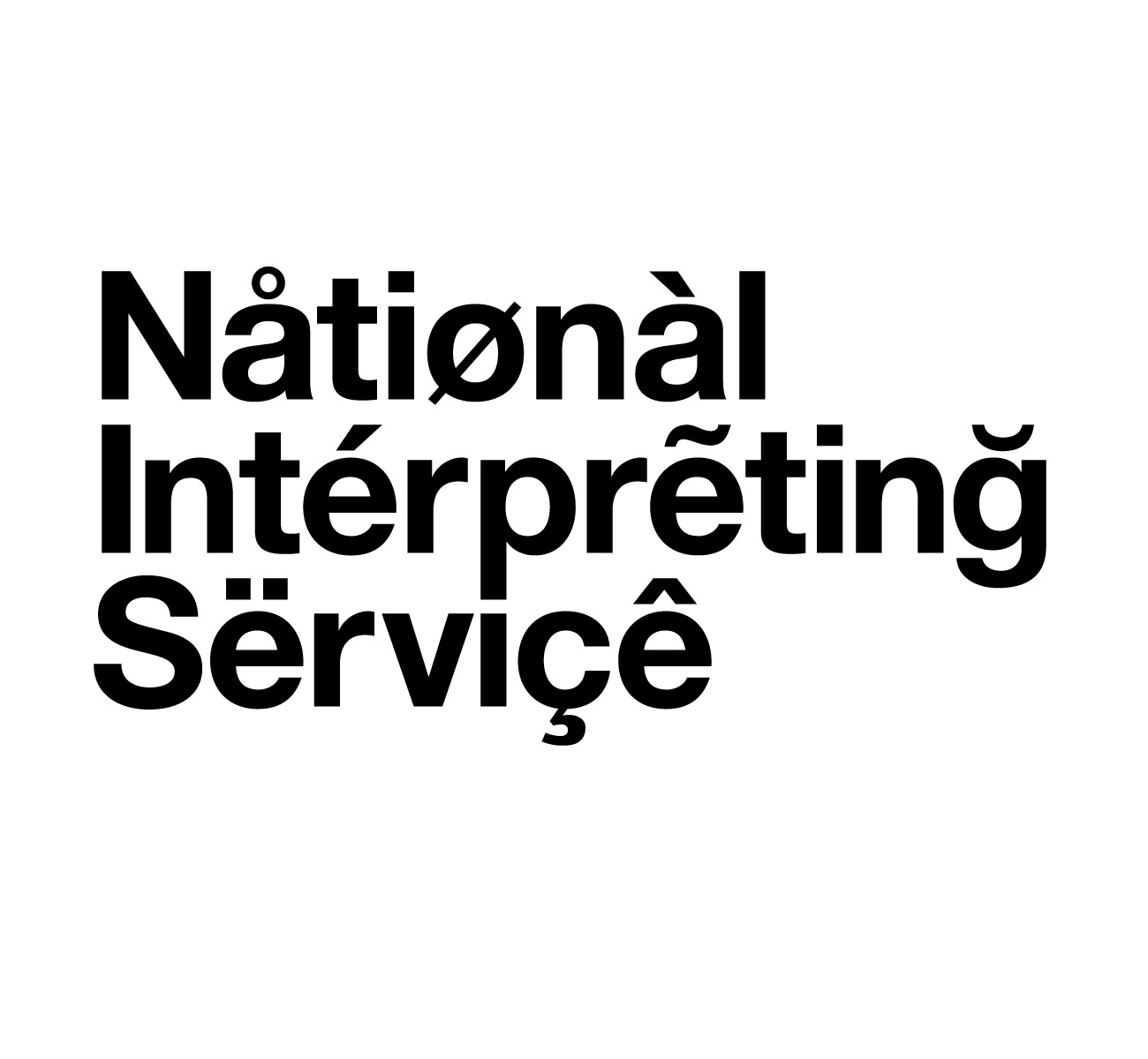
Ray pointed out another creative use of faux diacritics. The logo for the National Interpreting Service was designed in 2003 by Browns:
An identity for a national UK organisation offering instant telephone translation, in any language, for any situation. Its clients range from large corporations to the emergency services.
From The Beautiful Meme’s eulogy on Grafik:
… the balance is beautiful. A perfect example of knowing how much is too much and how much is just right. Three diacritic marks on each line. One can only imagine the combinations they went through. They gave themselves a bit of a break in that they ignored how the glyphs effect the pronunciation of the name. Try reading it and you end up sounding like your drunk uncle being racist at Christmas.


")

")


")


